
Culture typographique. 1.7. Compatibilidad con los navegadores (Bootstrap 3, el manual oficial) Bootstrap ha sido pensado para utilizarse en las versiones más recientes de los navegadores de escritorio y navegadores móviles.
Aunque también funciona con los navegadores más antiguos, en estos casos es posible que algunos componentes se vean peor de lo esperado. Concretamente, Bootstrap soporta las versiones más recientes de los siguientes navegadores y plataformas: Bootstrap también debería funcionar bien en Chromium (Linux) y Internet Explorer 7 (Windows), aunque no están soportados oficialmente. Discover.typography by H&Co.
5 Google Web Font Alternatives to Helvetica and Arial. Helvetica and Arial are the most overused fonts on the web and as with anything that gets overused, it gets boring.
They’re also usually used as backup fonts when a custom font can’t be shown. Thankfully there are hundreds of alternatives available and some of the best are free. Google’s web font family has some awesome fonts which are brilliant, and better looking than Helvetica and Arial. I’ve picked out five fonts which are brilliant alternatives and are free to use how you like. Unfortunately Google’s own user interface for its web fonts is awful and doesn’t show off fonts like it should. Open Sans Lato Source Sans Pro PT Sans Droid Sans As always, if you have some other font suggestions just leave them in the comments. Also check out our font collection – Free Font Downloads Author: Oliur Rahman All posts by Oliur Rahman.
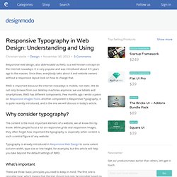
Responsive Font Size with CSS. Making your font-size respond to viewport or container size should be a must to complete your responsive designs.

Having a fixed font-size accross devices is not always a good idea. The key point is to get a readable font size and a comfortable line length in most viewports. 16 Pixels: For Body Copy. Anything Less Is A Costly Mistake. 16 Pixels: For Body Copy.

Anything Less Is A Costly Mistake Advertisement I know what you’re thinking. “Did he just say 16 pixels? For body copy? I’d like to persuade you otherwise. As usability expert Oliver Reichenstein says in “The 100% Easy-2-Read Standard1”: [16 pixels] is not big. In this article, I’ll explain why 16 pixels should generally be the minimum size for body copy in modern Web design. You see, in most cases, if you’re building websites with the font size set between 10 and 15 pixels, you are costing your clients money. Readership = Revenue If you’re building a website for someone — even yourself — chances are its purpose is to make money. Perhaps it’s to sell a product directly, or to offer a service, or just to generate leads. So, every element should be designed to achieve that goal.
Think about it. Important Facts About Reading At age 40, only half the light gets through to the retina as it did at age 20. Responsive Font Size with CSS. Responsive Typography in Web Design: Understanding and Using. Responsive web design, also abbreviated as RWD, is a well-known concept on the internet nowadays.
It is very popular and was introduced about 4-5 years ago to the masses. Since then, everybody talks about it and website owners without a responsive layout look on how to change that. RWD is important because the internet nowadays is mobile, not static. We do not only browse from our desktop machines anymore, we use tablets and smartphones. RWD has different components. Why consider typography? The content is the most important element of a website, we all know this by know. Typography is already introduced in Responsive Web Design to some extent (column width, type size or line height, for example), but this article will help you take beyond the default settings of RWD.
Techniques for Responsive Typography. When it comes to responsive type on the web, there's more to do than just resizing the text's container and having the text reflow inside of it.
This in-depth article covers various techniques for making text responsive. One of the most important aspects of responsive web design is responsive typography. When it comes to responsive type on the web, there’s more to do than just resizing the text’s container and having the text reflow inside of it. From choosing a font type and color, to achieving legible font sizes, line heights, and line lengths on different screen sizes, there are several ways to go about achieving fluid and truly responsive text on the web. First Things First: Making text accessible Before getting into techniques to resize text on different screen sizes, you need to make sure that your text is legible and accessible by using sufficient color contrast and an easily readable font to avoid turning your page’s content into an eye sore.
Choose A Readable Font Face. Responsive Typography: The Basics. By Oliver Reichenstein When we built websites we usually started by defining the body text.
The body text definition dictates how wide your main column is, the rest used to follow almost by itself. Used to. Until recently, screen resolution was more or less homogenous. Today we deal with a variation of screen sizes and resolutions. In the heat of the relaunch I wrote a quick blog post on responsive typography, focussing solely on the aspect of our latest experiment: responsive typefaces. To avoid designing different layouts for every possible screen size, many web designers have adopted the concept of Responsive Web Design. Adaptive layouts: adjusting the layout in steps to a limited number of sizes Liquid layouts: adjusting the layout continuously to every possible width Note: Responsive design already incorporates a lot of macro typographic issues (type size, line height, columns width).
Choosing a typeface The right tone Serif or sans serif? Optimal line height for responsive design.