
1.4. Matplotlib: plotting — Scipy lecture notes. 1.4.2.

Simple plot Tip In this section, we want to draw the cosine and sine functions on the same plot. Starting from the default settings, we’ll enrich the figure step by step to make it nicer. Python - Stacked bar chart with differently ordered colors using matplotlib. A GUI for the exploration of functions with Python / Matplotlib « The Sugar High. Sliders can be a great tools for lazy engineers and modelists who want to play around with the parameters of a program without recompiling it a thousand times.
Most scientific languages ( python-pylab, matlab, scilab…) support some basic sliders methods but it can be quite long to create a GUI. In this blog I present a light, user-friendly function I implemented for my everyday work. Example with a numerical function The new value of volume is automatically computed each time you move the sliders. It is also computed if you press Enter (which can be useful to get several values, when your function is non-deterministic). Matplotlib tutorial. Sources are available here.
Figures are in the figures directory and all scripts are located in the scripts directory. Github repository is here Many thanks to Bill Wing and Christoph Deil for review and corrections. Working with transformations — Matplotlib 1.1.1 documentation. Matplotlib includes a framework for arbitrary geometric transformations that is used determine the final position of all elements drawn on the canvas.
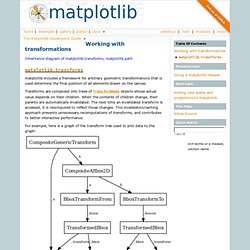
Transforms are composed into trees of TransformNode objects whose actual value depends on their children. When the contents of children change, their parents are automatically invalidated. The next time an invalidated transform is accessed, it is recomputed to reflect those changes. This invalidation/caching approach prevents unnecessary recomputations of transforms, and contributes to better interactive performance. For example, here is a graph of the transform tree used to plot data to the graph: Python - Matplotlib: rotating a patch. Pylab_examples example code: custom_ticker1.py. (Source code, png, hires.png, pdf) #!
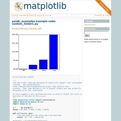
/usr/bin/env python """The new ticker code was designed to explicitly support user customizedticking. Adding new scales and projections to matplotlib. Matplotlib supports the addition of custom procedures that transform the data before it is displayed.
There is an important distinction between two kinds of transformations. Separable transformations, working on a single dimension, are called “scales”, and non-separable transformations, that handle data in two or more dimensions at a time, are called “projections”. From the user’s perspective, the scale of a plot can be set with set_xscale() and set_xscale(). Projections can be chosen using the projection keyword argument to the plot() or subplot() functions, e.g. plot(x, y, projection="custom")
Python - What is the difference between 'log' and 'symlog' Pylab_examples example code: major_minor_demo1.py. (Source code, png, hires.png, pdf) #!
/usr/bin/env python"""Demonstrate how to use major and minor tickers. Ticker. Tick locating and formatting This module contains classes to support completely configurable tick locating and formatting.
Although the locators know nothing about major or minor ticks, they are used by the Axis class to support major and minor tick locating and formatting. Generic tick locators and formatters are provided, as well as domain specific custom ones.. Tickmarks in matplotlib (Krioma.net Blog) Over time I’ve become more and more a lover of Python.
I still don’t use half of the fancy stuff and very much use it as a scripting language, but as you can see from some previous posts I really do think that it is well suited for astronomical purposes. Anyway, I digress, one thing that was bugging me was producing publication quality plots. I’ve still got things to tweak with my plots but I think I’m finally happy with my script and thought I’d share one vital thing – tickmark lenghts. It took me ages to figure out what paramter this was called and lets be honest if no body else gets any use from this I’m bound to the next time I forget / can’t find any code with this implmeneted in. Removing the frame from legends in matplotlib « follow the sheep.
Pyplot. Ubuntu Start Page. Matplotlib.pyplot.legend. Legend in matplotlib. Pyplot. 1.5. Matplotlib — Scipy lecture notes. 1.4.2.
Simple plot Tip In this section, we want to draw the cosine and sine functions on the same plot. Starting from the default settings, we’ll enrich the figure step by step to make it nicer. Python - Stacked bar chart with differently ordered colors using matplotlib. How-To. Plotting: howto Find all objects in a figure of a certain type Every matplotlib artist (see Artist tutorial) has a method called findobj() that can be used to recursively search the artist for any artists it may contain that meet some criteria (e.g., match all Line2D instances or match some arbitrary filter function).
For example, the following snippet finds every object in the figure which has a set_color property and makes the object blue: Customizing Location of Subplot Using GridSpec. GridSpecspecifies the geometry of the grid that a subplot will be placed. The number of rows and number of columns of the grid need to be set. Optionally, the subplot layout parameters (e.g., left, right, etc.) can be tuned.SubplotSpecspecifies the location of the subplot in the given GridSpec.subplot2grida helper function that is similar to “pyplot.subplot” but uses 0-based indexing and let subplot to occupy multiple cells.
Basic Example of using subplot2grid To use subplot2grid, you provide geometry of the grid and the location of the subplot in the grid. For a simple single-cell subplot: Python - Moving matplotlib legend outside of the axis makes it cutoff by the figure box. Matplotlib - How to put the legend out of the plot. Errorbars in matplotlib « scienceoss.com. Pyplot. Creating a custom bar plot in matplotlib « scienceoss.com. Supported Color Names — A Python Environment for (phylogenetic) Tree Exploration. Pylab_examples example code: filledmarker_demo.py. (Source code) Thumbnail gallery. Pyplot tutorial. Matplotlib.pyplot is a collection of command style functions that make matplotlib work like MATLAB.
Each pyplot function makes some change to a figure: e.g., creates a figure, creates a plotting area in a figure, plots some lines in a plotting area, decorates the plot with labels, etc. In matplotlib.pyplot various states are preserved across function calls, so that it keeps track of things like the current figure and plotting area, and the plotting functions are directed to the current axes (please note that “axes” here and in most places in the documentation refers to the axespart of a figure and not the strict mathematical term for more than one axis). import matplotlib.pyplot as pltplt.plot([1,2,3,4])plt.ylabel('some numbers')plt.show() (Source code, png, pdf) You may be wondering why the x-axis ranges from 0-3 and the y-axis from 1-4.
Plot() is a versatile command, and will take an arbitrary number of arguments. Plt.plot([1, 2, 3, 4], [1, 4, 9, 16])