
Ggplot2: Cheatsheet for Scatterplots. Data and Code Download All data and code for this blog can be downloaded here: NB: It's been pointed out to me that some images don't show up on IE, so you'll need to switch to Chrome or Firefox if you are using IE.
Thanks! Ggplot2: Cheatsheet for Barplots. Data and Code Download All data and code for this blog can be downloaded here: NB: It's been pointed out to me that some images don't show up on IE, so you'll need to switch to Chrome or Firefox if you are using IE.
Thanks! How We Created Color Scales on Datavisualization.ch. Ggtern: ternary diagrams in R - an extension to ggplot2. Pocket : Introducing ggvis. Nbviewer.ipython. GgPlot2: Histogram with jittered stripchart. Here is an example of a Histogram plot, with a stripchart (vertically jittered) along the x side of the plot.

Alternatively, using the geom_rug function: Of course this simplicistic method need to be adjusted in vertical position of the stripchart or rugchart (y=-2, here), and the relative proportion of points jittering. Ggplot2. Software and Programmer Efficiency Research Group. Setting Axis Limits on ggplot Charts. I’ve been doodling some chart in R/ggplot using geom_text() to generate a labelled scatterplot.
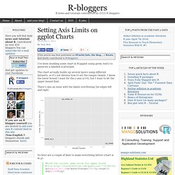
The chart actually builds up several layers using different datasets, so it’s not obvious how to set the ranges cleanly: I know the lower bound I want for the y-axis (y=0), but I want to let the upper bound float. There’s also an issue with the labels overflowing the edges left and right. Ggplot2 - axis formatting. Ggplot2: Quick Heatmap Plotting. A post on FlowingData blog demonstrated how to quickly make a heatmap below using R base graphics.
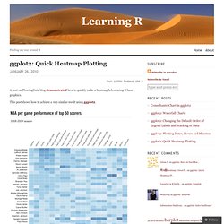
This post shows how to achieve a very similar result using ggplot2. Data Import FlowingData used last season’s NBA basketball statistics provided by databasebasketball.com, and the csv-file with the data can be downloaded directly from its website. The players are ordered by points scored, and the Name variable converted to a factor that ensures proper sorting of the plot. Whilst FlowingData uses heatmap function in the stats-package that requires the plotted values to be in matrix format, ggplot2 operates with dataframes.
The game statistics have very different ranges, so to make them comparable all the individual statistics are rescaled. Plotting There is no specific heatmap plotting function in ggplot2, but combining geom_tile with a smooth gradient fill does the job very well. A few finishing touches to the formatting, and the heatmap plot is ready for presentation. Rescaling Update. Add a background png image to ggplot2. Hey everybody, this is just a short post but I found it very useful.
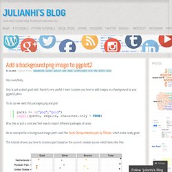
I want to show you how to add images as a background to your ggplot2 plots. To do so we need the packages png and grid Btw, this is just a cool and fast way to import different packages at once. As an example for a background image plot I used the Sochi Olympic Medals plot by TRinker, which looks really good. Ggplot2: Cheatsheet for Visualizing Distributions. In the third and last of the ggplot series, this post will go over interesting ways to visualize the distribution of your data.
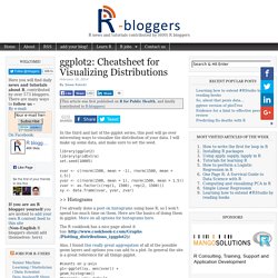
I will make up some data, and make sure to set the seed. library(ggplot2) library(gridExtra) set.seed(10005) xvar <- c(rnorm(1500, mean = -1), rnorm(1500, mean = 1.5)) yvar <- c(rnorm(1500, mean = 1), rnorm(1500, mean = 1.5)) zvar <- as.factor(c(rep(1, 1500), rep(2, 1500))) xy <- data.frame(xvar, yvar, zvar) >> Histograms I’ve already done a post on histograms using base R, so I won’t spend too much time on them. Here are the basics of doing them in ggplot.
Also, I found this really great aggregation of all of the possible geom layers and options you can add to a plot. Notice the warnings about the default binwidth that always is reported unless you specify it yourself. Software and Programmer Efficiency Research Group. Our research often involves quantitative studies producing large amounts of data.
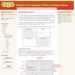
To analyze and visualize that data we use various tools (and we sometimes develop our own, such as Trevis or LagAlyzer). One of the most effective general information visualization tools we know is Hadley Wickham's ggplot2 package for R. Our pages here provide a quick reference, mostly for our own use. We made them public because we think others might benefit from them, too.
A short tutorial for decent heat maps in R. I received many questions from people who want to quickly visualize their data via heat maps - ideally as quickly as possible.
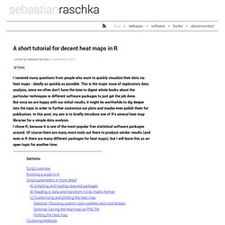
This is the major issue of exploratory data analysis, since we often don’t have the time to digest whole books about the particular techniques in different software packages to just get the job done. But once we are happy with our initial results, it might be worthwhile to dig deeper into the topic in order to further customize our plots and maybe even polish them for publication.
In this post, my aim is to briefly introduce one of R’s several heat map libraries for a simple data analysis. I chose R, because it is one of the most popular free statistical software packages around. Plotting y and log(y) in one figure. Sometimes I have the desire to plot both on the linear and on the log scale.
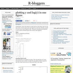
To save space just two figures is not my solution. I want to reuse the x-axis, legend, title. Plot matrix with the R package GGally. I am glad to have found the R package GGally. GGally is a convenient package built upon ggplot2 that contains templates for different plots to be combined into a plot matrix through the function ggpairs. It is a nice alternative to the more limited pairs function. The package has also functions to deal with parallel coordinate and network plots, none of which I have tried yet. The following code shows how easy it is to create very informative plots like the one in Figure 1. Figure 1 Plots like the one above are very helpful, among others things, in the pre-processing stage of a classification problem, where you want to analyze your predictors given the class labels.