
A Complete Guide to Flexbox. Background The Flexbox Layout (Flexible Box) module (a W3C Candidate Recommendation as of October 2017) aims at providing a more efficient way to lay out, align and distribute space among items in a container, even when their size is unknown and/or dynamic (thus the word “flex”). The main idea behind the flex layout is to give the container the ability to alter its items’ width/height (and order) to best fill the available space (mostly to accommodate to all kind of display devices and screen sizes). A flex container expands items to fill available free space or shrinks them to prevent overflow. Most importantly, the flexbox layout is direction-agnostic as opposed to the regular layouts (block which is vertically-based and inline which is horizontally-based).
While those work well for pages, they lack flexibility (no pun intended) to support large or complex applications (especially when it comes to orientation changing, resizing, stretching, shrinking, etc.). Basics & Terminology display. A Complete Guide to Flexbox. Code a Useful Expanding Vertical Navigation Menu. Today we have yet another awesome step-by-step CSS project for you!
This time around we’re going to build a super useful expanding vertical navigation menu. It’s a great way to hide a lot of links in a fairly small space and the animations will add a nice touch to your site. Even if you’re a complete beginner, you should be able to pull this off. I’ll guide you along every step of the way and explain how each chunk of code works so you can implement these same techniques in future projects and deepen your understanding of CSS. Let’s get started! The Concept. CSS: Using Percent for Margin and Padding · MattSnider.com. For Mint.com, Jason Putorti and I are refactoring the way we do CSS graphing to support positive and negative values, where the bars are all scaled using percentages, so the design can change without any re-engineering.
Hopefully, Jason will write a guest article about this soon, but until then, this development inspired todays article. In our graphs, the negative bar needed to be offset by the height of the positive region, and initially we thought to use the margin-top style to apply this offset. However, when we applied the style, using percentages, the resulting offset was drastically less than expected. Doing a little research, I was reminded that when you use percents to apply the margin of an element, the browsers determine the actual size of the margin by multiply the percent against the width of the parent node (this is true for margin-top, -right, -bottom, and -left). It is not based on either the height or width of the element that the margin is applied to. Example 1: Margins. Learn CSS Positioning in Ten Steps: position static relative absolute float. 1. position:static The default positioning for all elements is position:static, which means the element is not positioned and occurs where it normally would in the document.
CSS floats: container does not stretch to fit floated contents : Mike Padgett ~ Photosynthesis. Horizontal examples - Sly.
18 Detailed HTML5 Website Layout Coding Tutorials. HTML5 is the next revision of core markeup language HTML and as of 2012 it is still in the development stage.HTML5 has many new features and techniques.Despite the long term development schedule,many aspects of HTML5 are being implemented in Firefox,Chrome and IE8.It seems there is no escape from the fact that HTML5 will be the web standart.
HTML5 coding has been getting more popularity in coders so in today’s post we bring together step by step examples of web layout coding with HTML5. How to build a HTML5 Website from Scratch View Tutorial Creating ‘Mono’ HTML5 CSS3 Single Page Layout View Tutorial. Expand on Hover Tiles with CSS and jQuery. A tutorial on how to create an Expand on hover Tiles.
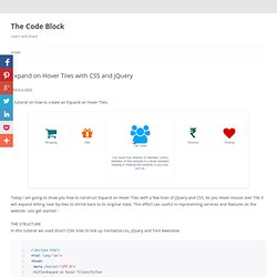
Today I am going to show you how to construct Expand on Hover Tiles with a few lines of jQuery and CSS. As you Hover mouse over Tile it will expand letting near by tiles to shrink back to its original state. This effect can useful in representing services and features on the website. Lets get started ! In this tutorial we used direct CDN links to link up normalize.css, jQuery and Font Awesome. Example 3 - Animated Bar Chart via jQuery. Create a stunning menu in CSS3. The advent of CSS3 has introduced a world of possibilities for web designers and developers.
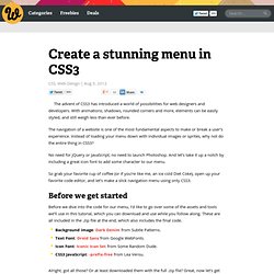
With animations, shadows, rounded corners and more, elements can be easily styled, and still weigh less than ever before. The navigation of a website is one of the most fundamental aspects to make or break a user’s experience. Instead of loading your menu down with individual images or sprites, why not do the entire thing in CSS3? No need for jQuery or JavaScript; no need to launch Photoshop. 30 Pure CSS3 Tutorials & Examples. CSS3 contains several new important features to enhance your designes, it has completly opened new posibilities for designers.

With CSS3 and HTML5, one can now create extremely modern and very stylish web designes, loaded with effects and animations. But CSS3 selectors are relatevily new and are not supported in older browser, especially the older Internet Explorer versions.