
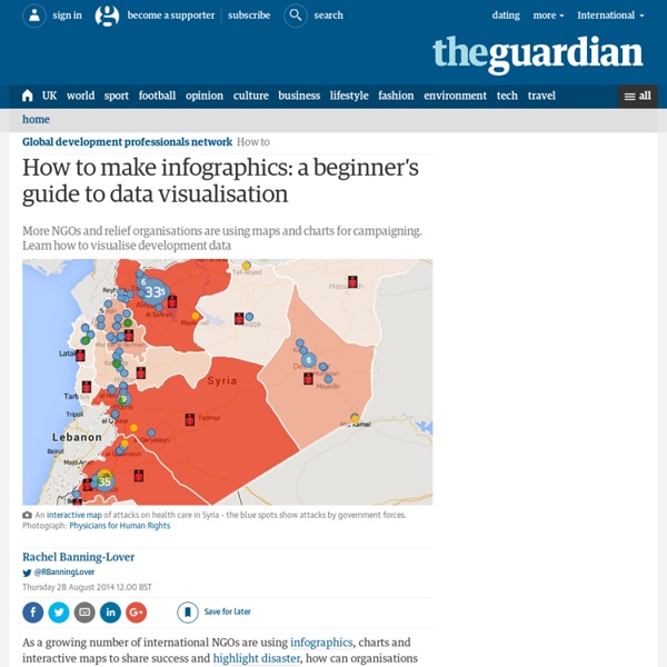
A Real Map of the Middle East Could this map be any more different from the previous one discussed on this blog? That one dealt with the water, wetlands and shifting shorelines of Louisiana. This one zooms in on lines in the sand of the Middle-Eastern desert. Yet both maps do something similar: knowing that our current maps no longer reflect reality, they replace their conventional wisdom with a new cartography, based on the new facts on the ground. For Louisiana, that means a shoreline that bites much deeper inland. The Middle East has been in turmoil since the so-called Arab Spring of 2011, with the Syrian civil war as its bloodiest consequence. Here, the colonial-era boundary system known as Sykes-Picot has broken down, apparently permanently: few can envision a return to a unitary Syrian state – or a unitary Iraqi one, for that matter. The Syrian central government (in light grey), based in Damascus, controls a coastal strip of territory in a patchwork shared with a number of rebel forces.
About Bones You probably don’t give much thought to your skeleton, even though it’s holding you together. Do you have as many bones now as you did when you were born? What’s the shortest bone in your body? When it comes to bone health, Dr. By age 30, we’re already starting to lose bone density if we don’t exercise. Love This? Thanks for subscribing! “Most people don’t realize it when they’re deficient in vitamin D,” Stearns said in an interview with Care2. Check out The Cleveland Clinic infographic below to learn more about the bones that make up your skeleton. According to the National Osteoporosis Foundation, women 50 and younger and men 70 and younger need about 1,000mg of calcium a day. If you’re under age 50, you need 400 to 800 IU of vitamin D a day. Guidelines differ for children, pregnant women and women who are breastfeeding. If you don’t get enough calcium and vitamin D from your diet, talk to your doctor about dietary supplements. Main post photo: Thinkstock | Infographic: Cleveland Clinic
Mongolia Adopts An Innovative System of 3-Word Locations The idea is simple enough. Wouldn’t locations be easier to remember if we traded in complicated GPS coordinates for simple and memorable three-word phrases? That’s the idea behind what3words, a new system that—in the words of Big Think’s Frank Jacobs in his entertaining article on the system—is “doing for geolocation what domain names did for IP addresses.” That is, make them easier to share and to remember. (Read Frank’s article—it’s fun.) what3words has divided up the earth into 57 trillion three-by-three-meter squares and created an algorithm to assign each one a three-word name. You can also find the name of any location using their website’s interactive map. what3words estimates 4 billion people live in locations without a numbered street system, and it’s difficult for these people to open bank accounts, receive deliveries, or even be contacted. It’s not that surprising it’s Mongolia, well-monied these days thanks to its vast mineral deposits.
Here's a Helpful Infographic on the Many Risks of Helicopter Parenting Below you'll find a nifty infographic produced by the folks at Yellowbrick detailing the consequences of everyone's favorite irritating childrearing trend: helicopter parenting. We've written a lot about this topic here at Big Think; our archives are a veritable smorgasbord of pieces detailing its effects and consequences. Our focus isn't merely because we like to helicopter the helicopter parents, but because shifts in how we raise our kids have resulted in a generation of young adults who lack critical thinking, self-reliance, and coping skills. And that sucks not just for said young adults, but also for everyone else who has to deal with their problems. The image below will shed some light on all these elements, as well as offer a more basic crash course for those still unfamiliar with this troubling trend: For additional information on and analysis of the items above, check out the Yellowbrick blog.
42 maps that explain World War II by Timothy B. Lee on November 13, 2014 World War II was a great tragedy, claiming 60 million lives and throwing millions more into turmoil. Yet the war also spurred rapid technological development, hastened the end of colonialism, and laid the foundation for institutions like the United Nations and the European Union. Here are 42 maps that explain the conflict — how it started, why the Allies won, and how it has shaped the modern world. Background World War II, animatedWorld War II was the biggest conflict in world history, with major battles on three continents and some of the largest naval engagements in history. The Axis (and the Soviet Union) attacks Japan and China were already at war in 1937People often describe World War II as beginning in September 1939 when Germany invaded Poland. The Allies besieged Tens of thousands of British troops escape from DunkirkThe war in France didn't go well for the Allies. The USA and USSR are drawn into the conflict The Allies retake Europe and Africa
There's Big Money to Be Made in Asteroid Mining See the full version of the infographic. If humans were ever able to get their hands on just one asteroid, it would be a game-changer. That’s because the value of many asteroids are measured in the quintillions of dollars, which makes the market for Earth’s annual production of raw metals – about $660 billion per year – look paltry in comparison. The reality is that the Earth’s crust is saddled with uneconomic materials, while certain types of asteroids are almost pure metal. X-type asteroids, for example, are thought to be the remnants of large asteroids that were pulverized in collisions in which their dense, metallic cores got separated from the mantle. There is one such X-type asteroid near earth that is believed to hold more platinum than ever mined in human history. Near-Earth Mining Targets Both companies are looking specifically at near-Earth asteroids in the near-term, which are the easiest ones to get to. Where the Money is Made
MapCrunch - Random Google Street View Trump's conflicts of interest: a visual guide | US news Trump's conflicts of interest: a visual guide By Nadja Popovich and Jan Diehm “I will be leaving my great business in total in order to fully focus on running the country in order to MAKE AMERICA GREAT AGAIN!” Donald Trump tweeted on Wednesday. The early morning announcement, which provided no further details but promised a press conference on 15 December, followed weeks of bad press over conflicts of interest posed by the Trump Organization’s international real estate dealings. “While I am not mandated to do this under the law,” Trump wrote, “I feel it is visually important, as president, to in no way have a conflict of interest with my various businesses.” So far, the visuals haven’t been good for the president-elect. Closer to home, the business interests of the Trump Organization will cross paths with the US government on multiple fronts, providing ample opportunity for further conflicts. General Services Administration v Trump International Hotel, DC What the President-elect could do
The Most Disproportionately Well-Paying Job in Each State 8513 25Share1 Click to enlarge Get rich quick schemes rarely go according to plan, so unfortunately you're going to have to do some work if you want to make it big. Still, if you want to get the most bang for your buck, you might want to check out what state is going to pay you the most for the same job. Business Insider found the jobs that make the most money in each state versus the national average. The Afternoon Map is a semi-regular feature in which we post maps and infographics. November 11, 2015 - 4:25pm ©2016 Mental Floss, Inc. Support for ISIS in the Muslim World - Perceptions vs Reality According to a Brookings report from last January: 40% of Americans believe most Muslims oppose ISIS.14% think most Muslims support ISIS.And 44% (the plurality) of Americans believe Muslim views are evenly balanced on the issue. American perceptions of Muslims’ support for the Islamic State are all over the map. And you only have to search Google for “how many muslims support isis” to see why. The first result shows “81% of respondents support the Islamic State.” The range of answers to this question reported by the media is enormous, partly because much of it comes from online polls, social media sentiment analysis, and other non-scientific / unrepresentative studies. Last month, the International Business Times cited a study from Pew Research Center concluding ISIS is “almost universally hated.” What the Muslim world actually thinks of ISIS Looking only at scientific opinion polls, the results are actually very consistent. In the Muslim world, support for ISIS is low across the board.