
If the World were 100 PEOPLE 50 would be female 50 would be male 26 would be children There would be 74 adults, 8 of whom would be 65 and olderThere would be: 60 Asians 15 Africans 14 people from the Americas 11 Europeans33 Christians 22 Muslims 14 Hindus 7 Buddhists 12 people who practice other religions 12 people who would not be aligned with a religion12 would speak Chinese 5 would speak Spanish 5 would speak English 3 would speak Arabic 3 would speak Hindi 3 would speak Bengali 3 would speak Portuguese 2 would speak Russian 2 would speak Japanese 62 would speak other languages83 would be able to read and write; 17 would not 7 would have a college degree 22 would own or share a computer77 people would have a place to shelter themfrom the wind and the rain, but 23 would not 1 would be dying of starvation 15 would be undernourished 21 would be overweight 87 would have access to safe drinking water 13 people would have no clean, safe water to drink
Map Explorer Explore maps of future climate as simulated by individual climate models. IMPORTANT: When viewing and using results from individual climate models, it is imperative that you also take account of the range in the climate projections. If you have not already done so, we encourage you to use the Climate Futures approach to identify two or three models that capture the range of results relevant to your application. More information can be found in the Climate Campus here . Initially, the map shows just the four NRM Super-Clusters . Users who wish to see maps of multi-model results should refer to the Technical Report and Cluster Reports . Get Started 1. 2. 3. 4. 5. 6. 7. 8. Navigating and Reading the Map The gridded results corresponding to your settings are displayed on the map. The map can be zoomed using the + and - buttons. The legend to the right of the map shows the colour scale used to display the results as well as the units. Configure Data Configure View Map View Options Save & Export 1.
The Perennial Plate | Adventures in Sustainable Eating Budgeting Take charge of your money By taking charge of your money, whether you have a little or a lot, you will ease money stress and feel more secure and in control. 1. Track your spending Where is your cash going each day? Tracking your spending helps you understand your daily money habits. Track your personal expenses on the go with our free and easy-to-use app. TrackMySpend 2. How much money is coming in and going out each week, fortnight or month? Work out where your money is going and make it stretch further. Budget planner Video: Starting a budget starting a budget video Heidi and Andrew from the MoneySmart team share their top tips on starting a budget Put your budget into action Related links 40 Maps They Didn’t Teach You In School By the time we graduate high school, we learn that they never taught us the most interesting things in there. Sure, you might be able to name the European countries or point New York on the map, but does that give a you real understanding of how the world functions? To fill this gap, we have gathered a great and informative selection of infographical maps that they should’ve shown us at school: every single one of these maps reveals different fun and interesting facts, which can actually help you draw some pretty interesting conclusions. Show Full Text What makes infographical maps so engaging is how easy it becomes to conceive graphically presented information. Without further ado, we invite you to learn things like most popular sports in different countries, who has the largest breasts, red hair map of Europe, world’s most consumed alcoholic beverages, or which brands dominate in different states of the USA. Trust us, these are way better than the ones they taught you at school!
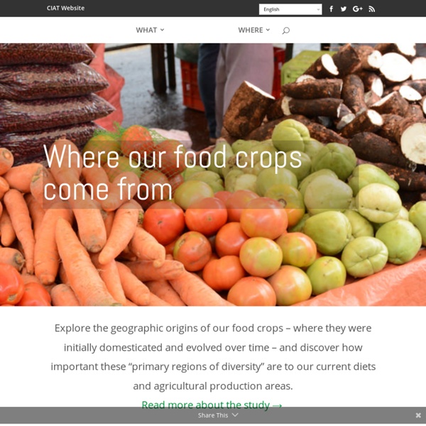
How terrorism in the West compares to terrorism everywhere else - Washington Post How Does It Grow: Video Teaches Eaters Where Their Food Comes From When we took a video camera into the heart of Philadelphia to ask passersby how foods like coffee, rice and cinnamon grow, the answers — or rather, the inability to answer — was staggering. Almost across the board, if the interviewee was over the age of 60, they did well on our pop quiz. If they were younger, no matter their gender or race, they struggled. "What is flour made from?" a man said, pondering the question. "Rice? While this test was far from scientific, it presents stirring evidence of the disconnect we have when it comes to our food sources. A recent Australian survey reported that 20 percent of its nation's children believe that pasta comes from animals and 27 percent think that yogurt comes from plants. But does it matter? Let's start with the obvious connection: health. Children are not reputed to be great adventurers of taste: if they can't identify a food on their plate, they're going to need some coaxing. That's our mission with our new video series, How Does it Grow?
Yes, native plants can flourish after bushfire. But there’s only so much hardship they can take In a fire-blackened landscape, signs of life are everywhere. A riot of red and green leaves erupt from an otherwise dead-looking tree trunk, and the beginnings of wildflowers and grasses peek from the crunchy charcoal below. Much Australian flora has evolved to cope with fire, recovering by re-sprouting or setting seed. However, some plants are sensitive to fire, especially when fires are frequent or intense, and these species need our help to recover. Read more: Some say we've seen bushfires worse than this before. After announcing a A$50 million wildlife and habitat recovery package, the Morrison government recently met with Australia’s leading wildlife experts to steer recovery efforts. Encouraging native flora to bounce back from these unprecedented fires requires targeted funding and actions to conserve and restore plants and ecological communities, including seed banking. How do plants naturally recover from fire? Seeds may wait in woody fruits stored on the plant.
The Most Disproportionately Well-Paying Job in Each State 8513 25Share1 Click to enlarge Get rich quick schemes rarely go according to plan, so unfortunately you're going to have to do some work if you want to make it big. Still, if you want to get the most bang for your buck, you might want to check out what state is going to pay you the most for the same job. The Afternoon Map is a semi-regular feature in which we post maps and infographics. November 11, 2015 - 4:25pm ©2016 Mental Floss, Inc. Aurora Australis Viewing Locations ( southern hemisphere ) ABOUTA collated map of aurora australis viewing locations in Australia & New Zealand.The map was established and is overseen by the admins of Facebook group Aurora Australis Tasmania.FYI: In the southern hemisphere we face South to view aurora australis ........( in the northern hemisphere you face North to view aurora borealis ) ==================== DATA LICENSING ====================Please do not collect / disseminate our map location information Please ask for permission if you wish to re-use our informationAs per respective entities======================================================= DISCLAIMER & SAFETY NOTICE:> Care taken but no responsibility is given for the accuracy of the map - locations have been supplied by members of Aurora Australis Tasmania &/or Aurora Australis (New Zealand) facebook groups, who are contributing the location to be suitable for viewing an aurora australis from. !!
Tender Greens | Sustainable Life Project Tender Greens began hiring homeless teens to work in their restaurants and saw how food can bring healing and opportunity to young lives. The founders of Tender Greens and Scarborough Farms created a program to provide transitioning foster youth access to a safe, consistent learning and living environment. The Sustainable Life Project partners with local organizations to recruit young adults transitioning out of the foster care system to participate in a culinary internship program to learn about where food comes from and what it's like to work in a fast-faced restaurant. Youth transitioning out of foster care face unique challenges that make them especially vulnerable. Distrust, abuse, neglect and general lack of access to resources and guidance often make navigating adulthood difficult. The Sustainable Life Project (SLP), developed by the founders of Tender Greens Restaurants, believes firmly in the power of food to bring nourishment, healing and opportunity to young lives.