
The globe of economic complexity About close x The Globe of Economic Complexity The globe of economic complexity dynamically maps out the entire world production of goods to create an economic landscape of countries around the globe. The original Atlas of Economic Complexity The Globe is built upon The Atlas of Economic Complexity, a powerful interactive tool that enables users to visualize a country’s total trade, track how these dynamics change over time and explore growth opportunities for more than a hundred countries worldwide. The Center for international development Associated Paper This project will be featured at the 2015 IEEE VIS conference in Chicago. Data Used Technology This visualization was built with webGL, a new graphics library that enables to create new 3D worlds in the browser. Contact Aknowledgements We would like to thank Marcela Escobari, Ricardo Hausmann, Gus Wezerek and Tim Cheston for their insight and support.
Here's Everyone Who's Immigrated to the U.S. Since 1820 From 1820 to 2013, 79 million people obtained lawful permanent resident status in the United States. The interactive map below visualizes all of them based on their prior country of residence. The brightness of a country corresponds to its total migration to the U.S. at the given time. Use the controls at the bottom to stop / resume the animation or to move back and forth in time. Two Centuries of U.S. Immigration (1 dot = 10,000 people) Over time, the sources of immigration trace a clear path across the world. Through most of the 1800’s, immigration came predominantly from Western Europe (Ireland, Germany, the U.K.). Here are the largest immigration “waves” charted over time, showing the progression. While it may seem that immigration over the last few decades has been higher than ever before, the picture looks very different when viewed relative to the size of the U.S. population. Here is the same chart, with the immigration shown as a percentage of the U.S. population. Credit: Related
Cartocrise - Culture française tu te meurs. Recensement des festivals, structures et associations supprimés/annulés. ------------------ Carte qui sera malheureusement toujours en construction. N'hésitez pas à zoomer pour voir les différents marqueurs par commune. Pour me glisser une structure/festival/asso manquante, merci de faire un mail par ici : cartocrise@openmailbox.org ---- A la date de publication, le 23 janvier 2015 : 48 points sont répertoriés. Structures fermées, festivals annulés / Arts de la Rue Structures fermées, festivals annulés / Arts Pla Structures fermées, festivals annulés / Cinéma Structures fermées, festivals annulés / Danse Structures fermées, festivals annulés / Inclassable - Pluridisciplinaire Structures fermées, festivals annulés / Littérature - Arts de la Parole Structures fermées, festivals annulés / Musique Structures fermées, festivals annulés / Théâtre
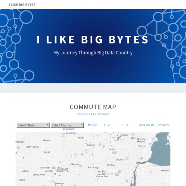
United States Commutes and Megaregions data for GIS This Figshare dataset contains the files created by and used in a related PLOS ONE paper, entitled 'An economic geography of the United States: from commutes to megaregions', by Garrett Dash Nelson and Alasdair Rae, published 30 November 2016. Update: 27 January 2017 - see item 7. below In addition to the files listed below, we have also provided a series of maps here, as high resolution PNGs. 1. 2. 3. 4. 5. 6. 7. Please see the attached readme file for full information. This Figshare dataset contains the files created by and used in a related PLOS ONE paper, entitled 'An economic geography of the United States: from commutes to megaregions', by Garrett Dash Nelson and Alasdair Rae, published 30 November 2016. Update: 27 January 2017 - see item 7. below In addition to the files listed below, we have also provided a series of maps here, as high resolution PNGs. 1. 2. 3. 4. 5. 6. 7. Please see the attached readme file for full information.
Home - Eurostat Home Welcome to Eurostat The home of high-quality statistics and data on Europe Learn more about us EU key indicators Skip the carousel Explore data & tools Database Statistical themes Interactive publications Data visualisations Latest news View all Asset Publisher © Federico Rostagno/Shutterstock.com EU ports handled 3.4 bn tonnes of freight in 2024 4 December 2025 © Gorodenkoff/Shutterstock.com EU spending on R&D exceeded €403 billion in 2024 © insta_photos/stock.adobe.com Save the date: webinar on housing statistics © Drazen/stock.adobe.com Volume of retail trade stable in the euro area © teamjackson/stock.adobe.com 80% of EU enterprises report global value chain constraints 3 December 2025 © Jenny Sturm/stock.adobe.com Find out more about people with disabilities in the EU © wi6995/Shutterstock.com Industrial producer prices up by 0.1% in the euro area © batuhan toker/stock.adobe.com 25% of fatal work accidents happened in public areas 2 December 2025 Quick access Release calendar Statistics Explained Podcasts
Exploring Mexico through Dynamic Web Maps | GIS Education Community One of the people I regard most highly here at Esri has created an online atlas of Mexico. He started it off as an Esri storymap, but as he continued to add content, it soon become a “story atlas.” As an educator I was immediately struck by how useful the atlas could be as a tool to teach and learn about Mexico. I am continually amazed and also hear from educators at how little American students really know about their neighbor to the south. You can use this resource of over 30 thematic maps to teach and learn about population, landforms, climate, historical landmarks, caves, indigenous cultures, tourist attractions, and more. The atlas includes a unique set of cartograms showing the states of Mexico mapped on a number of different variables. Mexico story map with precipitation theme. Joseph Kerski is a geographer who believes that spatial analysis through digital mapping can transform education and society through better decision-making using the geographic perspective.
Cartographie numérique : précis de discrétisation pour les nuls sept82014 Faire des cartes, c'est bien. Choisir judicieusement les plages de couleurs qui la font, c'est encore mieux ! En géographie, on appelle "discrétisation" une méthode qui "rend discrètes" les données considérées. Pour cela, on découpe généralement sa carte en un certain nombre de "classes" dans lesquelles sont rangées des valeurs colorées avec une teinte unique. Sauf qu'il y a différentes manières de discrétiser une carte, et qu'aucune d'entre elles n'est parfaite. Dans ce qui suit, on considérera le même jeu de données appliqué à 78 zones géographiques, à colorier en six classes. Une des questions que l'on se pose le plus souvent quand on traite d'importants volumes de données est : que faire des valeurs extrêmes ? On peut soit les considérer comme négligeables, voire parasitaires et ne pas les valoriser, ou bien articuler toute une histoire autour d'elles. Pour obtenir l'amplitude type, on divise simplement l'étendue de l'échantillon (maximum-minimum) par le nombre de classes.
An Economic Geography of the United States: From Commutes to Megaregions Abstract The emergence in the United States of large-scale “megaregions” centered on major metropolitan areas is a phenomenon often taken for granted in both scholarly studies and popular accounts of contemporary economic geography. This paper uses a data set of more than 4,000,000 commuter flows as the basis for an empirical approach to the identification of such megaregions. Citation: Dash Nelson G, Rae A (2016) An Economic Geography of the United States: From Commutes to Megaregions. Editor: Joshua L. Received: July 2, 2016; Accepted: October 22, 2016; Published: November 30, 2016 Copyright: © 2016 Dash Nelson, Rae. Data Availability: The data are available at the following Figshare link: Funding: The publication fee for this article was provided by the University of Sheffield. Competing interests: The authors have declared that no competing interests exist. Introduction Background Data and Methods The ACS 2006–2010 Census Tract Flow Dataset