
Code-Free Responsive Website Design Software. Landing Page: Create, Publish and Optimize for Free. Love Life and Furniture - Welcome to the greatest show on Earth. Life. The Kings of Summer, Now Playing in Select Cities. The Original Women's Mountain Bike. Create & tell true brand Stories. Tower Films. TSOVET : We’re passionate about designing and building watches. Home. We empower visionaries to lead meaningful brands. Umwelt A/S. We make apps. Home - dunkelblaufastschwarz. Strategic Design Firm. Kontrapunkt. We’re happy to announce that we welcome three new partners to Kontrapunkt’s partner group: Head of Consumer Design, Mikael Tonning; Head of Consumer Brand Accounts, Ronnie Erik Greve and Head of Digital, Morten Gade.
Their entry is a considerable reinforcement and supports our ambition to drive digital and consumer design. They all have an excellent track record at Kontrapunkt and are highly valued by our clients. Today, we celebrate their strong effort. Now all of our core fields are represented in the partner group. This leaves us even better geared for the future. Kontrapunkt’s partner group now consists of:Bo Linnemann, Kim Meyer Andersen, Mads Quistgaard, Nicoline Klareskov, Lars Larson, Svante Lindeburg, Mikael Tonning, Ronnie Greve and Morten Gade. Mobile Website Gallery.
Showcase of Outstanding Responsive Web Designs. This showcase rounds up a collection of the most inspiring and outstanding examples of responsive web design.
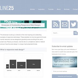
These websites not only look great at full scale monitor resolution, but are designed to gracefully scale according to the user’s screen size. Resize you browser, view the site on a smartphone, tablet or netbook and you’ll see the same design in a range of well presented formats. Websites are no longer viewed only on a computer monitor. Smartphones, tablets and netbooks throw a range of resolutions and different screen sizes into the mix for designers to now worry about. The idea of catering for various resolutions isn’t anything new. Ready for some examples? Alsacréations Sasquatch Festival Earth Hour Cognition Tileables Philip Meissner Interim Ribot Visua Design Laufbild Werkstatt Sweet Hat Club iamjamoy Andrew Revitt Stijlroyal Sleepstreet Pelican Fly eend Converge SE iwantedrock Joni Korpi Jason Weaver Cohenspire Think Vitamin.
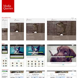
Inspiration: Fluid & Responsive Design. Responsive design all started with this article by Ethan Marcotte.

Some people see it as a trend. But it is more than just a trend. It is a new design solution — it helps to resolve the design problems associated with the different resolutions and devices (desktop, laptop, tablet, and mobile). I'm going to share a list of responsive sites that I feel are nicely done. I've categorized the list into two categories: Adaptive and Fluid & Responsive. Adaptive Design The following sites are examples of adaptive design. iA Information Architects is one of my favorite minimal sites. Head London Although the Head London site is not fluid, but it did a pretty good job on the responsive layouts. Food Sense Pay attention to see how the Food Sense site responds. Fork CMS Go to the Fork CMS site, resize your browser window. Media Queries. Hirondelle USA.
The Responsinator. Responsinator · Make your own · About · Login iPhone 3+4 portrait · width: 320px We're hosted on Linode.com - signup, they're great.
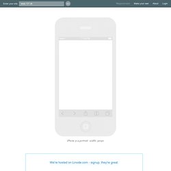
Remove these ads - make your own customised Responsinator. iPhone 3+4 landscape · width: 480px iPhone 5 portrait · width: 320px iPhone 5 landscape · width: 568px Crappy Android portrait · width: 240px.