
10 tips for better slide decks. When your slides rock, your whole presentation pops to life.

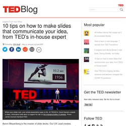
At TED2014, David Epstein created a clean, informative slide deck to support his talk on the changing bodies of athletes. Photo: James Duncan Davidson/TED Aaron Weyenberg is the master of slide decks. Our UX Lead creates Keynote presentations that are both slick and charming—the kind that pull you in and keep you captivated, but in an understated way that helps you focus on what’s actually being said. He does this for his own presentations and for lots of other folks in the office. We asked Aaron to bottle his Keynote mojo so that others could benefit from it. Aaron used this image of a New Zealand disaster to kick off a slide deck from TED’s tech team — all about how they prepares for worst-case scenarios.
The big picture… Think about your slides last. And now some tactical tips… Go easy on the effects and transitions. (20) Visual Design Principles: 5 things you should know to create persuasive content. How to Make a Presentation - Tutorial. Today I wanna talk to you about, The 6 Things You Need to Do Before You Create Your Presentation.

So here’s a thing, what most people do when they create a presentation is they jump right into it. They open up PowerPoint or any other program they’re using and they start putting together the content, the slides and images randomly. That doesn’t end up with a good end result. So what I’ll do in this case is I’m gonna divide this video into 3 parts. Part I, is gonna be about this episode, The 6 Things You Need to Do Before You Create Your Presentation. And the next one is going to be about actually creating your presentation. And in the last but not least is going to be bringing it all together which I’m gonna be talking about consistency and basically just you know, finalizing your compelling presentation. How to Select and Pair Fonts in your Design - Design Tips.
How to make a presentation - choose the best color. Hey guys, Payman here.

Part 2 of the 3 part series of How to Create Compelling Presentations. In the last episode, I talked about what you need to do before you create your presentations. That was referring to brainstorming, defining your audience, the medium and also how to create an outline. In this episode, we’re going to talk about how to choose the right color for your presentation. And to understand colors and also how to apply them to your presentations. 1. When I talk about colors, I’ll very briefly talk about the color wheel. Your secondary colors, what you do is you take equal parts, you combine them and you end up with your secondary colors. 2. Now, in terms of colors, I’ll go a little bit deeper into that but first I’m going to talk to you a little bit about developing your theme. What you really want to do is to create presentations from my color, my theme aspect and even the content that actually emotionally connect with your audience.
11 Design Tips for Beautiful Presentations. If you’re looking to get the highest fidelity custom design for your presentation, look no further than our sister agency Column Five. Presentations often receive a bad rap—for good reason. We’ve all sat through those long-winded speeches and hot mess PowerPoints, which completely undermine the point of visual presentations. So, what differentiates a good presentation from a poor one? Content and design. While your speech may be perfect, the images you show can greatly add or detract from your message. 1) Skip the Stock Template Using the slide themes included in your software is presentation death. 2) Don’t Use More than 6 Lines of Text Packing too much information into a slide will completely undermine its purpose. 3) Ditch the Bullet Points Too many presentations are bullet point crazy. 4) Use Sans Serif Fonts With typography, go for legibility over fun. 5) Size Fonts Appropriately 6) Maintain a Strong Contrast Between Text and Background 7) Use No More than 5 Colors 9) Use Single Images.
5 Best Practices For Making Awesome PowerPoint Slides. Most PowerPoint presentations are the worst.

Far too often, the slides are text-heavy and the person simply reads them off. And while there is important information being discussed and employees have the best of intentions of listening, their minds invariably begin to wonder and boredom prevails. Don’t let that happen. Make your presentations memorable by having awesome slides that enhance your presentation, not take away from it. In her LinkedIn Learning course Content Marketing: Slides, Instructor Dayna Rothman gave five best practices for creating awesome slides that’ll make your presentation stand out. Whatever style you pick, you want to keep it consistent throughout the piece.
Instead, one consistent tone makes the presentation flow much better. A good example: Connexion : comptes Google. Thomas Suarez: A 12-year-old app developer. Visual Design Principles: 5 things you should know to create persuasive content. (21) Easybib for Google Docs.