
The 9 Rules of Design Research - Mule Design Studio - Medium. Lately, I’ve noticed a lot more ambient enthusiasm for research among both early stage start-ups and established organizations.
Businesses have embraced the idea that meaningful innovation requires understanding their customers as humans with complex lives. This is fantastic. I’ve also been hearing quite a few of the same myths, misperceptions, and hedges repeated. So, in the interests of being helpful—because I do like to be helpful—here is a snackable listicle of simple correctives designed to share far and wide (I’ve been assured that research proves readers enjoy snackable listicles. And puppies.) 1. Table of Contents: - Prototypr. Gwent (Written by Michael Harrison) In terms of UX, Gwent picks up where the Witcher 3 left off, CD Project Red have always been experts at blending modern UI styles with the aesthetic and charm of their Role-Playing Universe and Gwent is no exception.
The art of Gwent is overwhelming beautiful, and the game makes sure to show this off at every opportunity. Almost every button, notification, portrait, load screen and menu background display a gorgeous, high resolution piece of art, not to mention the seemingly endless sets of cards and their rarer animated counterparts. The effect this has on the player is to fully immerse and engage them in the universe before they even queue for a match. But that’s not all Gwent does well, they’ve put a lot of thought and effort into the usability of the menus and user interface, often iterating and scrapping entire menus to be replaced with an improved version. Pyre Robo Recall Even from a VR perspective, Robo Recall doesn’t necessarily do anything new. : Ian Hamilton's Blog - Game accessibility quotes of 2019.
The following blog post, unless otherwise noted, was written by a member of Gamasutra’s community.
The thoughts and opinions expressed are those of the writer and not Gamasutra or its parent company. 2019 was a year of huge change in the accessibility field, with progress across every corner of the industry - post on that coming soon. But public discourse was dominated by just a few topics – text size, difficulty options (and off the back of that how accessibility relates to creative vision), and subtitling. Below are a few things gamers and developers have said over the year that stood out for me, covering those topics but also some others too. It's a long page, but an easy read. The confusing roles of UX - UX Collective. The roles in the design industry are deep and overlapping.
It’s why new designers often struggle to understand the terminology, and why it’s become so confusing that designers are struggling to define what they do. Konsoll 2019: Åsa Roos - Why Design Matters Applying Ethics to User Experience Design. Inventory UX Design - How Zelda, Resident Evil, and Doom Make Great Game Menu UX. Celia Hodent: The Gamer's Brain - Triangulation 395. Game Ux Summit Europe 18. Game UX Summit '19. Applying the 5 Domains of Play: Acting Like Players. User eXperience - Jesse James Garrett at USI. How Accessible Were This Year's Games? Inventory UX Design - How Zelda, Resident Evil, and Doom Make Great Game Menu UX. 10 Usability Heuristics Applied to Video Games. Video games may seem very different from websites or apps: they don’t usually have a practical goal (such as to inform people or help them create an artifact), but instead they aim to entertain.
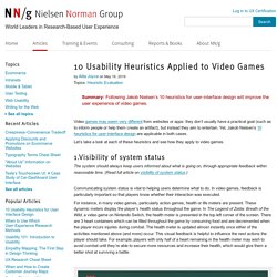
Yet, Jakob Nielsen’s 10 heuristics for user-interface design are applicable in both cases. Let’s take a look at each of these heuristics and see how they apply to video games. 1.Visibility of system status The system should always keep users informed about what is going on, through appropriate feedback within reasonable time. We categorized over 500 user onboarding experiences into 8 UI/UX patterns. What is user onboarding Before we jump in to user onboarding UI/UX patterns, lets take a moment to review what user onboarding is, as why it's so important.
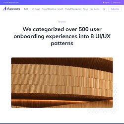
User onboarding is a once in a user’s lifecycle experience that—when done well—shortens a user's time to value. We refer to this moment of value as a user’s wow or aha moment—aha like, “Wow this is awesome!” Or “Aha! Now I get it!” User onboarding is, first and foremost, about teaching your users how to use your app so that they can find success faster, reach their moment of activation, and understand the value of your product. The State of UX in 2019. Applying the Three Levels of Design to Building Software Products — UX / UI Design. Start Projects With Phase Zero. Sometimes, clients just don’t know what they want.
A lot of times they have a rough idea of the problem they’re trying to solve and the project they want you to work on, but even those rough ideas aren’t enough. Other times, they may not actually know exactly what they want, just that they’ll “know it when they see it.” dds are, your clients hired you to solve one problem or another. If they lack clarity about what they want the end result to look like, it could be because they lack clarity about what they’re trying to solve. If that’s the case, then perhaps you ought to start your process a step back and find the right problem.
One design firm, Continuum, has been doing just that for decades and it’s lead to innovations like the Reebok Pump and the Swiffer mop. TRIAGE NEEDED.
User Interface. Game UX Summit 2016 - Anders Johansson - Navigation Tools for The Division. Intro to UX Design - User Experience and You - Extra Credits. Agile Is not Easy for UX: (How to) Deal with It. Introduction Agile has taken over the software-development world.
In recent years, it’s become the most popular software-development methodology. Agile development has a lot of benefits: an incremental approach, the ability to change direction based on customer and stakeholder feedback, short timeframes that keep the teams focused. However, Agile methodologies are focused on developers. They grew out of programmers’ attempts to solve common pain points experienced during big software development projects. Under an Agile paradigm, the entire team works on the same elements of a project simultaneously in order to avoid “throwing it over the wall” (i.e. hand it off from one team to another, waterfall-style).
The State of UX in 2019. The State of UX in 2017. #3 Everything is a conversation “Chatbot” is one of the hottest terms in our industry right now, and we are pretty confident you are going to be building one quite soon — if you haven’t already.
But what does the future of Conversational Interfaces look like? If you’re reading this article, there’s very little chance you haven’t heard about Conversational Interfaces in 2016. At uxdesign.cc, we’ve written about the technical and social challenges of designing conversations, helped designers who wanted to get started in that space, talked about prototyping bot experiences, and even curated some of the best chatbot experiences we’ve seen this year. The UX of Virtual Identity Systems. UX Design Methods & Deliverables. L’UI c’est pas de l’UX - Google Slides. How Google Unified Its Products With A Humble Index Card. If you hadn’t noticed, every Google service has been trending toward a certain understated elegance.
The company’s infamous era of championing 41 shades of blue is long over, as the company has learned to embrace clean lines, airy typography, and liberal white space across their platforms. But amidst implementing these long-established good design practices, Google rediscovered an old idea: index cards. Just like index and business cards of yore (or at least the late '90s), Google’s cards are plain, white rectangles peppered with nothing more than a little bit of type and maybe a photo. Are cards the epitome of flat modernism, or are they subconscious skeuomorphism? Even Google’s designers debated this point when I posed the question. We first saw cards returning results through Search’s Knowledge Graph, as Google began summarizing Wikipedia entries into condensed blurbs.
Yes, Google is even developing cards on cards. Game design vs UX design. Short form: UX design is about removing problems from the user. Game design is about giving problems to the user. In both cases you look at users’ cognitive reasoning and process capacity. And these days, we have UX designers on game teams, and they are incredibly valuable. The 5 Domains of Play: Applying Psychology's Big 5 Motivation Domains to Games. 9 tendances UX Design en 2017. Game accessibility guidelines. A straightforward reference for inclusive game design. Gaming Motivations Group Into 3 High-Level Clusters - Quantic Foundry. Last week, we presented a handy reference chart of our Gamer Motivation Model based on our data from over 140,000 gamers.
Here it is again for ease of reference. Want to know how you compare with other gamers on these motivations? Take a 5-minute survey and get your Gamer Motivation Profile. As we mentioned, motivations in the same column tend to be correlated, while motivations in different columns tend to be less correlated. Game Genre Map: The Cognitive Threshold in Strategy Games - Quantic Foundry.
The Gamer Motivation Profile allows gamers to take a 5-minute survey to get a personalized report of their gaming motivations. Currently, we have data from over 140,000 gamers worldwide. In the survey, we also ask gamers to list their favorite game titles. This allows us to pivot between gamers and games–we can use the aggregated game audience profiles to compare games. For example, is Civilization more strategically complex than SimCity? Well, we can compare their audience Strategy scores to find out. Beyond onboarding: ramping up your users from novice to expert. Beyond onboarding: ramping up your users from novice to expert Onboarding is a fashionable topic at the moment. You see lots of onboarding articles and tear-downs shared these days. But onboarding is just the first date. If someone installs your app or registers on your site, you’re not guaranteed a long term relationship — far from it. One study quoted by Luke Wroblewski, paints a pretty clear picture:
Data vs Insight for UX Design. Funny how things can pop into your head when you’re not thinking about them. I can’t remember why this occurred to me last week … but it was one of those thoughts I realized I should write down so I could use it later. So I tweeted it. Lots of people kindly “re-tweeted” the thought, which immediately made me self-conscious that it may not explain itself very well. The Psychologist’s View of UX Design. Game UX Summit 2016 - Ian Livingston - Working Within Research Constraints in Video Game Development. The 6 game UX roles. The Gamer's Brain: How Neuroscience and UX Can Impact Design. Laws of UX. UX Methodologies for Holistic Product Design. Common UX mistakes that can kill your project. Fixing Six Mistakes Companies Make when Working with UXers. Which UX Deliverables Are Most Commonly Created and Shared?
Three State Solution. The Blank Slate. Ignoring the blank slate stage is one of the biggest mistakes you can make. The blank slate is your app's first impression and you never get a second...well, you know. The problem is that when designing a ui, it's usually flush with data. Designers always fill templates with data. Every list, every post, every field, every nook and cranny has stuff in it. Context Over Consistency. Should actions be buttons or links? It depends on the action. Copywriting is Interface Design. How We Made The Last of Us's Interface Work So Well. I'm super-glad there's an article out there like this, especially hot on the heels of the Deux Ex menu showcase. UI, UX: Who Does What? A Designer's Guide To The Tech Industry. Design is a rather broad and vague term. Creating Outstanding Experiences for Digital Natives. COM : Technology. I always think you should have some sort of philosophy when you design your software , this may not be a a opinion just related to UIs but i think it is important.
I think it is very good if you have a simple concept that a user can understand. The ideal case is if the two first pages of your Documentation makes the user "get it" and everything after that is following that rule. Classics is of course the UNIX concept of "Everything is a file", Or in HTML everything is done by tags, and even if you have to most fancy HTML tool in the world it helps to know a bit about what a tag is and some basics of how to write HTML manually. It makes the user understand what the application does, and makes it more predictable. Don't ever try to hide the the basics of the software, even though the user will almost only use high level functions to do fancy things, He or She will sooner or later want to do something by hand, just to have total control and then the app should let them!
Developers, Please Copy These Player-Friendly Ideas From Arkham Knight. Game UX Summit 2016 - David Lightbown - Untapped Resource Helping Ubisoft to Make Better Tools. GoodUI. Crappy User Interfaces.