
Typographica. A Journal of Typography. Photoshop Typography Tutorials. Jun 22 2008 We cannot escape typography; it’s everywhere on the web.
In most modern designs it is used to not only present information but also be read by the users. Today we’re going to take a look at 40 stunning typographic posters, along with step-by-step Photoshop tutorials which can enrich your design skills and improve the quality of your works. You might be interested to check other related posts for some inspiration: Typographic Posters 1-The Gift v2 by MrBadger 2-Typography by fabianohikaru 3-TechnicalLove by Mrgraphicsguy 4-Beauty by Mrgraphicsguy 5-Stel Christian Cambas Poster by SeBDeSiGN 6-Oriental Pages_Page32 by Malikanas 8-Tony Rohr’s Ring 9-State To State.
Typetester – Compare fonts for the screen. Typographica. A Journal of Typography. Typechart - Browse Web Type, Grab CSS. 5 Simple Ways to Improve Web Typography. Type is one of the most-used elements of the web.
Think about it. Unless you are YouTube or Flickr, chances are your site visitors are coming for your text content – not the fancy packaging that surrounds it. So why are web designers still treating text like a secondary element? Good typography brings order to the page and increases legibility. It allows people to process information faster. A more scannable, readable site means happy visitors. I could blather on forever about how far typography has come on the web, and how far yet it has to go. But plenty has been said about what web type can’t do. 1. Stupid, but true: No two browsers use the same presentation defaults. Two I recommend: Yahoo’s CSS Reset Stylesheet Eric Meyer’s CSS Reset Stylesheet 2. Measure refers to the length of a single line of type. Additionally, your leading should increase with the length of your Measure. Likewise, if you have a small column such as a sidebar with a short Measure, your leading should be tighter.
12 Examples of Paragraph Typography. These are supporting examples for the blog entry, The Paragraph in Web Typography & Design.
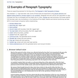
Only standard <p> tags have been used. Some of these styles are experiments using pseudo elements and adjacent sibling selectors; browser support is not consistent. Paragraph font size is set at 1em (equivalent to 16px if browser font size is unchanged) and line height set at 1.25em. Georgia was used exclusively. No browser specific CSS has been used—any inconsistency in the rendering of line-height, baseline and element positioning has been left for cross browser comparison before implementing. 1.
Much of the material for this volume was collected during the time that I was preparing for the press the Evolution of Woman, or while searching for data bearing on the subject of sex-specialization. The Elements of Typographic Style Applied to the Web – a practical guide to web typography. Hyphenator - Javascript that implements client-side hyphenation of HTML-Documents.
Create a Letterpress Effect with CSS Text-Shadow. The letterpress effect is becoming hugely popular in web design, and with a couple of modern browsers now showing support for the text-shadow CSS3 property it’s now simple and easy to create the effect with pure CSS.
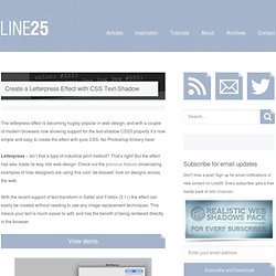
No Photoshop trickery here! Letterpress – Isn’t that a type of industrial print method? That’s right! But the effect has also made its way into web design. Check out the previous feature showcasing examples of how designers are using this cool ‘de-bossed’ look on designs across the web. With the recent support of text-transform in Safari and Firefox (3.1+) the effect can easily be created without needing to use any image replacement techniques. View demo Start out by creating a simple background. <! <h1>Line25</h1> <h2>Pure CSS Letterpress Effect</h2> Set up a plain HTML document, then add a few lines of text to test the effect on. Style up the text using the usual CSS properties to edit the size and basic appearance. Now we’re ready to apply the text-shadow property. 30 Useful and Cutting Edge CSS3 Text Effect and Web Typography Tutorials. CSS Gradient Text Effect.
Do you want to create fancy headings without rendering each heading with Photoshop?
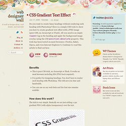
Here is a simple CSS trick to show you how to create gradient text effect with a PNG image (pure CSS, no Javascript or Flash). All you need is an empty <span> tag in the heading and apply the background image overlay using the CSS position:absolute property. This trick has been tested on most browsers: Firefox, Safari, Opera, and even Internet Explorer 6. Continue to read this article to find out how. View Demos Download Demo ZIP Benefits This is pure CSS trick, no Javascript or Flash. How does this work? The trick is very simple. The HTML markups <h1><span></span>CSS Gradient Text</h1> The CSS That's it! Make it work on IE6 Since IE6 doesn't render PNG-24 properly, the following hack is required in order to display the transparent PNG (add anywhere in between the <head> tag): This is why we hate IE 6!