
Step-by-step logo. BY CHUCK GREEN I don't know about you but I love to see examples of how other designers work—they reveal better (or worse) ways of doing things and allow me to gauge whether my methods are mainstream or totally whacked-out.
“If anyone finds out how I obsess about this stuff,” I tell myself, “they'll stick me in a home.” The problem is that step-by-step examples are rare. Why? Mainly because unless you are interested in sharing such information, there isn't much reason for recording it. And even if you are, detailing the steps can get in the way of the process. The good news is I rarely let normal get in my way. I don't know about you, but I start out on paper. I'm most concerned with concepts at this stage—not designs.
I often show my clients those rough ideas. What may appear to me to be a great solution to the problem sometimes just doesn't work for reasons I could not be expected to know. The logo I'll discuss here was designed for a helicopter transport company—Metro Aviation. Wow. Create a Rationalized, Geometric Wordmark and Ambigram – Vector Premium Tutorial. Creating your own graphic identity is never an easy feat.
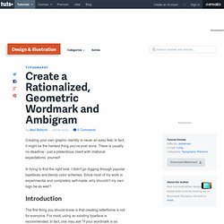
In fact, it might be the hardest thing you've ever done. There is usually no deadline - just a pretentious client with irrational expectations: yourself. In trying to find the right look, I didn't go digging through popular typefaces and trendy color schemes. Since most of my work is experimental and completely self-made, why shouldn't my own logo be as well? Introduction The first thing you should know is that creating letterforms is not for everyone. In this tutorial, I'll teach you how to make a logo that fulfills the following needs. Secondly, my work needs a signature, a symbol, something that identifies a particular piece of work as my own. Good, so I want a simple sans-serif wordmark and related ambigram.
Step 1 Before we get into it, I thought I'd show one of my letters in comparison with Futura Std, that way you get a sense of proportion on how large to create your circles. Step 2 To begin, create your first circle. 35 Must See Logo Design Process. Dache: Logo Design Process. Previously, I have featured David Pache of Dache on WDW, an amazing logo designer from Switzerland.
He is known for designing unique and colorful logos. I'm very glad to have David to share his design process of the WebMYnd's logo. This case study (written by David himself) provides full creative brief and progress images from start to final. Read on to find out how David got inspired by Wassily Kandinsky's art (one of the most famous 20th-century abstract artists) to create this fantastic logo.
Introduction Last year, I was approached by a startup who required a logo in order to launch a business in the US. The creative brief The main aspect of their brief was to create an identity which would communicate the idea of collecting everything you look at on the web in one place and to inspire the idea of extending your memory. Getting started Initially, I took the brief at face value and brainstormed some ideas. Drafting and development Colours Final colour placement and concept presentation. How a logo is born >> Hello Digital brand identity.
Hello Digital is Birmingham’s first digital festival.
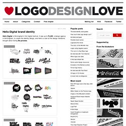
It was up to FLUID, a design agency in Birmingham, to create the identity design, and here’s a look at the design variations brought about during the process. From FLUID’s portfolio feature: “Using a bold typeface and speech bubble-esque visual moniker we created a logo that would appeal across all audiences; conveying the interactive nature of the festival, where people could ask / be asked questions to find out and develop their knowledge of digital media. “The logo’s composition allowed it to be used in a multitude of 2D and 3D form (stickers, 6 foot tall styrofoam letters and an inflatable sphere to name a few) as the centrepiece of the event’s wider visual branding, all of which received great feedback from the press and public, fulfilling the objective to create an impact at local and national levels.”
Image copyright: New Folder Image copyright: New Folder Thanks to Blair Thomson for the tip.