
Untitled. Description Logos are a critical part of the modern visual landscape.
To learn how to create your own, it's important to be able to identify the components and design techniques behind the most successful Logos. In this course, we will be deconstructing Challenging logos in order to explain why and how they work, and offers a methodical approach to creating a logo in Illustrator. These tutorials combine theory with nuts-and-bolts techniques that emphasize simplicity and readability: the principles that ground the best logo designs.
Topics include: Choosing the right typefaceDesigning with simple shapesAdding shine, texture, beveled edges, and transparencyDesigning with negative spaceChoosing logo colorsPreparing final files * Note: I have use used Adobe Illustrator cc version for this course. Grafica web: dalla carta al web, i diversi modi di concepire la grafica. Editoria Elettronica '10/'11. Appello di Settembre 2011 (quarto) Sono stati pubblicati i testi per l'appello di Settembre; la scadenza per la consegna è il 16 Settembre 2011, con le modalità specificate nei testi stessi.
Risultati dell'esame I risultati dell'appello di Settembre (quarto) sono accessibili a questa pagina. Visto l'esiguo numero di studenti partecipanti, gli orali verranno svolti su appuntamento; gli studenti interessati sono quindi pregati di contattare il docente via email. Inter-Ware - Outstanding Tech.
EPS: se lo conosci lo eviti. Questo è un articolo che ho scritto nel 2007 per la rivista Print Buyer in cui sconsiglio l’uso del formato EPS.
Oggi il formato preferito per i contenitori grafici è il PDF. EPS è un formato vettoriale (per gli schemi, i diagrammi e i disegni) che molti grafici usano anche per le immagini raster (le fotografie), specialmente se devono essere scontornate. EPS è nato con il PostScript (la parte PS di EPS) negli anni Ottanta (vent’anni fa). Ormai siamo nel 2007 ed il formato EPS ha fatto il suo tempo. È urgente informare i grafici che ancora lo usano che i tempi sono cambiati e l’EPS, per molti buoni motivi, è meglio evitare di usarlo.Un file EPS è composto da due parti: una parte PostScript (che è quella che verrà stampata) e una parte di anteprima (che si vede a schermo). Secondo problema. Fino a qualche tempo fa (anni fa) era necessario usare EPS anche per le immagini raster quando si voleva “scontornare” l’immagine. Terzo problema, la questione dei profili colore. How to draw - 95 drawing tutorials and pro tips. Every month, ImagineFX magazine is inundated with queries from digital artists looking for advice on a specific problem they are having with their drawing and painting projects – as well as their usual hit of hints, tips and inspiration.
Teoria Satanica Del Cono Di Pixel ^^ - Articoli. 8 Consigli Per Progettare La Copertina Di Un Libro. Come scegliere una palette di colori. Scegliere un colore è un processo complicato che richiede un’attenta analisi progettuale, ma scegliere un’intera palette di colori può essere ancora più complicato.
Quante volte ti è capitato di dover scegliere una palette di colori? A me moltissime! E selezionare i colori più giusti per ogni progetto, che sia un logo, una pagina web, un’applicazione o un volantino, è tutte le volte una parte di progetto estremamente importante, anche se, tutto sommato, divertente. Ma come fare a scegliere i colori per un progetto senza perderci delle ore o addirittura dei giorni? Il “trucco”, come sempre, è l’esperienza e cioè il sapere come fare. In questo articolo ho inserito quindi una serie di consigli testati personalmente per far si che la scelta dei colori per un progetto sia più veloce e più efficace.
Prima di cominciare però ricorda: ogni tipo di progetto ha diverse necessità tecniche e le tue scelte progettuali dovranno essere conseguenti. 5 Consigli BASE per scegliere una palette di colori 1. 5 suggerimenti per creare locandine efficaci ed accattivanti. I cookie ci aiutano a fornire i nostri servizi.
Utilizzando tali servizi, accetti l'utilizzo dei cookie da parte nostra.Accetto Note legali Privacy & Cookies Policy. Effetto 3D con lo strumento trama di IllustratorTotal Photoshop - Il primo sito di Video tutorial in Italiano su Photoshop, Fotografia, Illustrator, Premiere, After Effects, Dreamweaver e WordPress - Total Photoshop - Il primo sito di Video tutorial in It. Effetto 3D con lo strumento trama di Illustrator Creare effetti 3D per le nostre grafiche vettoriali è un gioco da ragazzi grazie allo strumento trama di Illustrator.
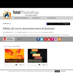
Una serie di righe e colonne e dei rispettivi punti di incrocio ci aiutano a posizionare zone di luce e di ombra ed ecco comparire la terza dimensione che regala un nuovo aspetto alle forme piatte che abbiamo disegnato. How to create an intricate pop-up menu. Illustrator Joe Wilson was approached by The Savoy's head barman Chris Moore to illustrate a luxurious pop-up menu.
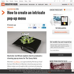
Fifteen recipes were brought to life in intricate 3D, featuring their ingredients and inspirations. Creating An Illustration With Stencil Techniques. 6 tips for using grids in logo design. Logo grid systems, construction guides and circles can be very powerful techniques for creating of a logo design in 2015.

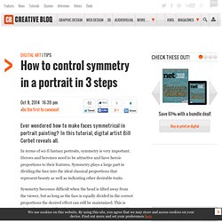
A logo grid is a geometric design technique that isn't necessary for every design project – but when executed correctly in your logo design, it can transform company's visual identity from branding zero to branding hero. Here, Niall O'Loughlin from 99designs shares his biggest do's and don'ts of using logo grids in the year ahead... Subscription offer 01. Tutorials - Corel Painter. How to control symmetry in a portrait in 3 steps.
In terms of sci-fi fantasy portraits, symmetry is very important.
Photoshop To Illustrator: A Workflow For Textile Artwork. Animagraffs: Education Animated by Jacob O’Neal « Adobe Creative Cloud. Part tutorial. Part infographic. And part animated GIF. Animagraffs. Tutorial: Make a 3D mockup of a box in photoshop. Making a 3D mockup to display a packaging design is a great technique that can give any designer an extra edge on their competition. Create Beautiful Page Layouts and a Striking Cover for a Children's Fiction Book. In this tutorial I’ll show you how to create a striking cover as well as creative page layouts for a children's book (in this case a modernized version of 'Alice in Wonderland'!).
Using Adobe InDesign, we’ll explore how thinking outside of the box with typography and images can make classically typeset pages more exciting. This tutorial looks at techniques you can use for layout and design; lessons you can apply when putting together your own print book or eBook. Many thanks to Mary Winkler for contributing her fantastic illustrations for the layouts. You can learn how to create your own Alice in Wonderland illustrations from her tutorial posted earlier today.
Open InDesign and select File > New Document. This allows for an interior page size of 135 mm by 216 mm which is an industry standard for paperback books. 10 best graphic design tutorials & tips - Features. Leading graphic designers share their expert design tips and tutorials to help you master patterns, textures, typography, vectors and more. As a graphic designer, there are many tools and techniques you'll want to master.
Whether you use Illustrator, InDesign, Photoshop, other software or even the traditional pen and paper, we've got tips and tutorials that'll help you develop your style, increase your skill set and inspire you to try something new. If you're interested in mastering the art of pattern design, learning how to use geometric shapes and textures in your designs, finding out how to create urban type or working with a retro style on a new project, you've come to the right place. We've got all that and more from experts including Rachel Cave, Loulou & Tummie, Gordon Reid and Ciara Phelan. 7 best Cinema 4D tutorials - Features. Amazing tutorials to help you learn to create 3D animations, videos, artwork and illustrations using Maxon Cinema 4D.
Maxon's Cinema 4D is the most popular 3D suite with creative professionals. It might not have the Hollywood movie cred of the likes of Autodesk's Maya, but it's a lot less expensive – and is therefore accessible to a much wider group of users from artists and illustrators to motion graphics artists. Cinema 4D is also easier to learn than other 3D tools if you're used to other creative applications from Photoshop to After Effects – and in After Effects CC, Adobe has even built-in a pipeline between AE and C4D that makes it easy to create 3D elements in Cinema 4D as part of a motion graphics or VFX project.
So whether you're new to Cinema 4D or an old hand, looking to produce static artworks, highly-crafted 3D type or dynamic animations, check out these seven brilliant tutorials from leading CG artists and animators. Daolian. Adobe Illustrator & Photoshop tutorial: Blend different illustration styles. Come creare un logo perfetto in 11 step.