

Designing for Context: The Multiscreen Ecosystem. To create applications and systems that are easy to use, it is crucial to understand the user and the context in which the app will be used. Understanding the context helps design systems that anticipate use cases at a relevant time of use. The more unobtrusive and transparent the experience is at the time of use, the better the design. This means the user does not have to think about the device he is using, changes in the environment, or changes in context, and can rely on great functionality and ease of use independent of his situation. In traditional systems, the context of use did not change much. Whether the use was in the office or at a personal computer at home, the surroundings were similar and there was no need to adapt to different environments. The Multiscreen App Ecosystem Designing for context is especially important when designing for a multiscreen ecosystem, where multiple devices are all a part of one product. The Do's And Don'ts Of Infographic Design.
Advertisement Editor’s Note: You might want to read Nathan Yau’s article The Do’s And Don’ts Of Infographic Design: Revisited1 here on Smashing Magazine which is a response to this article.
Since the dawn of the Internet, the demand for good design has continued to skyrocket. From Web 1.0 to Web 2.0 and beyond, designers have remained on their toes as they define the trends and expectations of our online universe. The Internet is a great designer’s playground, and online businesses are growing more and more appreciative of what can be gained from a bit of well-executed eye candy. Over the past two years, this fact has become the backbone of a growing trend in online marketing: the infographic. Infographics are visual representations of information, or “data viz” as the cool kids call it these days.
Of course, just as Web 2.0 changed 1.0, today’s infographics are far more eye-catching than simple pie charts and bar graphs. Wrapping Your Mind Around Data Viz Show, Don’t Tell. 12 Website Usability Testing Myths. The internet is a wonderful, magical place that is filled with more amazing content than you could shake a stick at; it has an almost unimaginable wealth of resources on a huge array of different topics, and more or less anything you can think of exists on the internet. The problem though, is not that there is too much content, nor that there are too many sites, it’s just that the vast majority of sites and services suffer from a number of different usability issues that make using them anything from difficult and frustrating to downright unpleasant to use . I’m sure you can think of a number of sites off the top of your head that fit into these categories.
Unfortunately there are a number of different myths floating about saying that improving usability takes too long, costs too much or doesn’t really do anything useful to these sites and services. As someone who works on a website usability testing tool I hear these myths far too often, and I’d like to dispell them permanently. Experience Design. Visualizing the customer experience using customer experience journey maps. Too often when we think of a customer, our view is filtered through the lens of our job, profession, department, or specialty.
Think of how patients are treated in most hospitals. They are viewed as a disease, an illness, a collection of parts – each with its own specialist. Deep Fried Bytes Technology Podcast. Why “everybody is a designer”: The UX Design Skills Ladder « User Experience Design Training & Consulting–UX Design Edge. Artistic Distance. As web designers, we are often confronted with the argument that the work we do isn’t “really art” because the constraints within which we most frequently work are labeled “commercial.”
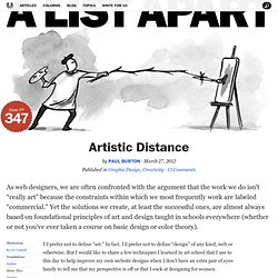
Yet the solutions we create, at least the successful ones, are almost always based on foundational principles of art and design taught in schools everywhere (whether or not you’ve ever taken a course on basic design or color theory). I’d prefer not to define “art.” In fact, I’d prefer not to define “design” of any kind, web or otherwise. Helping Your Clients Build an Effective Mobile Strategy. It can be a challenge convincing clients to add new strategies to their existing Web presence.
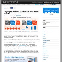
In a perfect world, a client would simply say, "You’re the expert. You know what’s best. Do whatever needs to be done to make it happen! " But, unfortunately, it just doesn’t work like that. Granted, we shouldn’t expect smart business managers to implement every new thing just because we tell them it’s a good idea. With Google executives saying things like "I believe that in 3 years desktop computers will be irrelevant…" and studies by Gartner stating that "Websites not formatted for the smaller screen will become a market barrier…" the Mobile Web is one of your gut instincts you want your clients to follow.
In a state of desperate urgency, you may be tempted to place all diplomacy aside, and just tell it to them straight, perhaps even reminding them of those other times they put off your advice. A List Apart. Improving the human experience one day at a time. How To Prototype And Influence People. Better Use of Paper in UX Design. People often ask me what the place of paper is in modern design, especially considering the arrival of tablets.
I always say that paper has unique traits that currently are unmatched by any advanced technology. The advantages of paper include: No limits, because paper has an extremely simple user interface with no predefined style, rules, or guidelines. Inherent collaborative qualities; it’s easy to share and easy to pin on the wall. It’s easier to throw away what you only spent five minutes designing. This is generally understood in the UX community. So paper is important for UX designers—no doubt about it. Observing UX design processes through the years, I’ve noticed that there’s hidden waste in sketching UIs. I’ll try to provide some guidance and solutions for your design work done with paper. Don’t Sketch Around the Project Poor paper sketching techniques can harm the design process. To be effective in designing with paper, designers should be: Quick Focused on structure, not details.