
Create and share your maps. Read Alice's Adventures in Wonderland. Note that this program is new research, and will not work on all machines.
It has been tested to run on a machine of the following description: 600 Mhz Pentium III or faster, or a recent Mac 1024 x 768 pixel screen or higher resolution, 16 bit color Windows NT, Windows 2000, Windows XP operating systems, or Mac OS X 256 Mb of RAM A fast internet connection No other memory-intensive programs running Microsoft Internet Explorer (5 or later) Netscape (6.2 or later) TextArc will often stop working the second time it is run in the same browser session. This is caused by the browser remembering parts of the program after it should have exited. The simplest way to run it multiple times is to STOP all browser windows, then come back and run it again. Note: TextArc will open a window that covers your primary monitor's desktop. Enjoy! Click this link to start TextArc Click this link to start TextArc in a window, or just look at the still screen shots. Data Visualization Demo.
Quadrigram.
Brainstorm and mind map online. Data Wrangler. UPDATE: The Stanford/Berkeley Wrangler research project is complete, and the software is no longer actively supported.
Instead, we have started a commercial venture, Trifacta. For the most recent version of the tool, see the free Trifacta Wrangler. Why wrangle? Too much time is spent manipulating data just to get analysis and visualization tools to read it. Wrangler is designed to accelerate this process: spend less time fighting with your data and more time learning from it. 51 Tools. Chart selection 1.
ChartChooser from Juice Analytics2. Charts suggestions from Andrew Abela3. Graph Selection Matrix from Perceptual Edge4. Periodic table of visualization from Visual Literacy.
Data vis. Infographiks. Diagrams. Maps. Tableau. Google Fusion Tables Demo. Introduction to open-source GIS tools for journalists. Originally published by Matt Wynn on poynter.org on 19 September 2011.

This excerpt is republished with permission. For years, it’s been only the most committed of journo-nerds who could invest both the time and money to put geography to use. To say that’s changing is an understatement. GIS (Geography and Geographic Information Systems) is quickly becoming an integral part of how journalism is created and delivered. Location is one of the key components of mobile, allowing information to be filtered based on location. Luckily, as the need for geographic literacy has increased, digital cartography has exploded. There are a bevy of tools available, but here’s an introduction to those that make up my open-source GIS suite. Getting your feet wet: QGIS Journalists mostly use GIS systems to map and layer different data sets. Even non-native GIS databases can be mapped through geocoding, whereby addresses are plotted on a map.
Piktochart. Declarative Graphics Framework.
Graphical visualization of text similarities in essays in a book. Implementation criteria The graphics generated were intended for high-quality reproduction in the book.
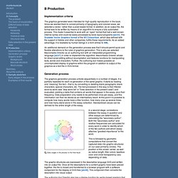
Since we wanted them to consist primarily of typography and colored areas, we selected a vector- rather than a pixel-based format. In addition, as an output file, the format was to be written by means of an algorithm to ensure a fully automated process. This made it essential to work with an ”open” format that had a well-known internal syntax and could be easily processed by book layout programs [ad.03]. We used Adobe Illustrator for graphics and Adobe InDesign for book layout. An additional demand on the generation process was that it should permit quick and flexible alterations to the rules of graphics generation. Generation process The graphics generation process unfolds sequentially in a number of stages. Early stages in the process to the final result This is followed by geometric computations that convert the captured data into graphic structures (in our case primarily circles).
Free Development software downloads. Dataesthetics: The Power and Beauty of Data Visualization. One of my areas of interest that has grown over the last couple years has been data visualization.
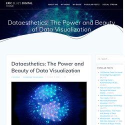
I’m a visually-oriented learner, and I look forward to seeing any techniques, illustrations, or technologies that: 1) Allow people to assimilate information as fast as possible. 2) Deepen understanding of knowledge by visually illustrating data in new and interesting ways. There is nothing like having an intellectual epiphony after looking at a picture for a few seconds (pictures can definitely be worth a thousand words). 3) Present information in an aesthetically pleasing way. Or, in extreme examples, inspire a sense of awe! Thanks in large part to del.icio.us, I’ve come across a wide assortment of sites and blogs that really illustrate some amazing work in this area.
While cleaning up my knowledge management related bookmarks, I started to revisit many of the sites I’ve tagged in recent months.