
How Kickstarter Makes Me Pull Out My Wallet) Kickstarter’s Million Dollar UX | How Kickstarter Makes Me Pull Out My Wallet Kickstarter is another hot application that is on my radar (aside from Airbnb, which caused a firestorm of reaction in my last post).
The Kickstarter team built a platform for individuals to raise funding for creative projects from anyone in the world. I love that the mission is inherently beneficial to the world. We live in an increasingly commercial and uncreative world (IMHO). A platform that lets anyone with a good idea (and the technology and wit to be successful on Kickstarter) build their dream is powerfully important and democratizing. This post is incredibly long. 3 UX Ideas to Learn from Square) 3 UX Ideas to Learn from Square Square has taken off like nothing else in the past 12 - 18 months.

Getting people to sign up for a credit card processing system over the Internet with no hand holding is not an easy tasks. So what are some things they do right that we can learn from? 1. Tell the visitor what your site will LET them do (not what them signing up will do for you or the network!) A lot of sites get distracted with telling you what is possible with the technology, what them joining will do for the network, etc. Square’s language is to the point and mindful of the target (businesses who previously could not accept payments for either logistical, financial, or technological reasons, but always aspired to do so). 2.
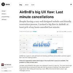
Dan McGrady - dMix - Toronto Startups, Ruby Developer and Designer. 1,634 views Posted almost 2 years ago in design AirBnB has a great UI, well optimized room booking workflows and excellent customer support.
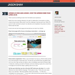
But it has one crippling problem: Hosts are supposed to select which days of the month their rooms are available. The problem is, many of them don't. I've been using AirBnB for two years now, whenever I travel to a new city. Unfortunately this Room is only available for Feb 11-16. Sorry, the place is no longer available Sorry Dan, we have a friend crashing the couch tonight. Hello dan, sorry but i don't have space during that window. thanks and please try again. Sorry the apartment is not available for those dates, I was out of town and without internet so I couldnt answer sooner. These replies usually take 6-12hrs to arrive after making the reservation (they have a max 24hrs window). Not only that but I put a lot of effort in finding a room in the right neighbourhood, with good reviews and for the right price.
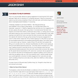
How The Airbnb Home Page Lures Us In) Airbnb UX Wins and Losses | How The Airbnb Home Page Lures Us In There must be something to learn from the Airbnb user experience.
Airbnb, like many startups following in its path of collaborative consumption or others simply trying to power offline action, have the challenge of earning user trust. While PR, word of mouth, and direct outreach can alleviate some trepidation, the product is where Airbnb seals the deal. 3 UX Ideas to Help CarWoo!) 3 UX Ideas to Help CarWoo!
This is my second public attempt at making suggestions for improving the UX for others’ web apps. Right now I’m sticking to YC companies because 1) they’re on everyone’s radars as up and coming companies 2) they’re still small, early, and humble enough to be able to meaningfully absorb feedback, I’m assuming. (Yesterday I tweeted my post about HelloFax - - to co-founder Neal O’Mara. He responded - awesome! +1 HelloFax. I’ve seen a bunch of HN posts about CarWoo! 1. The dropdowns, where the 2nd (the Model) is conditional on the 1st (the Make) is elegant. 2. Increase the width so that the right side is aligned with the right side of the downward facing arrow. 3. High Level - Redesign the home page, use geolocation to pinpoint where someone is, and show them awesome cars on a Google Maps API sort of how Lovely has done ( I would start clicking and voyeuring around pretty quickly, and would be hooked.
Low Hanging Fruit - Love the CarWoo! Posting a Task on Zaarly: Painful but Educational UX Lessons) Posting a Task on Zaarly: Painful but Educational UX Lessons [TLDR; Zaarly’s process for posting is painful.

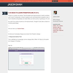
By suggesting task names and prices, better utilizing geolocation, and making login an integrated process of posting rather than a giant wall between you and your task, they can probably boost conversions.] Zaarly is a task marketplace, where people can buy and sell items, errands, etc. It competes with TaskRabbit, Coffee and Power, and others. 3 UX Ideas to Learn from Picplum (YC S11)) 3 UX Ideas to Learn from Picplum (YC S11) Picplum is a pretty cool startup.
They let people send special photos to family members each month. So basically no need to organize, print, and ship photos to people to stay in touch. Grandma and grandpa can easily follow your kids’ journey in growing up. It’s cool. 10 UI Ideas to Learn from Gumroad) 10 UI Ideas to Learn from Gumroad Gumroad is an exciting new startup that lets anyone sell digital content with just a link.

It was founded by the prolific Sahil Lavingia. Sahil has designed a number of useful apps, ranging from Pinterest in the early days, to Turntable, to Crate, to Caltrainer, etc.