
Device-Agnostic Approach To Responsive Web Design. Advertisement This is a different take on Responsive Web design.

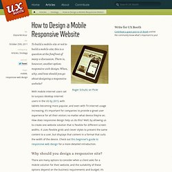
This article discusses how we can better embrace what the Web is about by ignoring the big elephant in the room; that is, how we can rely on media queries and breakpoints without any concern for devices. The Challenge Let’s start our journey by looking at these online tools: Reverie: Versatile HTML5 WordPress Framework. How to Design a Mobile Responsive Website. To build a mobile site or not to build a mobile site; this is a question at the forefront of many a discussion.

There is, however, another option: responsive web design. When, why, and how should you go about designing a responsive website? With mobile internet users set to surpass desktop internet users in the US by 2015, with tablets becoming more popular, and even with TV internet usage increasing, it’s important for companies to provide a great user experience for all their visitors no matter what device they’re on.