Zoom
Trash

Matthewhudson/device.js. Some Media Queries for Responsive Design. Support Us Recent Posts Upcoming Articles Home » Web Development » Some Media Queries for Responsive Design Now a days web is moving towards the responsive design.

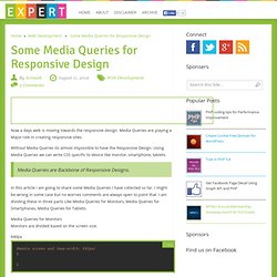
Media Queries are playing a Major role in creating responsive sites. Without Media Queries its almost impossible to have the Responsive Design. Using Media Queries we can write CSS specific to device like monitor, smartphone, tablets. Media Queries are Backbone of Responsive Designs. In this article I am going to share some Media Queries I have collected so far. Media Queries for Monitors Monitors are divided based on the screen size. 640px @media screen and (max-width: 640px) { } Copy @media screen and (max-width: 640px) { } 800px @media screen and (max-width: 800px) { } @media screen and (max-width: 800px) { } 1024px @media screen and (max-width: 1024px) { } @media screen and (max-width: 1024px) { } Media Queries for Smartphones Getting the most popular Smartphones. iPhone iPhone 4 HTC Evo. CSS3 Media Queries. CSS2 allows you to specify stylesheet for specific media type such as screen or print.

Now CSS3 makes it even more efficient by adding media queries. You can add expressions to media type to check for certain conditions and apply different stylesheets. For example, you can have one stylesheet for large displays and a different stylesheet specifically for mobile devices. It is quite powerful because it allows you to tailor to different resolutions and devices without changing the content.
Continue on this post to read the tutorial and see some websites that make good use of media queries. CSS3 Media Queries (demo) Check my demo and resize your browser window to see it in action. Max Width The following CSS will apply if the viewing area is smaller than 600px. If you want to link to a separate stylesheet, put the following line of code in between the <head> tag. Min Width The following CSS will apply if the viewing area is greater than 900px.
Media Queries for Standard Devices. If you think responsive's simple, I feel bad for you son.

We got 99 viewports, but the iPhone's just one. —Josh Brewer, March 10, 2010 A major component of responsive design is creating the right experience for the right device. With a gazillion different devices on the market, this can be a tall task.