
Visualization Tools. Big Data Visualization: Review of the 20 Best Tools. Big Data is amazing.
It describes our everyday behavior, keeps track of the places we go, stores what we like to do and how much time we spend doing our favorite activities. Big Data is made of numbers, and I think we all agree when we say: Numbers are difficult to look at. Enter Big Data visualization. Google, Facebook, Amazon, Apple, Twitter and Netflix all ask better questions of their data – and make better business decisions – by using data visualization. It gets better: Data visualization lets you interact with data. You might be wondering: How do I get a clean and engaging visualization for all my data? Here’s the deal: There are tools that help you visualize all your data in minutes.
Whether you’re looking to wow your audience at your next presentation or you are a developer looking for a practical way to visualize large sets of data, there are amazing tools out there for both parties. Want to know the best part? How The Wall Street Journal creates mobile-friendly interactives. Credit: By notbrucelee on Flickr.
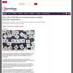
Some rights reserved. Journalists and newsroom developers can still find working together to build tools and meaningful data visualisations a challenging process. But now there's another element to consider: how will the interactive look on a smartphone? At The Wall Street Journal, the mobile aspect is at the forefront of developing graphics and interactive elements to accompany or enhance the reporting, particularly when working with large data sets. The outlet's most recent example, published yesterday, is an interactive map that shows the different levels of nitrogen dioxide across Europe and how polluted the air is in specific countries or cities due to emissions produced by diesel cars.
The interactive was built explicitly for this piece and Bentley spent roughly four and a half days developing it, using different technologies that he was already familiar with. Screenshot of The Wall Street Journal's pollution map on mobile. Resources. 14 best data visualization tools for better storytelling. Posted on November 30, 2014 by Rob Petersen inShare95 If you can’t measure it, you can’t manage it. – Peter Drucker This succinct truth says you can’t know whether you are reaching your goal unless success is defined and tracked.
Data visualization is technology that lets corporate executives and other end users see data to better understand information in context. Hundreds of tools are now available to chart, create dashboards and better measure and mange data. The growth of data visualization says a mix of data and narrative is now a better way for businesses to tell their story.
Which tools are best to tell your story? How you define success? Once you’ve answered these questions, here are 14 of the best data visualization tools. DYGRAPHS: is a fast, flexible open source JavaScript charting library. COLOR BREWER: Originally designed with federal funding and developed at Penn State — is really for choosing map colors, and is worth spending some time with if plan to make many more. Resources. Les 20 meilleurs outils de datavisualisation au banc d’essai. Que vous soyez absolument novice ou codeur amateur, il existe aujourd’hui sur le web une impressionnante palette d’outils (presque) gratuits pour réaliser des datavisualisations.
Banc d’essai. Note : j’ai volontairement éliminé les outils (a) entièrement payants (b) trop moches pour être utilisés dans des rédactions (c) en Flash. Ce billet n’est consacré qu’aux outils de “visualisation”, et non de scraping ou de traitement des données (un autre billet suivra bientôt). ↑1 » Pour les novices/pressés : le clé-en-mains Ces outils gratuits ou freemium permettent de générer des graphiques ultra-rapidement en copiant-collant des données d’un tableur. Le meilleur – Datawrapper : Simple d’utilisation, sobre, rapide, Datawrapper est tout à fait satisfaisant pour la plupart des visualisations courantes. Les + : la possibilité de personnaliser les couleurs, de mettre en évidence une série, la navigation par onglets entre les différentes séries.
La boite à outils. Les outils de dataviz prennent le métro ! Tableau-dataviz. The top 20 data visualisation tools. 30 outils gratuits pour visualiser et analyser les données.
Outils extraction, transformation, nettoyage...