

iPhone Safari Viewport Scaling Bug. Those who create responsive design for iPhone may be aware of the viewport scaling bug in iPhone Safari.
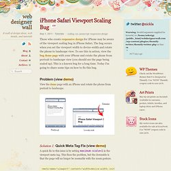
The bug occurs when you set the viewport width to device-width and rotate the phone to landscape view. To see this in action, view the bug demo page with your iPhone and rotate the phone from portrait to landscape view (you should see the page being scaled up). This is a known bug for a long time. Today I'm going to share some tips on how to fix this bug. Glyphish – Great icons for great iPhone & iPad applications. A tale of two viewports — part two. Page last changed today Related files: Part one of this article, about desktop browsers.
Compatibility tables. The full list of browsers can also be found here. Test page. Many thanks to Grace Kloba (Google), David Storey and Anne van Kesteren (Opera), Mike O'Malley (Microsoft), Kartikaya Gupta and George Staikos (RIM), and Mark Finkle (Mozilla) for reviewing earlier versions of this piece and providing me with valuable feedback. This article has been translated into Russian, Chinese, and Korean. In this mini-series I will explain how viewports and the widths of various important elements work, such as the <html> element, as well as the window and the screen.
On this page we’re going to talk about the mobile browsers. When we compare the mobile browsers to the desktop ones, the most obvious difference is screen size. A mobile screen is far smaller than a desktop screen; think about 400px wide at maximum, and sometimes a lot less.
ORIENTATION. CSS, JavaScript and XHTML Explained. Media Queries. Abstract HTML4 and CSS2 currently support media-dependent style sheets tailored for different media types.
For example, a document may use sans-serif fonts when displayed on a screen and serif fonts when printed. ‘screen’ and ‘print’ are two media types that have been defined. Media queries extend the functionality of media types by allowing more precise labeling of style sheets. A media query consists of a media type and zero or more expressions that check for the conditions of particular media features. Targeting the iPhone 4 Retina Display with CSS3 Media Queries - WaltPad. Four years ago, (eight months before the original iPhone was announced) Dave Hyatt wrote about high DPI web sites on the Surfin’ Safari blog: One area of Web design that is going to become more important in the coming years is high DPI.
Designing for iPhone 4's Retina Display. So, um, maybe you heard: there’s a new iPhone out.
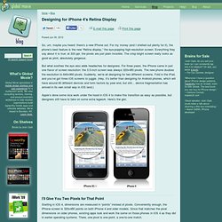
For my money (and I shelled out plenty for it), the phone’s best feature is the new “Retina display,” the eye-popping high-resolution screen. Everything they say about it is true: at 320 ppi, the pixels are just plain invisible. The crisp bright screen really looks as good as print, absolutely gorgeous. But what soothes the eye also adds headaches for designers. For three years, the iPhone came in just one flavor of screen resolution: the 3.5-inch screen was always 320x480 pixels. Apple’s done some nice work under the hood in iOS 4 to make this transition as easy as possible, but designers still have to take on some extra legwork. I’ll Give You Two Pixels for That Point Starting in iOS 4, dimensions are measured in “points” instead of pixels.
In other words, dimensions for all the various elements of iOS 4 remain the same, but their units have changed: you just substitute points where you used to say pixels. Designing for the Retina Display (326ppi) For three generations of the iPhone, Apple kept the screen consistent (320x480 pixels and 3.5 inches diagonal).
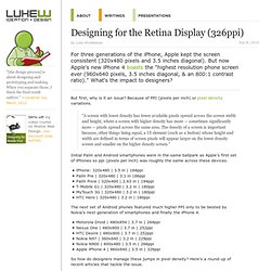
But now Apple's new iPhone 4 boasts the "highest resolution phone screen ever (960x640 pixels, 3.5 inches diagonal, & an 800:1 contrast ratio). " What's the impact to designers? But first, why is it an issue? Because of PPI (pixels per inch) or pixel density variations. "A screen with lower density has fewer available pixels spread across the screen width and height, where a screen with higher density has more — sometimes significantly more — pixels spread across the same area. Initial Palm and Android smartphones were in the same ballpark as Apple's first set of iPhones so ppi (pixels per inch) was roughly the same across these devices. The iOS Design Cheat Sheet / Ivo Mynttinen - (Navigazione anonima) Great tips to improve your iOS design workflow.

This article is outdated. The current version of this article includes data for newer iOS devices such as iPhone 5 and the new iPad. Check out the iOS Design Cheat Sheet Volume 2. When you are designing a lot of applications for Apple’s touch devices like the iPhone or iPad you often have to follow some conventions regarding sizes or radii of Icons, Buttons or Tables. iPhone - Safari Screen Dimensions & Layout. 10 Tips for New iPhone Developers. Making a webapp for the iPhone is a lot like making a normal web site, but with a few quirks to abide by.
In this article, I'll give you a wide variety of tips, covering things such as: "must-haves", usability guidelines, testing/debugging, pitfalls, and performance issues. I hope you enjoy it! WebApps vs. Native Apps Keep in mind that a web application runs in the browser, while a native application is installed on the iPhone. How to Hide the Address Bar in MobileSafari « Mobile. While the iPhone packs a lot of resolution into its relatively small screen, the address bar consumes about 60 pixels of real estate by default when a page is loaded in MobileSafari.
With either 320 or 480 pixels available to the viewport, 44 of which are reserved for the bottom toolbar, it’s necessary to maxamize every available pixel. Below, we will show you two examples you can use to hide the default address bar when the page loads, allowing you to reclaim this valuable space in your iPhone presentations. Hide the Address Bar within Mobile Safari. With both iOS and Android-driven devices using WebKit as their browser's rendering engine, web developers have many advantages: A rendering engine with capable of flawless CSS animationsA rendering engine that's fast...very fastA rendering engine that's modern and forward-thinking These advantages allow us to create web apps within that browser that look as good as native applications.
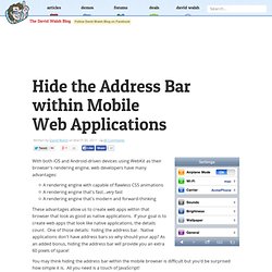
If your goal is to create web apps that look like native applications, the details count. One of those details: hiding the address bar. Native applications don't have address bars so why should your app? Gotcha: Hiding the Status Bar. Okay, so this is a well-worn topic. However, there are a few potential gotchas that are worth visiting. To begin, if you want to hide the status bar in a running application, it’s quite simple – this technique is handy for things that are best shown fullscreen, for example, I used this technique when previewing images for an iPhone wallpaper app so users could see the entire image with no scaling. Hiding the status bar is as easy as: Gotcha #1 If you want to set the status bar to hidden at application startup, if you attempt to use the above line inside the applicationDidFinishLaunching method, the status bar will be shown while your application is loading, then it will quickly disappear.
Not a good thing. Statusbar - IOS 4.3 hide status bar permanently. Recent. Lovely ui. About / badges / buttons / capture / coach mark / comments / circles / compose / count / detail / empty data sets / favorites / feed / home / icons / launch screen / list / navigation / notifications / player / profile / search / settings / stats / menu on Brewseful on the App Store on iTunes. Mobile UI Patterns › Activity Feeds.