LES IMAGES
Oliver-moran/jimp: An image processing library written entirely in JavaScript for Node, with zero external or native dependencies.
Native Responsive Images. How It All Began Our story starts in ancient times, when WURFLs roamed the wilderness, and mobile-only websites were a thing.

In these times, a developer that wanted to provide access to his website to mobile users created a simpler, dumbed down version of the “real” website, and served that based on UA detection. As you surely know, the proliferation of devices with numerous viewport dimensions and many different capabilities called out for a better way to target mobile (and not-so-mobile) users. Responsive Web Design combined new browser capabilities and CSS techniques to create websites that adapt to the device displaying them, and look ideal everywhere.
Image Resizing Services.
Responsive images are landing soon and many organizations are looking for ways to resize images.
Thankfully, there are a number of startups, established companies, and open source solutions for image resizing. I’ve pulled together a spreadsheet of the image resizing services to make it easy for people to explore their options. Figuring out what to include and what to ignore was difficult.
Image Resizing Services and Projects - Google Sheets. Kraken Image Optimizer · Kraken.io. Image and Video Upload, Storage, Optimization and CDN.
Responsive Images: Use Cases and Documented Code Snippets to Get You Started. Introduction Finally, true responsive images are becoming a reality on the web — in pure HTML, without convoluted hacks.
The <picture> element and a couple of new attributes for the <img> element are behind a flag in Chromium 37 and shipping in Chromium 38 (so coming soon in Opera), in Firefox Nightly and are being implemented in WebKit (although it remains to be seen if Apple will ship it in the next version of Safari).
The new <picture> element can be verbose and confusing, because it solves a range of use cases. To help you match your requirements to the responsive image syntax, we’ve prepared this article full of examples. Four questions. Picturefill. ResponsiveImages.org. Easy FPO and Dummy Images for Any Project. ReSmush.it > the 3 Billion (and still free) Image optimization API. Smush.it!
Responsive Images: If you're just changing resolutions, use srcset.
By Chris Coyier On September 30, 2014 responsive images If you're implementing responsive images (different images in HTML for different situations) and all you are doing is switching between different versions of the same image (the vast majority of usage), all you need is the srcset attribute on the <img>.
Gaze upon this easy syntax: It's not just the syntax that is easy, it does a better job than <picture> with <source>s with explicit media attributes (we'll cover why in a moment). Plus it has the opportunity to be much better in the future with browser settings and browser improvements.
Ajouter des images responsive à une page web - Apprendre le Web. Picturefill. Compressive Images Revisited - TimKadlec.com. 2012 was a dark time for responsive images.
Standards work had begun, but there was no consensus and many angry people (myself included). Some remained unconvinced that responsive images were even a problem that needed to be solved. But there was still a glimmer of hope in these dark days. In July of that year, Daan Jobsis discovered a technique that the Filament Group would later dub “compressive images”.
Fluid Images — Unstoppable Robot Ninja. (Hello!
If you think this article’s interesting, you might check out my ALA article on responsive web design.) I’ve always hated publishing. I don’t mean the industry, but the act.
Le schéma Data-URI. When to base64 encode images (and when not to)
Introduction Ever since Steve Souders started evangelizing web performance, it’s been pounded into our heads that extra HTTP requests add a lot of additional overhead, and that we should combine them if possible to dramatically decrease the load time of our web pages.
The practical implication of this has been to combine our JavaScript and CSS files, which is relatively easy and straightforward, but the harder question has been what to do with images. Sprites Image sprites are a concept taken from video games: the idea is to cram a ton of image assets into one file, and rearrange a “viewport” of sorts to view only specific pieces of that file at a time.
Data:urls – what are they and how to use them. If you follow this blog you already know the infamous website performance rule #1 - reduce the number of HTTP requests.
Actually, to celebrate Earth Day and to jump the "go-green" wagon/jargon, my favourite performance mantra as of late is "Reduce, Reuse, Recycle" (the Recycle part is a wee fuzzy but, oh well) So to reduce the number of requests for JavaScript files, you combine all .js into one monolithic file. Same for .css. Encoder ses images en base64. Base64 Image Encoder. Responsive Images in CSS. The term "responsive images" has come to mean "responsive images in HTML", in other words, the srcset and sizes attribute for <img> and the <picture> element.
But how do the capabilities that these things provide map to CSS? CSS generally wasn't really involved in the responsive images journey of the last few years. That's for good reason: CSS already has the tools. Responsive images was, in a sense, just catching up to what CSS could already do.
Responsive Images 101, Part 1: Definitions. Over the last few years, we’ve written a quite a few articles about responsive images.
Now that responsive images have landed in browsers, it seemed like a good time to step back and cover the basics for those who are just starting to tackle responsive images. Ergo, a new series of articles called Responsive Images 101 that will cover everything from why we need responsive images to how to pick the right responsive images solution. Let’s dig in! What are Responsive Images?
Picturefill. Des outils en ligne pour l'édition d'image. Responsive Images 101, Part 1: Definitions - Cloud Four. TinyPNG – Compress PNG images while preserving transparency.
Base64 Image Encoder. PngOptimizer.
Wikiwand. ReSmush.it > the 2 Billion (and still free) Image optimization API. Masonry. Responsive Images Done Right: A Guide To And srcset. Advertisement Many companies try to create a great experience for customers. But few are willing to make the changes required to deliver on that promise. In fact most don’t even realize just how bad their experience can be. This is why we made a new book called “User Experience Revolution,” a practical battle plan for placing the user at the heart of your company. Get the book now!
Picturefill. Responsive Image Breakpoints Generator by Cloudinary.
Responsive Images 101, Part 1: Definitions - Cloud Four. GIF Maker - Video to GIF Creator Tools. GIF MAKERCreate animated GIFs from video files and YouTube links. Have you ever watched a video online and thought, "Man, this cute cat video would be SO much better in GIFs!
" Well, GOOD NEWS! GIPHY just released a Creation Tool that will help you reach your GIF goals and dreams. It's called GIF MAKER and it's super easy to use.
CSS3 : dégradés sans image à l'aide de background et gradient.
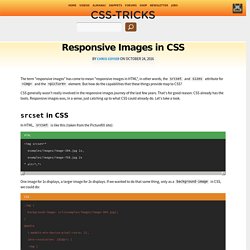
Responsive Images in CSS. Sandbox. 1. A very wide image contained in a paragraph with no styles applied Dunstan kindly lent me this charming image. Pellentesque in felis quis tortor consectetuer condimentum. Phasellus nibh nibh, interdum sit amet, sagittis nec, cursus sit amet, dolor.
Over 389,582 Free Photos and Images.
SCX – Free Stock Photos – SXC.hu - stock.xchng. Free Images & Stock Photos by StockFreeImages.com. Over 389,582 Free Photos and Images. Data URI.
LES SPRITES
