
12 Tools To Check Your Site's Accessibility. When you design any web site, one of your first goals is to make sure you get as many visitors as you can, but have you checked the true accessibility of your site?

Can a color blind person read it? Are all of your scripts cooperating? Your colors may look nice together, but is the contrast different enough that it is all legible? Well, those questions are exactly what these 12 tools are designed to help you answer, and it certainly may never be a bad idea to run more than one to make sure they are all telling you the same thing.
One caveat to this list, while these tools are helpful and will help you spot some problems, never trust them to be the ultimate authority, but more of a starting point on your road to the smoothest running site you can build. ACTF aDesigner: An extension for the open source Eclipse development platform, it is built specifically to test for the accessibility of the visually impaired. ColorADD. Can Color-Blind Users See Your Site? As of December 2011, this topic has been archived.
As a result, it is no longer actively maintained. For more information, see Archived Content. For information, recommendations, and guidance regarding the current version of Internet Explorer, see Internet Explorer Developer Center. Robert Hess Microsoft Corporation October 9, 2000 Contents My last few articles have discussed color-related issues, and a few people have asked me to provide some information on how to select colors for Web sites so that someone who is color-blind can properly view them. To begin, let's examine exactly what it means to be color-blind. Color My World It all starts with the eye, or more specifically with the "cones" in the eye. Figure 1. I'm going to dive into the nitty-gritty of rods and cones here for a few seconds; if you prefer to cut to the chase, feel free to skip down to the section on finding solutions. L-cones are sensitive primarily to the red portion of the visible spectrum. Figure 2. Finding Solutions. WAVE Web Accessibility Tool.
IDI Web Accessibility Checker : Web Accessibility Checker. Coblis — Color Blindness Simulator. If you are not suffering from a color vision deficiency it is very hard to imagine how it looks like to be colorblind.
The Color BLIndness Simulator can close this gap for you. Just play around with it and get a felling of how it is to have a color vision handicap. As all the calculations are made on your local machine, no images are uploaded to the server. Therefore you can use images as big as you like, there are no restrictions. Be aware, there are some issues for the “Lens feature” on Edge and Internet Explorer. So go ahead, choose an image through the upload functionality or just drag and drop your image in the center of our Color BLIndness Simulator.
Color Theory for the Color Blind. Color blindness is a mild disability through which the affected experience a decreased ability to distinguish colors from others.
This can be a real drawback for anyone in the design field since color theory is an integral feature in successful design, and a lot of decisions are based on the feeling and emotion derived from design decisions, rather than a generic set of guidelines and taxonomies. You've probably heard a lot about accessibility in web design already; it's important to cater for the widest audience, who could potentially have problems with your website if not designed in the right way. As a bonus, we'll touch on that a bit later, but the main focus of this article is actually looking at how a color-blind designer can still successfully tailor a website's design. Colorblind Web Page Filter. Color Blindness/Color Deficient Vision. The human eye contains rods which detects levels of light (dark versus bright) and three kinds of cones which distinguish among the different colors.
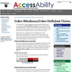
If none of the cones are functioning (very rare), then a person has grayscale vision. If the cones are semi-functional (also rare), then the person sees colors, but they are muted. More commonly, a person with color blindness (or "color deficiency") has a difference in only one of the cones, and it is usually either the red cone or the green cone. The result is that some colors appear to be more similar or are muted. The different type of deficiencies are simulated below. Why Red/Black Can Be Bad Some color blind users are lacking the capability to detect the lower color wave frequencies associated with red. Sample Warning Signs Note that the black text on red sign becomes black on black for some color blind users.
Why Red/Green Can be Bad. Colour Blindness Check - Etre. Approximately one in twenty people have some form of colour blindess that prevents them from seeing colour the same way that people without any colour vision deficiencies do. Many images and resources on the web are coloured in such a way that it's difficult for users with vision deficiencies to comprehend them. We've seen many examples in our time, including theatre seating plans where colour blind users couldn't differentiate one section of seating from another! There are a number of colour blindness conditions, including the three simulated by our tool.