
Mapping the Stories of U.S. Global Change: the 5 Key Problems. Use this tab to explore 800+ threats to biodiversity in the United States, and ways in which communities are addressing them.
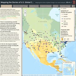
Click on a point to reveal a news story, featured against the backdrop of forest loss (where pink reveals tree cover loss across 2000-2013). When we think of our “environment”, we typically think of biodiversity - the species of plants, animals, fungi, and bacteria in an area, whether it is a forest, ocean, or city park. The landscapes we live in are defined by their biodiversity, and the interactions of these species in a functioning ecosystem provides services that benefit us all, whether we realize it or not.
Bees pollinate our crops, plants hold potential medical cures, healthy pastures feed our livestock, and natural chemical cycles clean our air and water. These ecological processes are important elements of the US economy and are at the foundation of livelihoods across the country. Biodiversity loss in your state might look like: Here’s Every Single Job in America, Mapped. Data for GOOD Knowledge is the first step on the way to progress.

Over a recent break from school, Harvard sociology Ph.D. candidate Robert Manduca whipped up a fascinating visualization of the geography of American jobs, powered by data sets from the U.S. Census Bureau’s Longitudinal Employer-Household Dynamics. At first glance, this might look like a map of U.S. population density. But there’s more than meets the eye. Before you dig in to “Where are the Jobs?
“I was surprised by the extent to which jobs are spatially concentrated,” Manduca says. The difference in job density between Hudson County, New Jersey (to the left) and Manhattan, New York (to the right) is staggering. Though it may seem like a lot about our economy has changed since the last Census, subsequent surveys and reports suggest that Manduca’s findings remain relevant five years later. Where Are The Jobs? Where Are The Jobs?
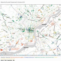
Employment in America, 2010 Leaflet | Jobs: Map data from US Census LEHD, Imagery by Robert Manduca under CC BY 4.0, Background: Map tiles by Stamen Design, under CC BY 3.0. Data by OpenStreetMap, under ODbL. One Dot = One Job. Manufacturing and Logistics - Professional Services - Healthcare, Education, and Government - Retail, Hospitality, and Other Services. USA Atlas. Demographic Atlas. American Migration. Map of How Manhattan’s Grid Grew - Interactive Map. Map of How Manhattan’s Grid Grew - Interactive Map. Map: Diversity and segregation in the D.C. area. DC Census 2010 : A shrinking majority. American Migration [Interactive Map] MALBOUFFE – McDo vu du ciel, cartographie d’un empire. Steve Von Worley Les Etats-Unis vus du ciel ?
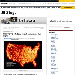
La densité de la population américaine au commencement de la ruée vers l'Ouest ? Vous n'y êtes pas : voici une carte de la répartition des McDonald's américains réalisée par le photographe Steve Von Worley et consultable en ligne à cette adresse. "La lecture de cette carte nous confirme que le géant du fast-food, qui compte plus de 13 000 restaurants aux Etats-Unis, s'implante méthodiquement dans et autour des agglomérations, ainsi que le long des réseaux autoroutiers, analyse le site fluctuat.net. Les rares zones d'ombres de la carte s'expliquent par la topographie : parc national des Everglades, désert du Nevada, montagnes de l'Idaho, grandes plaines du Dakota Sud, etc. " Le blog Arcorama s'est amusé à fabriquer la même carte pour la France, deuxième plus grand marché du groupe à l'échelle mondiale.
Arcorama nous explique le modus operandi d'une telle réalisation. Le site propose enfin un lien vers une carte mondiale du prix du Big Mac. Welcome to NHGIS. Map: Diversity and segregation in the D.C. area. Data Visualization: Journalism's Voyage West. Interactive Map Showing Immigration Data Since 1880 - Interactive Graphic. Map: Where Americans Are Moving - Forbes.com. Interactive map: 30 years of census data. Food Desert Locator. MyBlockNYC. Mapping America — Census Bureau 2005-9 American Community Survey.
Comparing US states with countries: US equivalents. Which countries match the GDP and population of America's states? IT HAS long been true that California on its own would rank as one of the biggest economies of the world. These days, it would rank eighth, falling between Italy and Brazil on a nominal exchange-rate basis. But how do other American states compare with other countries? Taking the nearest equivalent country from 2009 data reveals some surprises.
Who would have thought that, despite years of auto-industry hardship, the economy of Michigan is still the same size as Taiwan's? Also see our other "country equivalents" interactive maps:Indian states and territories as countriesChinese provinces as countriesBrazilian states as countries. America By The Numbers - Where We Live. Mapping the Measure of America. The 12 States of America. U.S. population hits 300 million mark - U.S. news - Life.