Web design
> Développement web
10 Ways to Improve Typography In Your Designs. Typography is more than just picking a font and a point size from some drop-down menus on your computer.

It’s an art and a skill whose history goes back centuries, to the wooden and metal type used with printing presses. And while we can learn from typography’s long legacy, most of us could also use a few practical tips on how to help our type look better in everyday projects like resumes, newsletters, or business cards.
Top 15 Web and Graphic Design Blogs to Follow. It can take years for a blog to become well established and recognized by the design community and it takes that long to build a good following.

There are hundreds of Web and Graphic design blogs are all over the internet, finding which one’s are trustworthy and contain well written (and informing) articles can be hard these days. I decided to compile a list of 15 web and graphic design blogs that I personally follow and find trustworthy (as far as original content goes). Please keep in mind that these are in no particular order. 1.
Intérêt et rôle de la rééducation tubaire. Etudes - Quelle tête aura le web design en 2014 ?
Publié le 24 février 2014 La mobilité du consommateur sur la Toile entraîne des mutations structurelles et culturelles dans la production et la pensée des plates-formes digitales.

INfluencia publie les résultats d’un rapport interne de l’agence Vanksen sur les 10 tendances du web design en 2014. En attendant l’impact sociologique de l’avènement programmé de l’« Internet Of Things », la société connectée rend déjà le consommateur plus exigeant, plus pressé, moins patient. Les besoins comportementaux des individus face à la Toile sont modifiés et foncièrement le webdesign doit s’adapter.
What’s new for designers, May 2013. The May edition of what’s new for web designers and developers includes new web apps, jQuery plugins and JavaScript resources, educational resources, wireframing kits, image tools, Photoshop extensions, web development tools, coding resources, and some really great new fonts.

Many of the resources below are free or very low cost, and are sure to be useful to a lot of designers and developers out there. As always, if we’ve missed something you think should have been included, please let us know in the comments.
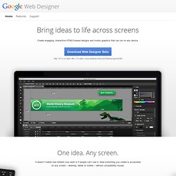
Web Designer. Illustration tools Import assets from any other creative suite or use the built-in illustration tools to create vector-style artwork – keeping your designs light.

To create new HTML tags in your designs, just draw them in with the Tag tool.
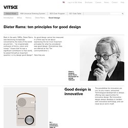
Motherfucking Website. Good design. Back in the early 1980s, Dieter Rams was becoming increasingly concerned by the state of the world around him – “an impenetrable confusion of forms, colors and noises.”

Aware that he was a significant contributor to that world, he asked himself an important question: is my design good design? As good design cannot be measured in a finite way he set about expressing the ten most important principles for what he considered was good design. (Sometimes they are referred as the ‘Ten commandments’.) Here they are. Good design is innovative The possibilities for innovation are not, by any means, exhausted.
Free textures for your next web project. Nothing like a field of beautiful flowers. Download Download These lovely water-colorful dots will make your designs pop. Download More leaves from another angle.
10 top typography resources. The web is a wonderful thing, brimming with resources and tutorials for people wanting to learn about the discipline and see some examples of beautiful and innovative typography to inspire.

But, sometimes, too much choice can be confusing, so we've picked some top sites that will really help you get to grips with it. Check them out - and let us know if we've left out any of your favourite resources in the comments below... Also read: What is typography? Learn the basic rules and terms of type 01.
80 awesome new WordPress themes.
Whether you design WordPress themes or just use them, you’ve got to stay on top of what’s happening in the world of WP theme creation.

Every few months we round up some of the best new themes, both free and premium, from some of the best theme designers out there. There are great features in both kinds of themes, with free themes offering ever-more premium-like features.
Download a free PSD every day.
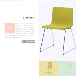
Vertical Showcase Slider with jQuery and CSS Transitions. Bernhard With restful springiness in the seat; prevents static sitting and provides enhanced seating comfort.

A Collection of Mini Icon Sets. Icons can add a lot of meaning to a website or web app design. Used appropriately, they can make it faster for your visitors or users to complete the tasks they need to complete.
Responsive Web Design: What It Is and How To Use It - Smashing Magazine. Advertisement Almost every new client these days wants a mobile version of their website.

It’s practically essential after all: one design for the BlackBerry, another for the iPhone, the iPad, netbook, Kindle — and all screen resolutions must be compatible, too. In the next five years, we’ll likely need to design for a number of additional inventions. When will the madness stop? It won’t, of course.
50 Useful Tools and Resources For Web Designers - Smashing Magazine. Advertisement An effective, well-organized workflow is an important asset of professional web designers.
The more useful and time-saving your tools are, the more time you can focus on important things, thus creating a foundation for timely good-quality results.
Infographie multimedia
Web Design Trends In 2013 (And Why)
Trends.
Build a Responsive, Mobile-Friendly Website From Scratch: Semantic HTMLBuildMobile. In the last article, as promised, we’ve begun doing some practical work with the planning and creation of a mockup. Now, we’ve focused on how to build a personal project wireframe thinking responsively and—consequently—how a responsive design can adapt to three target layouts: Default (PC desktop), Portrait Tablet, and Smartphone.
We’ve seen how to arrange the elements of a typical website in the three main devices’ categories by creating a template that represents the common content elements. In this third part of this series, I’ll concentrate on writing the HTML code and work on the structure of the homepage, while in the very next, I’ll be setting the first CSS styling rules to build the initial design of our project.
Optimiser l'ergonomie des formulaires web. Les formulaires sont très fréquents sur les sites web et parfois complètement incompréhensible. Il existe une multitudes d'astuces pour améliorer la compréhension de ceux-ci, éviter que les utilisateurs fassent des erreurs et optimiser le durée nécessaire pour les remplir. Cet article présente plus de 60 astuces et recommandations avec des explications. Structurer le formulaire Dans le cas d'un formulaire pour se connecter, il est possible de faire apparaître le formulaire au survol ou avec un clic de souris.
Why is Facebook blue? The science of colors in marketing. 33.5K Flares Filament.io 33.5K Flares × Why is Facebook blue? According to The New Yorker, the reason is simple.
20 WordPress Plugin Tutorials 2011. WordPress plugins are a vital piece of the WordPress infrastucture – there are thousands of free and commercial plugins out there that allow you to do almost anything you can think of with WordPress. WordPress has made it easy to write plugins with an API and the use of hooks.
Design Tip: Never Use Black by Ian Storm Taylor. One of the most important color tricks I’ve ever learned was to avoid using the color black in my work. Mrs.
Viewport resizer - responsive design bookmarklet - device screen size check.
Star Wars 3D Scrolling Text in CSS3. I always try to offer practical tips on SitePoint. Really.
52 of the very best website designs from 2012 featured on Admire the Web. 5 Tips for Responsive Builds. Jasondavis/colour-schemes. Tout les formats et tailles d’images sur Facebook, Twitter, Youtube, Pinterest…
Random Color Swatch Generator. La concurrence à Twitter Bootstrap. Je me suis rendu compte l'autre jour qu'en fait, non seulement Twitter Bootstrap devient de plus en plus un standard pour les sites éphémères. Mais aussi, que dans ce milieu, la concurrence existe et est plutôt rude. Foundation Le plus gros, le plus connu. C'est pas compliqué, dès que ça parle de Twitter Bootstrap, il faut toujours quelqu'un pour parler de Foundation. Pourtant il y a un fossé énorme concernant Foundation. Skeleton. The Photoshop Etiquette Manifesto for Web Designers.

