
London olympics 2012: the look of the games. Jul 23, 2012 london olympics 2012: the look of the games london olympics 2012 – the look of the games in four days time the london olympics will finally get underway.

Here we look at some of the designs that will help form ‘the look’ of the 2012 games. the overall look of the 2012 games has been overseen by mccann worldgroup in collaboration with london’s organizing committee. over the past 3 years they’ve collaborated with several designers, architects, advertisers, sponsors and others to implement an impressive visual identity that will be seen across the world for much of the next month. 2012 london olympics logo by wolff olins image: LOCOG logo by wolff olins the logo needs little introduction, love it or hate it, you certainly recognize it. Wolff olins worked with london’s organizing committee (LOCOG ) to define a clear ambition for london 2012. these games were to be everyone’s. 2012 london paralympics logo by wolff olins image: LOCOG - gareth hague, alias - surface architects. Agence d'identité visuelle - Vous cherchez une Agence d'identité visuelle ? - Withdesigners.
Pentagram. BETC Book. Paul Leichtfried – Visual Communication. Mein Name ist Paul Leichtfried.

Geboren und aufgewachsen in Reutte in Tirol, studierte ich Informationsdesign an der FH Joanneum Graz und an der University of Plymouth in England. Nach Arbeitserfahrungen in London, Barcelona und Monterrey in Mexiko, folgte ein Masterstudium der Visuellen Kommunikation (Klasse Hickmann) an der Universität der Künste Berlin.
Einen ausführlichen Lebenslauf sowie PDF-Portfolio gibt es gerne auf Anfrage. I am Paul Leichtfried an Austrian graphic designer originally from a small town in the Austrian Alps. After studying Information Design in Austria and the UK, I completed a MA in Visual Communication at the Berlin University of the Arts (Class Fons Hickmann). If you would like more information or to discuss commissions and collaborations, don't hesitate to get in touch. Full CV and Commercial Portfolio upon request. Paul Leichtfried: contact@paulleichtfried.com.
Une bonne charte graphique dans la communication. Comment faire la charte graphique d’un logo ? La réalisation d’une charte graphique sert à définir une unité de règles à respecter lors de l’utilisation de l’identité visuelle d’une société.
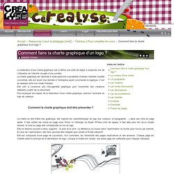
La charte graphique est destinée à toute personne susceptible d’utiliser l'identité visuelle concernée, elle est avant tout donnée à l’entreprise ayant commandé le logotype. C’est en quelque sorte son mode d’emploi. Elle sert à conserver une homogénéité graphique pour l’ensemble des créations réalisées à partir de ce document. Pour expliquer les étapes de la réalisation d’une charte graphique, prenons l’exemple du logo de crealyse. Comment la charte graphique doit être présentée ? La charte se doit d’être très graphique, elle reprend les caractéristiques du logo (les couleurs, la typographie …) dans une mise en page aérée. Elle se destine souvent à deux supports : le web et le print. Elle est composée d’une page de couverture, d’un sommaire, de l’ensemble des pages explicatives et des annexes. Que contient une charte graphique ? - catalogues, - etc.