Zoom
Trash

Galaxy of Covers (Ksenia) #ODDITYVIZ Space Oddity – a visual deconstruction. Travel Visa Inequality - How fair are travel visas distributed ? (ksenia) Travel Visa Inequality This project is a personal project by Christian Laesser.
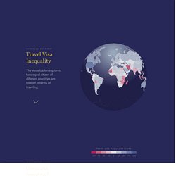
A vacation in Thailand made me curious about how equal travel visas are distributed between different countries. My intention of this project was to raise awareness for existing inequalities between different countries knowing that this problem is only one example of inequality around the globe. Subject The visualization shows the difference between visa travel policies of 194 countries based on Wikipedia data. Data Category: Visa requirements by nationality and linked Wikipedia articles.
Process The data was scraped from the Wikipedia list. Methodology Visa From Travel visa policies for a citizen of the selected country going abroad. Visa To Travel visa policies for a foreigner entering a selected country. Marvel Cinematic Universe. Sigma js. OII Network Visualisation Example. Martin Grandjean » Digital humanities, Data visualization, Network analysis » Introduction à la visualisation de données : l’analyse de réseau en histoire.
L’utilisation de la visualisation de données en histoire engendre des réactions contradictoires : alors que certains sont fascinés par son potentiel heuristique à en oublier leur sens critique, d’autres rejettent par principe ces pratiques, les suspectant de cacher un vide explicatif.
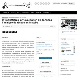
Cet article introduit la distinction entre visualisation de démonstration et visualisation de recherche, rappelant que le chercheur ne doit pas uniquement utiliser la visualisation comme moyen de communication, mais également pour nourrir la recherche elle-même. C’est particulièrement dans sa forme la plus complexe, l’analyse de réseau, que cette catégorie de visualisations de recherche va être discutée. Il faut distinguer les visualisations qui découlent d’un savoir scientifique et les visualisations qui créent un savoir scientifique : On distingue également les visualisations selon la nature de leur source, visualise-t-on une information ou un jeu de données ? Typage des données - Les docs de Magrit. Dataviz sur les réfugiés.
Dataviz sur les flux de migrants par période et en fonction de leur région de provenance. Les ombres des bâtiments de New York en dataviz. La dataviz c'est quoi en fait ? (Adam) D’où vient la visualisation de données ? Sonos & Spotify (Ksenia Lotnik) How We Connect We maintain connections in their hundreds, sometimes thousands, on social media and our networks of “friends” are linked by likes and shares.

We can go for months without a face to face interaction with some of the people we consider closest to our hearts. Against this backdrop, the need for tactile friendship has risen and we’re witnessing a renaissance of friendship’s truest forms. In our busy lives, time is increasingly precious, and we choose carefully who we spend it with. We have started to create our own ‘friendship ceremonies’ that are vibrant, loud and fun. Holiday Potlucks: The Perfect Antidote Potluck dinners are spontaneous; they focus on the group rather than the individual. Playlist Potluck, Playlists & Modern Friendship A Playlist Potluck is a gathering where we all contribute to the food and the music; perhaps the truest, democratic expression of the friendship ceremony that is an essential antidote to the stress and anxiety of modern life.
Dataviz sur les prix littéraires. Dataviz sur le climat (Dylan) Dataviz hausse des températures 1850-2018 (Dylan) (Rosa) Wind and Words: an interactive Game of Thrones data visualization. (Rosa) DataParis - Des données sur Paris et les Parisiens map. Revenu net annuel moyen par foyer fiscal.
Année : 2009. Source : INSEE. Impôt annuel moyen par foyer fiscal. Nombre de chômeurs par rapport à la population de 15 ans ou plus. Nombre d'étudiants par rapport à la population active de 15 à 64 ans. Nombre de diplomés de l'enseignement supérieur long par rapport à la population non scolarisée.Diplômes de l'enseignement supérieur long : licence, maîtrise, master, DEA, DESS, doctorat, école supérieure niveau licence et plus (hors DEUG, DUT, BTS, diplôme paramédical ou social...). (Rosa) Google Trends Electionland. Bloomberg - Are you a robot? (Rosa) Histography - Timeline of History. Histoire de Bruce Springsteen (Pierre)
"Coral Cities" : Top 10 Liveable Cities (Pierre) "One Angry Bird" : arcs émotionnels (Pierre) Methods All emotions were derived using the Microsoft Emotion API on standard video feeds.
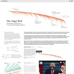
This service receives video as an input and outputs a timestamped identification of emotions detected in any faces present. The emotions detected are anger, contempt, disgust, fear, happiness, neutral, sadness, and surprise --emotions that are understood to be cross-culturally and universally communicated with particular facial expressions. While this set of emotions is culturally the most robust, it is worth noting the imbalance between positive and negative emotions.
There are five negative emotions, one neutral, one positive, and surprise, which is ambiguous. The disparity between negative and positive emotions is not a fluke. Process Given that the Microsoft Emotion API can analyze and record the emotions from many different faces within a frame, we edited each inaugural address to only include the president speaking. Accuracy Methods Process Accuracy. ODDITYVIZ - "Space Oddity" by David Bowie (Pierre)