
12 Ways Airports Are Secretly Manipulating You. Over the years, airports have evolved from bare-bones transportation hubs for select travelers to bustling retail centers for millions.

They’re being designed to both complement and influence human behavior. Everything from the architecture and lighting to the trinkets on sale in the gift shops is strategic. Here are a few tricks airports use to help travelers relax, get to their gates safely and on time, and hopefully spend some money along the way. 1. They make sure you can see the tarmac One key to a successful airport is easy navigation. For example, in many new airports, passengers can see through to the tarmac immediately after they leave security, or sooner. 2. “Very, very little in the style of an airport sign is arbitrary,” writes David Zweig, author of Invisibles: The Power of Anonymous Work in an Age of Relentless Self-Promotion. 3.
Newer airports incorporate as many windows as possible, even in stores. 4. That big sculpture in your terminal isn’t just there to look pretty. Dashboard Design User Experience Guidelines - Usability Geek. Why Product People Should Care About Business Strategy. Ownership of Business and Product Strategy Who’s responsible for ensuring that an effective business strategy exists?
The answer is simple in my mind: executive management. The leadership team of any company must lead the effort to create, review, and adjust the business strategy. But things are different when it comes to product strategy. Information On Different Types Of People For Graphic Communication, Website And Information Designers - Usability Geek. 10 Great Sites for UI Design Patterns.
You don’t want to spend your whole life redesigning the wheel do you?
No, neither do we. If you are looking for a design that solves a problem that has been solved inside a different application before; then the template for your wheel is probably already out there. That’s a design pattern to you and me. What’s the difference between UX and UI design? How to Use Gamification in Mobile App Onboarding.
Playing games is a human impulse.
People get a kick out of competing, collecting things, and finishing tasks. You can apply game design elements to anything, which is called gamification. Why you shouldn’t skip your wireframing. Handle Bad UX Requests Without Saying No (Video) Summary: UX professionals often receive poorly defined design requests.
When saying no is not an option, a more productive way of addressing the request is to focus on the outcome goals and the Return On Investment (ROI) of proper UX effort. 6 TED Talks Every UX Professional Should Watch. We’ve rounded up some of the best TED Talks for UX professionals.
These 6 awesome talks cover both user experience and the wider design principles to help you get inspired. 1. Sheena Iyengar: How to make choosing easier. We all want customized experiences and products — but when faced with 700 options, consumers freeze up. With fascinating research, Sheena Iyengar demonstrates how businesses (and others) can improve the experience of choosing. 2. David McCandless turns complex data sets, like worldwide military spending, media buzz, and Facebook status updates, into beautiful, simple diagrams that tease out unseen patterns and connections. 3.
10 Plus 1 Commandments for the Modern Mobile App Designer. What is Human-Computer Interaction (HCI)? Human-Computer Interaction (HCI) is a multidisciplinary field of study focusing on the design of computer technology and, in particular, the interaction between humans (the users) and computers. While initially concerned with computers, HCI has since expanded to cover almost all forms of information technology design. Loaded: 0% Progress: 0% Here, Professor Alan Dix explains the roots of HCI and which areas are particularly important to it.
What Typography Means in Email & How to Choose the Best Fonts - Designmodo. A Checklist for Registration and Login Forms on Mobile. Nobody loves registering on a new site or logging in on one they have visited before — on any type of device.
Yet, on mobile devices registration and login are more painful than on a desktop, for several reasons: Typing passwords is more difficult on mobile because it involves switching keyboards to access numerical or special characters. In fact, a study carried out at University of Munich shows that entering a password character on mobile takes almost twice as much time than on the desktop, and as a result people tend to create weaker passwords on mobile. Users have trouble remembering passwords, and many still store them in physical files or on a computer. These won’t be available on the go. 20 Blogs That Offer Best UX Design Resources (2017) We live in an age of sharing information, where one can easily get abundant valuable learning materials through internet as long as you are willing to explore.
Me, myself is exactly a “collecting” type: I can’t help buying a book which I think is helpful, even though I’m clear that there is no time to read it. Also, when I hit on some good learning materials like UX design resources on internet I’ll “Add to Favorites” immediately. For this reason, these years I’ve been in the design circle and my browser is full of various bookmarks; the storage of my cloud service has been expanded for many times. Today I want to share with you 20 blogs on UX design, each of them offers very inspiring UX design resources, including design techniques, tutorials, books, trends, design templates (like persona templates & examples).
If you are a veteran in the field, these UX blogs are nice places to get new inspirations. Messengers of Concepts. We study the concept of color semantics by modeling a dataset of magazine cover designs, evaluating the model via crowdsourcing, and demonstrating several prototypes that facilitate color-related design tasks.
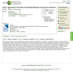
We investigate a probabilistic generative modeling framework that expresses semantic concepts as a combination of color and word distributions -- color-word topics. We adopt an extension to Latent Dirichlet Allocation (LDA) topic modeling, called LDA-dual, to infer a set of color-word topics over a corpus of 2,654 magazine covers spanning 71 distinct titles and 12 genres. Although LDA models text documents as distributions over word topics, we model magazine covers as distributions over color-word topics. The results of our crowdsourcing experiments confirm that the model is able to successfully discover the associations between colors and linguistic concepts. Visual Indicators to Differentiate Items in a List. Mobile screen space is limited, and on-the-go users are often interrupted and exhibit fragmented attention.
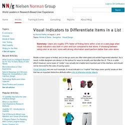
As a result, mobile designers are always on the lookout for ways to simplify and declutter the UI. This is a noble effort! Appointment Web Forms – Hacker Noon. Many challenges I deal with in the work place revolve around bringing users to register, purchase items, sign up, or some other web form that the client wants to improve. There is one particular web form that hasn’t been touched since its creation — every website does it the same (with some variation) without any evolution in the user experience, booking appointments. Disclaimer: This concept I’m about to present only works well and has been researched with offices, such as dentists, doctors, car maintenance, etc.
What we have today. There are two ways a booking form works today. Find a date on the calendar, view available times, and if none of those work for you, keep clicking through the each date that is available until you find a time that works for you. The second most common calendar format gives a weekly view. Design Thinking: A Quick Overview. If you have just started embarking your journey through the Design Thinking process, things might seem a little overwhelming. This is why we have prepared a useful overview of the Design Thinking process, as well as some of the popular Design Thinking frameworks commonly used by global design firms and national design agencies.
To begin, let’s have a quick overview of the fundamental principles behind Design Thinking: Design Thinking starts with empathy, a deep human focus, in order to gain insights which may reveal new and unexplored ways of seeing, and courses of action to follow in bringing about preferred situations for business and society. It involves reframing the perceived problem or challenge at hand, and gaining perspectives, which allow a more holistic look at the path towards these preferred situations.
It encourages collaborative, multi-disciplinary teamwork to leverage the skills, personalities and thinking styles of many in order to solve multifaceted problems. PC GUI History - DESIGNBRIEF. A collection of videos showing the evolution of the graphical user interface (GUI). 45 years of connected video screens to computers. This GUI History video collection takes you on a wonderful journey … The history of Atari Steve Jobs visits Xerox Palo Alto Research Center in 1979 (dramatization)
Usability Testing Of Mobile Applications: A Step-By-Step Guide. The mobile market is huge and growing at a very fast rate. With an estimated 4.5 billion subscribers worldwide, it is forecasted that the number of mobile phones will surpass the world population. Before Begin … A Couple of Words About This Guide As the title of this article says, this is a step-by-step guide. The reason why I went for such a structure is to provide completeness.
Very often one comes across articles that describe in detail a particular phase of mobile application usability testing. Question no.1 – Do you need to read each step? Usability Testing Of Mobile Applications: A Step-By-Step Guide. How just one word can change your conversion. Layout, images, colours, fonts are equally important in order to provide users with a pleasant online experience and increase the conversion rate of a website. Fuse. Alcatel Watch UX — User Experience Design (UX) The Seven Principles of Universal Design. It can be easy to forget that users don’t come in a standard format when designing products. Your Graphs Look Like Crap: 9 Ways to Simplify and Sexify Data. Remember your last marketing team meeting? That one person spoke to your team and just started throwing data at you from your monthly marketing reporting deck.
No context -- just numbers, graphs, and the occasional pop of color. User Interface Design Tips, Techniques, and Principles. Optimizing UI icons for faster recognition. What makes an icon a valuable addition to the interface, rather than a mere decorative element? Intuitiveness, aesthetic value, memorability, intercultural perception? 18 best practices to improve your e-commerce website. Role-Playing the Interaction. Bad Web Design Features. Is Booking.com the most persuasive website in the world?
One of the most important areas to invest time into is developing the persuasive layer of your online experience and deliver more reasons for your visitors to do what you want them to do. In fact, I see persuasion as being one of the next big battlegrounds online. As more websites are upping their game around the fundamentals of good user experience and usability principles they’re looking for the next area of growth and to gain competitive advantage. One brand I’ve paid particular attention to since 2009 has been Booking.com. I previously wrote a piece back in October 2011 about the wide range of persuasive techniques used on its search results page.
Since then Booking.com has continually evolved and refined its online experience, adding in new features, functionality and in particular using even more persuasive techniques. 5 Principles of Persuasive Web Design. Creating An Adaptive System To Enhance UX. OS X Human Interface Guidelines: User-Centered Design. Adaptive Vs. Responsive Layouts And Optimal Form Field Labels.
Persuasive Web: Where Psychology Meets Conversion. 14 Examples of The Persuasive Power of Color in Web Design. 7 Lessons Apple Can Teach Us About Persuasive Web Content. 5 Principles of Persuasive Web Design. About Interaction. When to Use Which User-Experience Research Methods. 15 common mistakes designers make. Marissa Mayer's New Rule For App Design. How To Write a Product Feature Set. 3 Tools for Getting the Most Out of Your A/B Testing. Health Design Challenge: d+collab // THE PATIENT RECORD. How to Utilize The Gestalt Principles. InterState: A Language and Environment for Expressing Interface Behavior. Incorporating Social Identity Theory Into Design – Smashing Magazine. Design Science: What Is Gestalt Theory? The Book Metaphor. Efficiently Simplifying Navigation, Part 2: Navigation Systems. Scaling User Interfaces: An Information-Processing Approach. IxD (Interaction Design) Checklist - Myplanet Digital. Jacquelyn Brioux.
State of Design: How Design Education Must Change. What UX Is and What Isn't. Stupid Smart Stuff. Hair-Raising Subway Ad Blows Away the Competition. Hair-Raising Subway Ad Blows Away the Competition. Introduction to Information Architecture. The 17 Designs That Bell Almost Used for the Layout of Telephone Buttons. Designing for Others. Mokk.me - Mobile web app mocks. Cs.swan.ac.uk/~csharold/tick/HCIed.pdf. Teaching and learning human-computer interaction. 7 unbreakable laws of user interface design. What You Should Know About Web Typography That Will Make You A Better Designer. Visual Definitions of User Experience.
The Psychology of Interaction Design. Usability vs. User Experience (UX) Data Visualization. Faculty.washington.edu/ajko/teaching/info360/ The Psychology of Color. GoodUI. Treatise on User Experience Design: Part 1. What Is User Experience Design? Overview, Tools And Resources. The Anatomy of an Effective Homepage. All That Glitters Is Not Gold: A Common Misconception About Designing With Data. Mobile Design: Where to Get Inspiration. 30 essential UX tools. 50 Awesome Resume Designs That Will Bag The Job. The Difference Between Information Architecture and UX Design. Creative And Innovative Navigation Designs. 7 Actions that Earn User Trust. How to Use Visual Hierarchy and Website Layout to Emphasize Your Message. Google's Design Team Showcases a Collection of Beautiful Apps. Martin Velchevski's answer to User Experience: What are the key characteristics of an effective UX designer.
Adaptive user interfaces for health care applications. Adaptive User Interfaces. Perceptual Computing SDK 2013. UX Strategy - Video, Poster and White Paper. Give Your Website Soul With Emotionally Intelligent Interactions. Can Do, Will Do, Still Do - Seven Principles of Persuasion, Emotion, and Trust. The Roots of User-Centered Design — Beyond Wireframing: The Real-Life UX Design Process. The Challenge Of Conducting User Research In Different Age Groups. Crash Course: Design for Startups.
How to Prototype a Mobile App with PowerPoint - DIY DROID.