Antipodes Map - Tunnel to the other side of the world. A history of global living conditions in 5 charts - Our World In Data. This is the introduction to Our World in Data – the web publication that shows how global living conditions are changing.
This text was previously titled "A history of global living conditions in 5 charts". A recent survey asked “All things considered, do you think the world is getting better or worse, or neither getting better nor worse?”. In Sweden 10% thought things are getting better, in the US they were only 6%, and in Germany only 4%. Very few people think that the world is getting better. What is the evidence that we need to consider when answering this question? I. To see where we are coming from we must go far back in time. 30 or even 50 years are not enough. Take a longer perspective and it becomes very clear that the world is not static at all.
To avoid portraying the world in a static way – the North always much richer than the South – we have to start 200 years ago before the time when living conditions really changed dramatically. II. III. IV. V. VI. VII. VIII. 7 maps that will change how you see the world. A Japanese architect has won a prestigious award for creating a new map, because it shows the world as it really is.
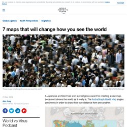
The AuthaGraph World Map angles continents in order to show their true distance from one another. Hajime Narukawa won the Good Design Award, beating over 1,000 entries in a variety of categories. “The AuthaGraph World Map provides an advanced precise perspective of our planet,” explain the organizers of the award. Not only that, but the map can then be transformed into a globe.
Why is this news? Ever since we first set sail to explore the world, humans have wanted to record what they saw and experienced. The map we are used to seeing depicts the world as flat, but it distorts the sizes of the continents, as this interactive map shows. For example, this still from the interactive map depicts the United States of America superimposed onto Brazil, and shows that the US barely covers it. Africa is a lot bigger than we think It’s a similar story with the African continent. GeoGuessr - Let's explore the world! Croquiz - Tous les croquis au BAC L - ES - S. 30 Breathtaking Satellite Photos That Will Change How You See Our World. Daily Overview is a new project that shares one satellite photo from Digital Globes a day in an attempt to change the way we see our planet Earth.
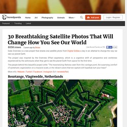
Show Full Text The project was inspired by the Overview Effect experience, which is a cognitive shift of perspective and worldview experienced by the astronauts when they get to see the planet Earth from space for the first time. The people behind this beautiful project write: “The mesmerizing flatness seen from this vantage point, the surprising comfort of systematic organization on a massive scale, or the vibrant colors that we capture will hopefully turn your head.” More info: Website | Tumblr | Facebook | Instagram (h/t: twistedsifter) Bourtange, Vlagtwedde, Netherlands Thanks for sharing! 3x per week 30,000,000+ monthly readers Error sending email 53.0066°N 7.1920°E. Barcelona, Spain 309th Aerospace Maintenance and Regeneration Group Tucson, Arizona, USA Central Park, New York City, New York, USA 40°46’56”N; 73°57’55”W. 36.211001, -115.266914. Browse by Topic. NASA Earth Observatory Home / Images Browse by Topic Image of the day Natural Hazards World of Change Atmosphere Heat Land Life Water Snow and Ice Human Presence Remote Sensing.
Édugéo, le géoportail de l'éducation. Territoire - Région de naissance, région de domicile - Cartes interactives - Région de naissance, région de domicile - Cartes interactives. Worldometers. Ressources de géographie pour les enseignants — Géoconfluences. Animations Risque Crue, Inondations.