
Data Visualization conferences and events. Project Room - Challenge Details. Data Visualization Contest. Challenge Overview. The Economist and Nielsen are challenging Solvers to review data, generate insightful conclusions with broad implications, and present a compelling visual presentation of the most interesting ideas.
The sources of information for this Challenge are global research, provided by Nielsen, reflecting consumer behavior, including the 2012 Global Consumer Confidence survey and the 2012 Global AdView Pulse report. This is a special Ideation Challenge, which has the following unique features: There is a guaranteed award. The awards will be paid to the best submission(s) as solely determined by the Seeker. The total payout will be $10,000, with at least one award being no smaller than $5,000 and no award being smaller than $2,000. Eligibility and exclusions: The Economist - Nielsen Data Visualization Challenge ("Challenge") IS OPEN TO MEMBERS OF THE GENERAL PUBLIC, WHO REGISTER AS AN INNOCENTIVE SOLVER ON THE INNOCENTIVE WEBSITE. Existing tools and OII InteractiveVis approach. From the beginning of this project, we have been keen to build upon the best of the existing tools and not “reinvent the wheel.”
At the same time, however, we have set ourselves some unique parameters to allow the widest use of visualizations produced with the tools we develop. In particular, we want our visualizations to be native HTML5 visualizations, run as standalone / offline visualizations, work on tablets and other touch-screen interfaces. At the same time, we want to make the process of going from datafile to visualization as easy and accessible as possible. We feel confident this combination of factors isn’t available yet, but there are some existing building blocks we can use. This blog post will look at each of the parameters mentioned above and then turn to look at existing visualization tools (Many Eyes, Google Charts, Simile Widgets) and libraries (Sigma.js, D3, Miso, Raphael).
The Pursuit of Faster (launched) SaaS Business Intelligence with Google Apps. Drive business user adoption through intuitive Self-Service BI Evaluating BI products?

Try this agnostic tool to evaluate over 150 features! Collaborate where critical business decisions are made Connect, Explore and Collaborate with Business Intelligence 3.0 Business Intelligence 3.0 Panorama is leading a BI 3.0 revolution and a creation of a new generation of BI solutions that enable organizations to leverage the power of Social Decision Making and Automated Intelligence to gain insights more quickly, more efficiently, and with greater relevancy. Player. What They Know - Kids. Nicholas Felton. Eyeo2012 - Amanda Cox. Technical Details. Gregor Aisch – driven by data. The Power of Networks: Knowledge in an age of infinite interconnectedness.
Converge to Inspire. The Sexperience 1000. A Periodic Table of Visualization Methods. Top Sites for "Data Mining"
Soluções Móveis. Your intuitive search assistant. We Feel Fine / by Jonathan Harris and Sep Kamvar. Mostrasesc. Data Visualization: 20+ Useful Tools and Resources. There are plenty of cool technologies available to collect and examine data.
Both web and desktop applications have provided some really great interfaces to fall in love with data mining, and with the rise in popularity we have noticed an increased number of infographics created over the past few years. Today we’ll be looking into some really cool and popular online resources for data visualization. You can see all kinds of data like human population, world condition and even human emotion presented via the visualization. While some of the visualization might be experimental, all of them have one similarity: they help you understand the data better, and this is exactly what visualization is for.
If you’ve designed your own infographic or visualization tool we’d love to check it out. Recommended Reading: More Infographic related posts. Better World Flux Now this is one beautiful visualization tool! The refined condition of BWF’s design comes as no surprise. Visual.ly We Feel Fine RSS Voyage. Generating simple collections for Pivot Viewer. The Silverlight PivotViewer control is an easy way to have a fast and spectacular gallery for your website/webapp. In this article I'll show how to generate collections for the PivotViewer using Linq-to-Xml and the command line tool. PivotViewer Introduction The control enables filtering, sorting with fluid animations, and uses Deep Zoom technology to make the loading fast. To get an idea about it, check out the Netflix pivot example and the Windows Phone Marketplace Visualizer (wp7apphub) .
For hosting you’ll only need a fileserver because simple collections are static and stored in xml and in (Deep Zoom) image files. Download PivotViewerSample with preset collection Download source for BloggerToPivot command line converter Data options PivotViewer collections are stored in Collection XML (CXML) schemas and Deep Zoom images (DZC). Simple collection – Maximum 3,000 items, static pre-generated collection. The London 2012 Olympic Games. This summer, we will see the best of the best compete for pride, glory, and, of course, medals at the Olympics.
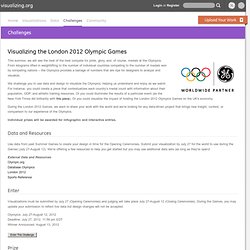
From kilograms lifted in weightlifting to the number of individual countries competing to the number of medals won by competing nations -- the Olympics provides a barrage of numbers that are ripe for designers to analyze and visualize. Many Eyes. 10 Tips to Create Useful & Beautiful Visualizations.