
Sign in to your account. Type the email address of the account you want to sign in with.
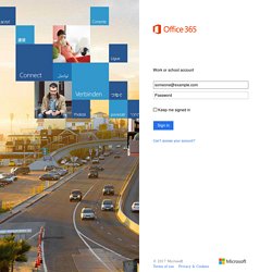
We're having trouble locating your account. Which type of account do you want to use? Sign in to {0} Which type of account do you want to sign in with? Be sure to type the password for your work or school account. Your user ID should look like an email address, for example someone@contoso.com or someone@contoso.onmicrosoft.com. All Current Works. DIVI Theme - Join Elegant Themes. Discover The Difference Of Visual Drag & Drop WordPress Websites Divi is a game-changer, and when you first use it you will understand why.
Building websites with the Visual Drag & Drop builder is unlike anything you have experienced before while creating WordPress websites. Divi lets anyone build beautiful websites with ease without having to code or install dozens of disjointed third party plugins. Join The Most Enthusiastic And Empowered WordPress Community On The Web The Divi and Elegant Themes community is something special.
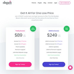
Build Unlimited Websites For Your Clients The Elegant Themes membership is a no-brainer for WordPress professionals. Harness The Promotion Power Of Bloom and Monarch Marketing is something that is often overlooked when starting a new website. Why choose Elegant Themes? Font Pairing in Web Design: 7 Key Principles Revealed and Explained. The right font pairing is essential to a pleasing reader experience, but choosing the right ones can be confusing.
You want to create a pairing that’s visually intriguing yet clear, and it’s not always obvious where to start. To help you strike the right balance, this post will break down the key principles of good font pairing and show you how to apply them to your design projects. Nail these principles and you’ll get the perfect font pairing every time! Principle #1: Contrast Is Key Contrast is the whole reason we create font pairings to begin with. However, what exactly do we mean by “contrast”? On the other hand, here’s what it looks like when two fonts don’t contrast sufficiently: To make sure your pairing has enough contrast, choose fonts that differ in the following areas: Weight Weight refers to how bold or light a font is.
For example, Lato (the heading font in our first example image above) comes in five weights. ThinLightRegularBoldBlack Point Size This is just the size of the text. Establish a Mood with Typography. The typefaces you select for a project can impact what people think as much as the actual message you convey.
Almost any website or design project will include the use of type. From a few words to a page filled with text the font choices you make in the early planning phases will carry through the project. Fonts can help create and establish a mood and set the tone for how your work is received. Do you want a modern look and feel? Or is the desired effect more classical? Keep in mind that each typeface on its own can say almost as much about the project as actual words on the page (or screen). Project Goals The first step with any design project is to determine what you expect as a final outcome.
Stick to simple typefaces that are highly readable for projects with large blocks of text. Consider the impact of type on images as well. More engaging font choices often work best when used sparingly and when they can stand on their own. Moods WakWAW takes a completely different approach. Trends. 7 Image Editing Tricks to Better Attract Visitors. I know you already spend heaps of time writing content for your WordPress site.
But how much time do you spend on the images you use in your content? If you’re like a lot of bloggers, probably not that much. In this post, I’m going to dig into some basic image editing tricks and tips to help you get the most from the limited time you have to create blog images. I’m not a professional designer – so these tips should be easy to implement no matter what your knowledge level is. Let’s jump straight into it… 1. Let’s start with a disclaimer – color advice should always be taken with a grain of salt.
We’re talking averages here – that doesn’t mean there aren’t situations where an image using a below average color does gangbusters. With that being said, red is the key to getting your images shared more often…at least according to two different analyses of millions of Pinterest images. I know – this data is for Pinterest, not blog images specifically.