
Font Style and Font color: A Matter of Creativity and Effective Designs. A web design is all about perfection, creativity and imagination at its best.
Composition and the Elements of Visual Design. Proportion - Golden Ratio and Rule of Thirds Proportion refers the size relationship of visual elements to each other and to the whole picture.
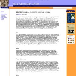
One of the reasons proportion is often considered important in composition is that viewers respond to it emotionally. Understanding Balance in Photography. Balance is a compositional technique in photography that juxtaposes images within a frame so that the objects are of equal visual weight.
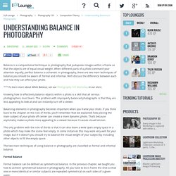
When different parts of a photo command your attention equally, perfect balance is achieved. In photography, there are two main techniques of balance you should be aware of: formal and informal. We’ll discuss the difference between each and how they can affect your photo. *** To learn more about White Balance, see our Photography 101 Workshop in our store. Knowing how to effectively balance objects within a photo is a skill that all serious photographers must learn. Balancing elements in photography becomes important when you frame your shots.
The only problem with the rule of thirds is that it can also leave a wide open empty space in a photo which may make the scene feel empty. Color Contrast in Photography" In a black-and-white photo, the color palette is restricted to white, black and shades of gray.

To create contrast, the photographer pits lighter elements against dark, sun against shadows. In color photography, the artist's palette is infinite and good contrast requires more consideration. Good color contrast starts with the color wheel. On one side of the wheel are the "warm" colors: shades of yellow, orange, red and pink. On the other side are the "cool" colors: hues of violet, purple, blue and green. Colors like red and green that live on opposite sides of the color wheel are called complementary colors -- think of Christmas decorations. Keep these complementary color pairs in mind when you're composing a shot. For the best color contrast, keep things simple [source: Tang]. Let's finish with some tips on getting great contrast in black-and-white photography. Feast for the Eyes. The visual arts are arts that we see.
This category usually includes just things that we see and things that are flat or two-dimensional. Visual arts are things like paintings, drawings, visual designs, photography, and computer art. Because "visual arts" means two-dimensional things, sculpture and architecture come under separate headings. Likewise, visual works of art stay in one place, unmoving, while we observe them. For this reason, performing arts-- stage, screen, music, and dance arts--also come under their own separate headings. Remember that art is a language all of its own that is different from our normal spoken language. Powerful Paintings. Visuals. Visual Literacy. Clean Up Your Mess - A Guide to Visual Design for Everyone. Visual Design. Some foundational ideas are so thoroughly ingrained in modern life that we hardly see them for their ubiquity and familiarity.
The concept of “module and program”—regular building blocks of repeating patterns that when joined together produce an organized whole—permeates our information-age lives even more thoroughly than it did the lives of our ancestors in the industrial revolution launched by manufacturing innovators like Eli Whitney. As the industrial world grew more complex, document designers in the mid-1800s began to adapt modular programs to newspaper, catalog, financial, and other publications, and modern page layout was born. A Rare Peek At The Guidelines That Dictate Google's Graphic Design. In April 2011, Larry Page took the reins as Google’s CEO.
He didn’t waste any time getting down to business. On his very first day on the job, Page launched an incredibly ambitious effort to redesign the company’s main products, including search, maps, and mail. He wanted them to be beautiful--Google had never been known for its visual polish--but he also wanted them to be cohesive, more like a true software suite than a jumble of disparate digital tools.
In the years since, Google’s products have improved leaps and bounds, aesthetically speaking, largely while working within the same shared design language. The rare glimpse into the company’s design process comes in the form of two documents--"Visual Assets guidelines"--freshly shared on Behance. The more exciting of the two covers product icons. Google encourages its designers to take a "reductive approach" to product icons. Practical Guidelines for Visual Design.
Practical Guidelines for Visual Design The following are some practical guidelines to follow in the design of instructional visuals.
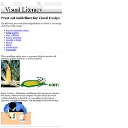
There are three major ways to represent objects: as pictorial symbols, graphic symbols, or verbal symbols. Being creative... Designing visual images for instruction requires the ability to think visually coupled with the ability to relate verbal symbols (words) with corresponding visual symbols (pictures or graphical images) in a meaningful and creative way. Research on eye movement states that people from Western cultures tend to look at the upper left-hand area of a visual first. Keeping these two principles in mind it is important to place important information near the dividing lines and place the start of the main message where the eye first strikes the area. National Center on Accessible Instructional Materials.