
Vega: A Visualization Grammar. Data_visualization. Zzzoot. Processing.js. D3.js - Data-Driven Documents. How to map connections with great circles. Here's the technical definition of great circles on Wikipedia: A great circle, also known as a Riemannian circle, of a sphere is the intersection of the sphere and a plane which passes through the center point of the sphere, as distinct from a small circle.
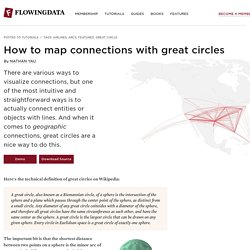
Any diameter of any great circle coincides with a diameter of the sphere, and therefore all great circles have the same circumference as each other, and have the same center as the sphere. A great circle is the largest circle that can be drawn on any given sphere. Every circle in Euclidean space is a great circle of exactly one sphere. The important bit is that the shortest distance between two points on a sphere is the minor arc of a great circle.
It turns out these maps are relatively easy to make in R once you know how to put the pieces together. Step 0. 1. Step 1. Open R. The first package maps, is used to draw the base maps, and the second, geosphere is used to draw the great circle arcs. Step 2. Here's the map that you get: 2. 3. Security Visualization. VizSec 2012 will be held in mid-October as part of VisWeek in Seattle.
When we know the exact date, we will update the web site. Papers are due July 1. The International Symposium on Visualization for Cyber Security (VizSec) is a forum that brings together researchers and practitioners from academia, government, and industry to address the needs of the cyber security community through new and insightful visualization techniques. Co-located this year with VisWeek, the 9th VizSec will provide new opportunities for the usability and visualization communities to collaborate and share insights on a broad range of security-related topics. Accepted papers will appear in the ACM Digital Library as part of the ACM International Conference Proceedings Series. Important research problems often lie at the intersection of disparate domains. More information is on the web site: Data Visualization, Infographics, and Statistics. VC blog. Posted: November 26th, 2014 | Author: Manuel Lima | Filed under: Uncategorized | No Comments » As some attentive users of Visual Complexity might have noticed, the number of projects featured on the website has slowly come to a halt, with the perpetual grand total of 777 being a grieving reminder of inactivity for well over a year.
Today, If you go the the main page and look at the top right corner, you will see an invigorating new message: “Indexing 782 projects”. Of course I didn’t want to write this blog post to announce that five new projects have been added to the database. This recent addition is part of a larger plan I’ve been wanting to share with you for some time. In October 2015, Visual Complexity will celebrate its 10th Anniversary, a significant feat considering the life-span of many online projects, and an eerie memo that a long time has gone by since I launched the website after graduating from a MFA program at Parsons School of Design.
I was immediately hooked. Treemaps.