
Untitled. Top 5 graph visualisation tools. Apollo Timeline. The One-Stop Shop for Big Data. They say a picture is worth a thousand words—but in online world, a chart or infographic will enrich any designers repertoire.
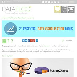
If you are focused on having a clear insight into your numbers, then you know what your business needs: Data Visualization. Let me introduce you to the article in which you will find 21 Data Visualization tools that are essential for your website. FusionCharts FusionCharts Suite XT gives you good-looking charts with exciting animation, smart designs and rich interactivity. It offers a unified experience across PCs, Macs, iPads, iPhones or Android platforms. Dygraphs Dygraphs is a fast, flexible open source JavaScript charting library that allows users to explore and interpret dense data sets. Marckhoury/mars. Cytoscape: An Open Source Platform for Complex Network Analysis and Visualization.
Gephi, an open source graph visualization and manipulation software. Literature and Latte - Scapple for Mac OS X and Windows. Rough It Out Scapple doesn’t force you to make connections, and it doesn’t expect you to start out with one central idea off of which everything else is branched.
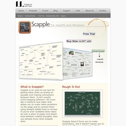
There’s no built-in hierarchy at all, in fact—in Scapple, every note is equal, so you can connect them however you like. The idea behind Scapple is simple: when you are roughing out ideas, you need complete freedom to experiment with how those ideas best fit together. It’s Scapple Simple. High Performance Visualization Solutions - HTML5. The undisputed tool of choice for the Oil&Gas industry is now available in a browser Go Mobile with your G&G data!
With JavaScript and HTML5 technology, the E&P industry’s most popular graphics-components package just got a major functionality boost. Now, you not only have an extensive set of advanced tools for the display of seismic data, logs and scientific plots. You have the power to develop and deploy your applications faster than ever on everything from desktops to mobile devices—without worrying about updates, installation or compatibility issues. All of which means you can focus on your core technologies. GeoToolkit.JS offers a wealth of robust features: Comparison of 3d tools - CGWiki. Drawing UML Diagrams with UMLGraph. Diomidis SpinellisDepartment of Management Science and TechnologyAthens University of Economics and Business Athens, Greecedds@aueb.gr Introduction UMLGraph allows the declarative specification and drawing of UML class and sequence diagrams.
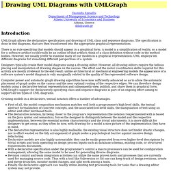
The specification is done in text diagrams, that are then transformed into the appropriate graphical representations. Example: Family Tree. Graffoo, a Graphical Framework for OWL Ontologies. Graffoo, a Graphical Framework for OWL Ontologies [1], is a wonderful new open source tool developed by Silvio Peroni that can be used to present the classes, properties and restrictions within OWL ontologies, or sub-sections of them, as clear and easy-to-understand diagrams.
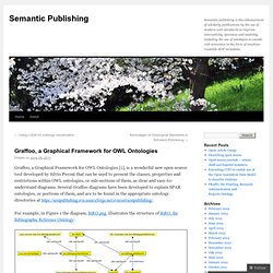
Several Graffoo diagrams have been developed to explain SPAR ontologies, or portions of them, and are to be found in the appropriate ontology directories at For example, in Figure 1 the diagram, BiRO.png, illustrates the structure of BiRO, the Bibliographic Reference Ontology: Graffoo diagram of BiRO, the Bibliographic Reference Ontology The lower part of the diagram shows how such a bibliographic record can be realized (i.e. expressed in a specific form, forming what in FRBR terminology is an Expression) as a bibliographic reference, such as you might find in an article’s reference list. First, a bibliographic reference typically does not include all the components of the full bibliographic record.
Dancing with Data « Quasipartikel. Last Sunday I gave a small workshop at the MapBox office, where I showed new findings I’ve discovered while working on my last visualization project.
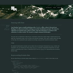
We turned a collection of countries into a dance of dots, each dot referring to a country in the collection. In other words: We created a simple animated Scatterplot. The goal was to implement a data-driven visualization where the output image is determined by the data and visualization state, such as filters and selected variables. Once users modify either the state or the data, the visualization gets updated accordingly using smooth transitions between states. We applied fundamental concepts such as Data Joins (a technique introduced by D3.js), Scales and Animation. Ultimate Guide to Website Wireframing. Most designers wireframe their designs in one way or another, even if it just involves them making quick sketches on the back of some scratch paper.
Wireframing is an important part of the design process, especially for more complex projects. Wireframes can come in handy when you’re communicating with clients, as it allows them to visualize your ideas more easily than when you just describe them verbally. Marketing is no longer just direct mail and billboards, it’s much more than that. You must be able to impress your clients by showing care and dedication to their marketing efforts, or they will just go to another agency. This is why wireframing is so important. This guide covers what you need to know about website wireframes to get started. Why You Should Wireframe Your Web Designs Wireframing is really the first step in the design process. Wireframes are also cost-effective by saving you potential time lost due to revising a high-fidelity comp.
Wireframe vs.
Diagramming. Art. CanvasMol.