
Eagereyes. Junk Charts. This post is part 2 of an appreciation of the chart project by Google Newslab, advised by Alberto Cairo, on the gender and racial diversity of the newsroom.

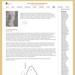
Part 1 can be read here. In the previous discussion, I left out the following scatter bubble plot. This plot is available in two versions, one for gender and one for race. The key question being asked is whether the leadership in the newsroom is more or less diverse than the rest of the staff. The story appears to be a happy one: in many newsrooms, the leadership roughly reflects the staff in terms of gender distribution (even though both parts of the whole compare disfavorably to the gender ratio in the neighborhoods, as we saw in the previous post.) Unfortunately, there are a few execution problems with this scatter plot. First, take a look at the vertical axis labels on the right side. I find this decision confounding. The horizontal axis? Here is the same chart with improved axis labels: Re-labeling serves up a new issue.
Numbers Rule Your World. Two years ago, Wired breathlessly extolled the virtues of A/B testing (link).

A lot of Web companies are in the forefront of running hundreds or thousands of tests daily. The reality is that most A/B tests fail. A/B tests fail for many reasons. Typically, business leaders consider a test to have failed when the analysis fails to support their hypothesis. "We ran all these tests varying the color of the buttons, and nothing significant ever surfaced, and it was all a waste of time! " Bad outcome isn't the primary reason for A/B test failure. 1. 2. 3. These issues are often ignored or dismissed. The Facebook Data Science team just launched an open platform for running online experiments, called PlanOut.
The rest of this post gets into some technical, sausage-factory stuff, so be warned. Bad design is when the experiment is set up in such a way that it does not provide data to answer the research question. Visual Business Intelligence. We typically think of quantitative scales as linear, with equal quantities from one labeled value to the next.
For example, a quantitative scale ranging from 0 to 1000 might be subdivided into equal intervals of 100 each. Linear scales seem natural to us. If we took a car trip of 1000 miles, we might imagine that distance as subdivided into ten 100 mile segments. It isn’t likely that we would imagine it subdivided into four logarithmic segments consisting of 1, 9, 90, and 900 mile intervals. Similarly, we think of time’s passage—also quantitative—in terms of days, weeks, months, years, decades, centuries, or millennia; intervals that are equal (or in the case of months, roughly equal) in duration. Logarithms and their scales are quite useful in mathematics and at times in data analysis, but they are only useful for presenting data on those relatively rare cases when addressing an audience that consists of those who have been trained to think in logarithms.
Visualising Data. Naomi Robbins - Effective Graphs. Data Visualization Blog The Excel Charts Blog. Statistical Graphics and more. The weather channel wetter-online pointed me to the latest global temperature anomalies which made me think about this post.
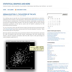
Everybody knows that worldwide temperatures are rising. Rising as well does the concentration of CO2, which is literally fueled by burning fossil fuels. Ok, here goes the proof that rising CO2 levels correspond to rising temperatures: As CO2 is the “most famous” greenhouse gas and thus causes temperatures to rise, the whole thing fits – at least for the timeframe we are looking at, which is 1970 to 2000.
(OK, putting the two quantities on selected separate scales is a bit cheesy, but this is how media will sell these topics to us …) Looking at the temperatures from 1880 to 2013 alone, gives rise to new questions when we look at the last decade: Looking at the smoothing spline for the monthly data, we see that global warming has stalled for almost a decade now – temperatures even seem to fall slightly.