
The top 10 open source web fonts. Simplifica Typography. SIMPLIFICA typography is an exceptional typeface created by KAIWA.
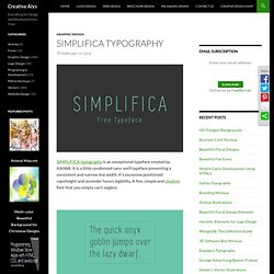
It is a little condensed sans-serif typeface presenting a consistent and narrow line width. It’s excessive positioned capsheight and ascender favors legibility. A fine, simple and creative font that you simply can’t neglect. Related Posts Fenix Typography Fenix is a serif typeface designed for display and long texts, its foundations are based in calligraphy, with strong serifs and rough strokes. How to design your own typeface. After many years as a graphic designer and type enthusiast, I decided to channel some of my passion into my own lettering and typography design projects.
After researching how to make your own font, it seemed a natural evolution to try my hand at designing a typeface. Much has been written about type design; on the history, drawing and technical complexities of creating typefaces (I've linked to some excellent resources at the bottom of this article) and many typography tutorials. But where exactly do you begin if you want to make your own font? If you're a designer or illustrator new to this discipline, what are the first practical steps, the common software and early considerations to get you going?
I had found some useful pieces of information but they were scattered across many sources and many were dated by technology. Sharing insights 01. Designing a typeface can be a long journey so it's prudent to have a clear vision of its purpose. The options are vast. 02. 03. 04. Steps to creating a font... This tutorial is also available as a pdf version.
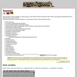
If you wish to follow along with the tutorial, this bundle should provide you with the basic files you need. I shall not presume to teach aesthetics, I concentrate solely on the mechanics here. NOBLEMAN: Now this is what I call workmanship. There is nothing on earth more exquisite than a bonny book, with well-placed columns of rich black writing in beautiful borders, and illuminated pictures cunningly inset. But nowadays, instead of looking at books, people read them. Font creation First create a new font with the New command in the File menu (or by using the -new argument at startup). Give the font a name with the Font Info command from the Element menu. You may also wish to use Encoding->Reencode to change what characters are available in your font. Creating a glyph Once you have done that you are ready to start editing glyphs. The outline glyph window contains two palettes snuggled up on the left side of the window.
Junction. Get to Know a Typeface! Minion. Normally, on this site, we write about expressive typefaces that evoke strong responses.
And since Shea and I are bitter, unhappy people, we write about typefaces that are easy to hate like Comic Sans and Papyrus. Minion, designed by Robert Slimbach in 1990, is one of those typefaces that only a typographer could love (not that other people dislike it; they just don’t notice it). If Minion were at a high school dance, it would sip punch with its back against the wall trying not to make any sudden movements while Curlz MT and Mistral breakdanced in the middle of the floor. Meanwhile, Comic Sans would try to make his friend Marker Felt laugh so hard that milk came out his nose and Papyrus would be smoking in the girls room. (This metaphor may be starting to break down.) The Elements of Typographic Style by Robert Bringhurst is one of the most influential books on typography. Mind Your En And Em Dashes: Typographic Etiquette. Advertisement An understanding of typographic etiquette separates the master designers from the novices.

A well-trained designer can tell within moments of viewing a design whether its creator knows how to work with typography. Typographic details aren’t just inside jokes among designers. They have been built up from thousands of years of written language, and applying them holds in place long-established principles that enable typography to communicate with efficiency and beauty.
MorganTw4 font. Vietnamese Unicode Fonts - Online Purchase. Okay Type · Alright Sans. Alright Sans is a contemporary sans-serif with a clean, prudent voice that avoids looking stiff or bland. Actually, it has just the right amount of warmth to convey a serious-yet-friendly tone. It has an open structure with shorter-than-normal capitals and a large x-height, giving it a roundabout economy that works exceptionally well across all media, in both large and small sizes. Its extensive character set, rich OpenType features, and wide range of weights makes it a reliable and versatile workhorse. Alright Sans Black Italic & Regular Alright Sans Extra Thin Italic & Bold Alright Sans Light Italic. Vietnamese Unicode FAQs. Support » Unicode Vietnamese font. Canto.