
Your Nerdy Best Friend - Broad coverage of apps and tech. The Sweet Setup - Apps and workflows for iPhone, Mac. Evergreen Data - Stephanie Evergreen - DataViz, Excel. The Wrong Kind of White Space Long-ish reports are probably never going away entirely, so let’s make them suitable for a digital reading age.

In the olden days, when we printed reports, they often had extra blank pages at the front and back. It probably gave printed materials a sense of... Adding Confidence Intervals to a Dot Plot Evergreen Data Visualization Academy member Dana McGuire recently wrote me to ask about her dot plot. How to Show Ranking Data in Excel Danielle, a member of my Evergreen Data Visualization Academy, submitted a question to our monthly Office Hours webinar about how to show ranking data.
Guest Post: Posters – They’re Not Just for Conferences Anymore! SE Note: I almost never make posters but I know they are a hot reporting tool for many of you, so I asked poster veteran Kylie Hutchinson to share her secrets. Visual Business Intelligence - Stephen Few - Dataviz, viz theory. This blog entry was written by Nick Desbarats.
As Steve has recently announced, he’s decided to transition away from teaching in the coming months to focus on new projects. After more than 15 years in the field of data visualization and more than 30 in IT, hopefully, we can all find our way to forgiving him for shifting his focus. It seems futile to try to estimate the number of people and organizations that have learned how to understand and communicate their data from Steve, but to say he’s changed the day-to-day practice of data visualization for more people in more ways than anyone else doesn’t strike me as hyperbolic.
While anyone who’s attended one of Steve’s workshops will tell you that it was transformative, I was completely bowled over by the public workshop that I attended in Minneapolis in 2013. Shortly after attending that workshop, I approached Steve and rather sheepishly asked if he’d ever considered adding a second instructor to teach his courses.
Nick. The Functional Art - Alberto Cairo - Dataviz, data journalism. Information Is Beautiful - David McCandless - Dataviz, data art. The Eurozone?
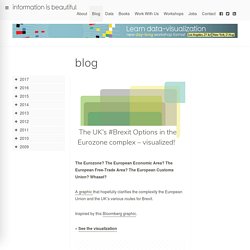
The European Economic Area? The European Free-Trade Area? The European Customs Union? Whaaat? A graphic that hopefully clarifies the complexity the European Union and the UK’s various routes for Brexit. Inspired by this Bloomberg graphic. » See the visualization The Kantar Information is Beautiful Awards 2017 is now open, celebrating the world’s most excellent information design. To mark our sixth year – and the increasing importance of data visualization & infographics across all media – we’re refreshing & relaunching the Awards.
AEA365 - American Evaluation Association - Post a day by and for evaluators. Hello, my name is Jayne Corso and I am the Community Manager for AEA.

As a community manager, I create weekly posts for AEA’s Facebook and Twitter pages. Although you can share similar content on Facebook and Twitter, your approach should be unique for each channel. I have put together a few tips for composing text for both Facebook and Twitter. Facebook: Hot Tip: Keep it to 80 characters The Facebook character limit is technically 63,206; however, when posting on Facebook, you should try to keep your text within 80 characters. Hot Tip: Don’t just post a link Facebook is a great channel for sharing blog posts or linking to external content, but don’t just post the link. Hot Tip: Use images Facebook posts that use images receive more engagement than posts without images. Twitter: Hot Tip: Keep it simple Twitter has a character limit of 140, but studies have shown that posts that are 120-130 in length receive better engagement.
Monitoring and Evaluation NEWS. Better Evaluation - Evaluation Capacity Building. Excel Tutorials - Ann K Emery. Walk through the analytical process one technique at a time.
Newest Tutorials Import and Merge Datasets Learn how to import, export, and merge datasets in Excel by using features such as text to columns, vlookup, and hlookup. Organize Your Spreadsheets When you’re staring at a spreadsheet for hours on end, a little organization can go a long way. Clean Data and Recode Variables Before you can analyze your data, you’ll need to check for missing data and recode some variables. Explore Your Dataset Use exploratory data visualization techniques like color-coding and sparklines find initial patterns. Calculate Summary Statistics (with Formulas) Summarize your data by finding the mean, median, standard deviation, and other descriptive statistics.
Calculate Summary Statistics (with Pivot Tables) Pivot tables are the fastest, most accurate way to analyze your data — and they’re easier than you think. Putting It All Together Learn intermediate and advanced spreadsheet skills. Chandoo - Excellent online tips and tutorials in excel. Sweethome Reviews - A New York Times Company.