
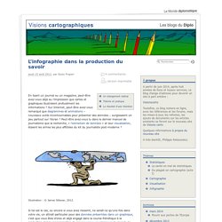
4 manières originales de structurer le plan et mieux visualiser le contenu de votre présentation - FormaVox. L'avenir est des données. Fragment of a figurative map of Charles Joseph Minard, a precursor of statistical graphics and data visualization.

At a time when journalism is undergoing a profound crisis as a result of the rise of social networks, financing difficulties, and increasing layoffs in the media industry, the 1st Data Journalism Conference organised by the Spanish chapter of the Open Knowledge Foundation opened up a new direction for the profession; a future that paradoxically goes back to its origins: to the search for new sources, to objective accounts of events and to data analysis. The conference took place on 24, 25 and 26 May in Barcelona, Madrid, Seville and San Sebastián.
In Barcelona, the CCCB was the venue for the first day of the conference, which lasted twelve hours and featured the participation leading experts in field of data journalism, including Mar Cabra, one of the coordinators of the event along with the journalist Karma Peiró. Interactive map of the London riots by The Guardian. Présenter une idée, un projet ou son organisation avec PowerPoint : mode d'emploi. David McCandless : « L’interaction est le futur de la datavisualisation » Datavisualization.ch Selected Tools. The top 20 data visualisation tools. Civic Infographics — English. By Giulio Frigieri The importance of perception for analysis and communication through infographics In his book “Graph design for the eye and mind”, Stephen Kosslyn asserts that “a good graph forces the reader to see the information the designer wanted to convey” and this would be the very “difference between graphics for data analysis and graphics for communication”[Kosslyn, 2006].

But are there any specific instances in which we can say that a data-based graphic is designed to describe, not to analyze? If so, what would make it more of an instrument for communication than for analysis? The fact that an explanatory text can be added – regardless of how concise or verbose it is – is not enough to imply that a chart’s nature is prevalently descriptive. L'infographie dans la production du savoir. En lisant un journal ou un magazine, peut-être avez-vous déjà eu l’impression que cartes et graphiques illustraient profusément les informations ?
Sur Internet, peut-être avez-vous remarqué que diagrammes et animations – nouveaux outils incontournables pour présenter des données – surgissaient un peu partout sur l’écran ? Peut-être avez-vous lu dans le dernier manuel de journalisme que la recherche, « l’extraction de données » et leur visualisation, étaient les armes les plus affûtées du kit du journaliste post-moderne ? Illustration : © James Sillavan, 2012. Si tel est le cas, ou encore si vous avez ressenti, ne serait-ce qu’une fois dans votre vie, un attrait particulier pour des données présentées dans un graphique, c’est que vous êtes d’ores et déjà engagé dans la course frénétique à la production et à la consommation de ces nouveaux envahisseurs du monde de l’information : les infographies. Alors, comment s’y retrouver dans ce labyrinthe ? Three Innovations in Crowd Sourced Scenario Planning, Part 1. Part 1, An Introduction I’ve spent the better part of the last four years working on approaches to online scenario planning as part of my PhD.
During this time I have designed and implemented three systems – each of which explored a different approach to crowd sourcing, engagement and online participation in futures work. Emergent Futures Mapping with Futurescaper. Futurescaper is an online tool for making sense of the drivers, trends and forces that will shape the future.
As a user interface system, it still needs development. As a tool for analyzing and understanding complex systems, it works very well and does something I have yet to see anything else be able to do. Several people asked me about this after my last post, so here is some more detail. Following the logic of collective intelligence (as part of my my PhD), I broke up the the scenario thinking process into discrete chunks, came up with a system for analyzing and relating them together, and then distilled them into key outputs for helping the scenario development process. Emergent Thematic Maps. La présentation Power Point. How to use FF Chartwell. Primarily suitable for Adobe Creative Suite, FF Chartwell for print uses OpenType ligatures to transform strings of numbers automatically into charts.

The data remains in a text box, allowing for easy updates and styling. It’s really simple to use; you just type a series of numbers like: ‘10+13+37+40’, turn on Stylistic Alternates or Stylistic Set 1 and a graph is automatically created. To help get you started using FF Chartwell we’ve created this video tutorial and here are some simple steps: ONE — Firstly always make sure the letter spacing is set to “0” (zero) TWO — Using the values 0-100, type the values, then use “+” to combine them into one chart. Heuristiquement. 3 Trends That Will Define The Future Of Infographics. Now that everyone loves them, early adopters and forward thinkers want to know what is next for the infographic.
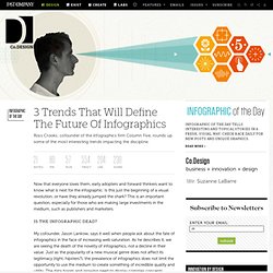
Is this just the beginning of a visual revolution, or have they already jumped the shark? This is an important question, especially for those who are making large investments in the medium, such as publishers and marketers. L'infographie, info ou intox ? C'est l'un des adages les plus connus : une image vaut mille mots.

Ce qui explique la vogue des infographies, représentations graphiques et esthétiques de données chiffrées. Que ce soit pour dresser un portrait des bacheliers français ou prendre la mesure de la consommation planétaire instantanée de produits technologiques, l'infographie semble être devenue la représentation la plus accessible de données originales. Mais en mars 2012, le site Internet Techni, dans son éditorial, posait la question suivante : les infographies sont-elles en train de gâcher le Web? Simplifier pour mieux transmettre.
La valeur ajoutée de la visualisation de données. Formation cartes mentales. Théorie Des Graphes.
Sémiologie graphique.