

Www.iicm.tugraz.at/iicm_thesis/hmader.pdf. ExtendNY - New York City Extended. We love Infographics. INFOGRAPHICS // we love infographics // vol. 3 // Movies Infographics Trilogy Meter #1 Trilogy Meter #2 Kill Bill Facts Mega Shark vs.
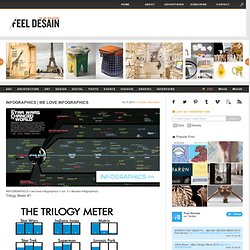
Giant octopus Facts Pixar characters size chart Monsters size chart Futuristic movies timeline Pulp Fiction timeline LOTR, Star Wars and other timelines Inception timeline Star Wars Influence Map Infographics: Time Travel in Movies & TV (Good) Data Visualization for the Web. Pitchdeck. Revolutionizing the way people discover, share, and interact with images online.

Inspired by Google Images, Flipboard and Pinterest Piccsy embodies all of the redeeming qualities these products provide, plus so much more. Traffic Visitors / Month Unique Visitors / Month Pageviews / Month Product Piccsy Users: Discover images through 'streams' that filter content based on custom parameters set by our community. Market/Competition Photo-sharing is one of the most popular activities on the Internet today. Piccsy recognizes the social/cataloguing void Google Images suffers from, as well as Tumblr's fragmented, unsearchable network, and Pinterest's reliance on user only bookmarking. By providing personalized streams using a uniform display, Piccsy is a social platform that aggregates images from around the web, based on customized parameters set by the user, offering a social way to discover images.
Financials Spent Since 07/10 Raising for Seed Series Technology Contact. Information design. Information design is the practice of presenting information in a way that fosters efficient and effective understanding of it.
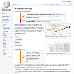
The term has come to be used specifically for graphic design for displaying information effectively, rather than just attractively or for artistic expression. Information design is closely related to the field of data visualization and is often taught as part of graphic design courses.[1] Etymology[edit] The term 'information design' emerged as a multidisciplinary area of study in the 1970s. Some graphic designers started to use the term, and it was consolidated with the publication of the Information Design Journal in 1979, and later with the setting up of the related Information Design Association (IDA) in 1991.[2] SnakeOil? Scientific evidence for health supplements. A generative data-visualisation of all the scientific evidence for popular health supplements by David McCandless and Andy Perkins.
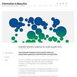
I’m a bit of a health nut. Keeping fit. Streamlining my diet. I plan to live to the age of 150 in fact. But I get frustrated by constant, conflicting reports and studies about health supplements. Is Vitamin C worth taking or not? In an effort to give myself a quick reference guide, I dove into the scientific evidence and created a visualization for my book. Play with interactive version | See the still image. Data Driven Architecture. One of the largest resources we have today is data.
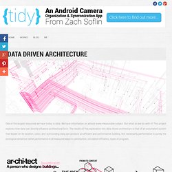
We have information on almost every measurable subject. But what do we do with it? This project explores how data can directly influence architectural form. The results of this exploration into data driven architecture is that of an automated system that based on its location, users, and surrounding data can produce an efficient and performative building. Not necessarily performative in purely the ecological sense but rather performative in all measured ways to satisfaction, circulation efficiency, types of program, The site: This project focuses on a site in downtown Chicago.
The tower would serve as residences. 50 Great Examples of Data Visualization. Wrapping your brain around data online can be challenging, especially when dealing with huge volumes of information.
And trying to find related content can also be difficult, depending on what data you’re looking for. But data visualizations can make all of that much easier, allowing you to see the concepts that you’re learning about in a more interesting, and often more useful manner. Below are 50 of the best data visualizations and tools for creating your own visualizations out there, covering everything from Digg activity to network connectivity to what’s currently happening on Twitter.
Music, Movies and Other Media Narratives 2.0 visualizes music. Liveplasma is a music and movie visualization app that aims to help you discover other musicians or movies you might enjoy. Tuneglue is another music visualization service. MusicMap is similar to TuneGlue in its interface, but seems slightly more intuitive. Data Visualization: Modern Approaches.
About The Author Vitaly Friedman loves beautiful content and doesn’t like to give in easily. When he is not writing or speaking at a conference, he’s most probably running … More about Vitaly Friedman … Data presentation can be beautiful, elegant and descriptive. There is a variety of conventional ways to visualize data - tables, histograms, pie charts and bar graphs are being used every day, in every project and on every possible occasion. However, to convey a message to your readers effectively, sometimes you need more than just a simple pie chart of your results.
Data presentation can be beautiful, elegant and descriptive. So what can we expect? Let’s take a look at the most interesting modern approaches to data visualization as well as related articles, resources and tools. 1. Trendmap 2007 Informationarchitects.jp presents the 200 most successful websites on the web, ordered by category, proximity, success, popularity and perspective in a mindmap.