
How to Evaluate Your Facebook Page. The Top 10 Marketing Infographics Of 2011. How the World Uses Social Networks [INFOGRAPHIC] Social networks in every country might live on the same Internet, but that doesn't prevent differences in online customs and culture from developing along geographic borders.
![How the World Uses Social Networks [INFOGRAPHIC]](http://cdn.pearltrees.com/s/pic/th/social-networks-infographic-12996851)
Ongoing market research service Global Web Index has mapped these differences in the infographic above (click it to enlarge). The research, run by London-based consultancy Trendstream, has conducted six waves of surveys about global consumer adoption of the Internet and social media in 36 markets. It used data from its February 2011 surveys of between 750 and 2,000 online users in each market to define three behavior types: messagers, groupers and content sharers. In some countries, many of them Asian, most people were focused on content sharing. Others, like the UK and Canada, had more people who put a greater emphasis on sending messages. Trendstream also used data from the survey to map social network penetration in each country that it surveyed. Does the way any country uses social networks surprise you? Online_communities_small.png (740×699) How are small businesses using Social Media? How Do These Airlines Score According To Their Social Media.
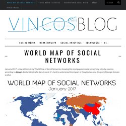
World Map of Social Networks. January 2017: a new edition of my World Map of Social Networks, showing the most popular social networking sites by country, according to Alexa & SimilarWeb traffic data (caveat: it’s hard to understand the impact of Google+ because it is part of Google domain traffic).

There are a lot of news since last January: Facebook is still the leading social network in 119 out of 149 countries analyzed, but it was stopped in 9 territories by Odnoklassniki, Vkontakte and Linkedin. It’s interesting to see that in some countries, like Botwana, Mozambique, Namibia, Iran e Indonesia, Instagram wins and that some African territories prefer LinkedIn. Overall LinkedIn conquers 9 countries, Instagram 7, meanwhile VKontakte and Odnoklassniki (part of the same group Mail.ru) grow up in Russian territories. In China QZone still dominates the Asian landscape with 632 million users and Japan is the only country where Twitter is the leader.
But what’s going on behind the first place? 9 expert tips for social media marketers. The StumbleUpon Lifecyle. How Has Twitter Changed Over The Years. Twitter Territory info graphic. Evolution of long distance relationships via tech. Search Benefits of the Blogosphere. The Growth Of Social Media [INFOGRAPHIC] If social media sites were superheroes. La tavola periodica del Social Media Marketing [Infografica. Il Social Media Marketing lo amiamo, lo odiamo, lo analizziamo e lo studiamo.

Usiamo i suoi strumenti per gioco, per entusiasmo, per diletto o perché “dobbiamo esserci perché ci sono tutti”. Usiamo i social network per svago ma anche per lavoro. Perché allora non dare un merito a questa disciplina? E’ entrata di forza nelle nostre vite quotidiane, cambiando i nostri comportamenti e anche il nostro modo di lavorare. Per questo, abbiamo pensato e realizzato un’infografica per dar merito a questa branca del marketing cosi affascinante e in continua evoluzione. Ne abbiamo raccolto l’essenza e l’abbiamo trasformata in immagine. Ed ecco solo per voi, lettori o follower (come preferite) di Web in Fermento, una tavola periodica aggiornatissima sulle nuove tendenze del Social Web. Se volete, stampatela e appendetela nel vostro ufficio, e perché no fate una foto e condividetela sulla nostra bacheca Facebook!
Enjoy it! Versione in alta risoluzione Rating: 5.0/5 (2 votes cast) Infographics: 10 Beautiful Social Media Data Visualizations. What's happening in the world of social media?

That's not a simple question to answer, as this space is quickly becoming one of the busiest, most interesting aspects of our digital lives. However, if we had to choose the best way to present the wealth of recent information on social media — how companies are using it to improve their business, how individuals are interacting with its many facets and how it's affecting our lives — the simplest way would probably be to showcase the best social media infographics from the last few months, and that's exactly what we did. We've gathered 10 amazing infographics, which are still quite fresh and contain very relevant info.
We hope you enjoy them! Let us know which ones you find most insightful in the comments below.