
Color Theory Basics with Natalia Taffarel. Color calibration. Professional Retoucher Natalia Taffarel Shows Us Her Techniques And Workflow. You are probably familiar with Natalia Taffarel as we've featured her in the past.
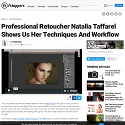
In case you aren't, you can check out her work here. What I love about Natalia is that not only is she a great retoucher but she's also very open and giving. Ever since I've known her when she started, she's always had a great attitude about sharing and helping others grow. This video really shows her character come through. Just recently, Train to Create, Wacom Europe and X-Rite made a London workshop possible with Natalia. How to Use Leading Lines for Better Compositions. Leading lines refers to a technique of composition where the viewer of your photos attention is drawn to lines that lead to the main subject of the image.

A leading line paves an easy path for the eye to follow through different elements of a photo. Usually they start at the bottom of the frame and guide the eye upwards and inwards, from the foreground of the image to the background, typically leading toward the main subject. The easiest place to find a leading line is on a road. Roadways are inherently leading because they go somewhere, give us a feeling of motion, and the lines often point so far inwards that they reach a vanishing point – the place where two or more lines converge into theoretical infinity. Using Leading Lines to Create Better Compositions. 20 Composition Techniques That Will Make Your Photos Look Better. There are no unbreakable rules when it comes to how you should compose your photographs After all, who likes rules except for your old school principal or heads of H.R. departments?
There are however, several guidelines you can use to help improve the composition of your photos. In this tutorial, I’ve listed 20 of these guidelines along with examples of each. I’ve started with the most basic ones and finished with some of the more advanced composition techniques. 20 Composition Techniques That Will Improve Your Photos. There are no unbreakable rules when it comes to how you should compose your photographs.
After all, who likes rules except for your old school principal or heads of H.R. departments? There are however, several guidelines you can use to help improve the composition of your photos. Centered Composition and Symmetry by Makayla Hensley on Prezi. The Rule of Thirds in Art. Rule of Thirds - COMPOSITION in Photography. Composition: Using the Rule of Thirds. The rule of thirds is a powerful compositional technique for making photos more interesting and dynamic.
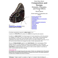
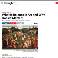
It's also perhaps one of the most well known. This article uses examples to demonstrate why the rule works, when it's ok to break the rule, and how to make the most of it to improve your photography. The rule of thirds states than an image is most pleasing when its subjects or regions are composed along imaginary lines which divide the image into thirds — both vertically and horizontally: Rule of Thirds Composition Region Divided Into Thirds It is actually quite amazing that a rule so seemingly mathematical can be applied to something as varied and subjective as a photograph. OK, perhaps you can see its usefulness by now — but the previous example was simple and highly geometric. Note how the tallest rock formation (a tufa) aligns with the rightmost third of the image, and how the horizon aligns with the topmost third.
Composition (visual arts) Beginning Graphic Design: Layout and Composition. Lesson 3: Layout and Composition /en/beginning-graphic-design/color/content/

Composition and Design Principles. ----------------------------------------------------------------------------- Everybody immediately responds to subject matter in art.
A picture of a butterfly and a picture of a snake do not get the same response. In addition to subject matter*, the formal aspects of visual composition are like the grammar of a language. In writing, a story is written with words - subject matter. Like good literature and good poetry is more than words and subject matter, art is more than pictures. The organization, the sentence structure, the style, and so on can make or break a good story.
The use of design principles applied to the visual elements is like visual grammar. TEACHING TIP Art vocabulary can be taught along with every project. Types Of Balance In Art And Design (And Why You Need Them) Humans naturally seek out symmetry and, according to Gestalt psychology, we tend to perceive objects as symmetrical shapes that form around a center point.
That’s why balance is one of the key principles of design. Visual balance is essential because it provides a sense of unity, order, and equilibrium. Your design needs to visually “hold together” in order to feel complete and harmonious. But to be clear, balance doesn’t mean everything should be perfectly symmetrical. It just means that the visual weight of objects, space, and color is equally distributed across the page.
What Is Balance in Art and Why Does It Matter? Balance in art is one of the basic principles of design, along with contrast, movement, rhythm, emphasis, pattern, unity, and variety.
Balance refers to how the elements of art (line, shape, color, value, space, form, texture) relate to each other within the composition in terms of their visual weight to create visual equilibrium. That is, one side does not seem heavier than another. How To Create Visual Tension in Your Designs - Vanseo Design. The pattern of building tension and then releasing that tension is one of the most ingrained patterns on all human beings.
Tension and release is at the heart of music, story, art, and pretty much all creative endeavors. The tension and release pattern in music creates rhythm. Understanding Balance in Photography. Balance is a compositional technique in photography that juxtaposes images within a frame so that the objects are of equal visual weight.
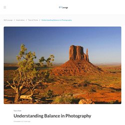
When different parts of a photo command your attention equally, perfect balance is achieved. In photography, there are two main techniques of balance you should be aware of: formal and informal. We’ll discuss the difference between each and how they can affect your photo. *** To learn more about White Balance, see our Photography 101 Workshop in our store. Knowing how to effectively balance objects within a photo is a skill that all serious photographers must learn. Balancing elements in photography becomes important when you frame your shots.
Using Color Theory in Web Design. In an earlier post, 5 Dos of Great Blog Design, we discussed the concept behind color theory in the way it pertains to white, or negative, space. Color theory tells us that different colors work together – or don’t – for specific reasons. (For a more in-depth definition of color theory, check out this article from NYU.) While you may not think about how color will affect those visiting your blog, during the web design process the designer considers this as a very critical component of creating the perfect web site. How color makes us feel.