
Multi-Device Layout Patterns. Through fluid grids and media query adjustments, responsive design enables Web page layouts to adapt to a variety of screen sizes.
As more designers embrace this technique, we're not only seeing a lot of innovation but the emergence of clear patterns as well. I cataloged what seem to be the most popular of these patterns for adaptable multi-device layouts. To get a sense of emerging responsive design layout patterns, I combed through all the examples curated on the Media Queries gallery site several times. I looked for what high-level patterns showed up most frequently and tried to avoid defining separate patterns where there were only small differences.
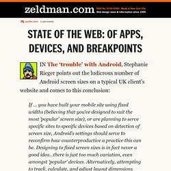
Mostly Fluid The most popular pattern was perhaps surprisingly simple: a multi-column layout that introduces larger margins on big screens, relies on fluid grids and images to scale from large screens down to small screen sizes, and stacks columns vertically in its narrowest incarnations (illustrated below). State of the web: of apps, devices, and breakpoints. IN The ‘trouble’ with Android, Stephanie Rieger points out the ludicrous number of Android screen sizes on a typical UK client’s website and comes to this conclusion: If … you have built your mobile site using fixed widths (believing that you’ve designed to suit the most ‘popular’ screen size), or are planning to serve specific sites to specific devices based on detection of screen size, Android’s settings should serve to reconfirm how counterproductive a practice this can be.
Designing to fixed screen sizes is in fact never a good idea…there is just too much variation, even amongst ‘popular’ devices. Alternatively, attempting to track, calculate, and adjust layout dimensions dynamically to suit user-configured settings or serendipitous conditions is just asking for trouble. I urge you to read the entire article—it’s brief yet filled with rich chocolatey goodness. On designing content-out (a response to Zeldman and others) (…reposted from a lengthy comment on Zeldman’s blog…) “I love “content-out” as a strategy…setting a series of breakpoints based on ems (based in turn on font size) could create lovely context-based layouts that move fluidly from one state to another.
They won’t match with device sizes but they won’t be trying to. There is a lot to think about and play with there.”- Zeldman, State of the Web: Of apps, devices and breakpoints There IS a lot to think about and designing content-out is quite liberating, but it’s also important to remember why we’re doing this. Designing content-out works quite well. The Best Browser is the One You Have with You. The web as we currently know it (and therefore build it) has primarily been accessed from the desktop.
Current trends indicate this is about to change. The ITU predicts that in the next 18–24 months, mobile devices will overtake PCs as the most popular way to access the web. RESS: Responsive Design + Server Side Components. There's no shortage of debate about the best way to develop Web sites that work well across many networked devices.
Some teams favor a client-side approach while others lean towards server-side solutions. Which One: Responsive Design, Device Experiences, or RESS? As more organizations realize they need to invest heavily in multi-device Web designs, the inevitable question of “how” comes up.
Thoughts On Developing A Responsive Design Workflow. Print design has the physical constraint of the canvas.
The format is fixed. The situation is different on the web. We can’t know in advance exactly how someone will view our sites. Think “Responsive Design” If you are a happy owner of a smartphone or tablet, you are already familiar with ways to consume and interact with content on these platforms.
But building all those apps & websites costs money… and we still need websites for the “classic” desktop users. Is there another way to merge all those fabulous ideas into a unique platform ? The answer we believe in is called “Responsive design”. For those who don’t know about it, responsive design combines progressive enhancement techniques, CSS media-queries, and innovative project approaches to allow us to create a website that responds to the context it’s being viewed within. Not only to the screen size of the device, but also to its capabilities (keyboard or lack thereof, touch-based devices,… ). Before we dive in the explanation, let’s review the problems with native Apps and mobile-specific websites. Problems you face when you develop Mobile Apps : Problems you face when you develop separate Mobile Websites : Multi-Device Web Design: An Evolution. As mobile devices have continued to evolve and spread, so has the process of designing and developing Web sites and services that work across a diverse range of devices.

From responsive Web design to future friendly thinking, here's how I've seen things evolve over the past year and a half. If you haven't been keeping up with all the detailed conversations about multi-device Web design, I hope this overview and set of resources can quickly bring you up to speed. I'm only covering the last 18 months because it has been a very exciting time with lots of new ideas and voices. Thoughts On Developing A Responsive Design Workflow. Responsive web design from the future. The ultimate responsive web design roundup. 70 Examples Of Modern Responsive Web Design. Techniques For Gracefully Degrading Media Queries - Smashing Coding. Media queries are the third pillar in Ethan Marcotte’s implementation of responsive web design.
Without media queries, fluid layouts would struggle to adapt to the array of screen sizes on the hundreds of devices out there. Fluid layouts can appear cramped and unreadable on small mobile devices and too large and chunky on big widescreen displays. Media queries enable us to adapt typography to the size and resolution of the user’s device, making it a powerful tool for crafting the perfect reading experience.
CSS3 media queries, which include the browser width variable, are supported by most modern Web browsers. Mobile and desktop browsers that lack support will present a subpar experience to the user unless we step up and take action. 10 Excellent Tools for Responsive Web Design. By Jason Gross So, you’ve decided to venture into the creation of responsive web designs. Wonderful! With the browsing landscape diversifying into mobile devices, netbooks, desktops and so forth, responsive web designs allow web designers to provide different layouts for specific devices (based on screen size and browser features) giving site visitors an optimal user experience.
So now, you’ve determined that it would be beneficial to create responsive web designs. Responsive Web Design. The English architect Christopher Wren once quipped that his chosen field “aims for Eternity,” and there’s something appealing about that formula: Unlike the web, which often feels like aiming for next week, architecture is a discipline very much defined by its permanence. Article Continues Below A building’s foundation defines its footprint, which defines its frame, which shapes the facade. Each phase of the architectural process is more immutable, more unchanging than the last. Creative decisions quite literally shape a physical space, defining the way in which people move through its confines for decades or even centuries. Working on the web, however, is a wholly different matter. But the landscape is shifting, perhaps more quickly than we might like. In recent years, I’ve been meeting with more companies that request “an iPhone website” as part of their project.
A flexible foundation#section1. Flexible, Mobile-First Layouts with CSS3. Some experts are projecting mobile devices to become the dominant medium for web browsing within five years, overtaking browsing on desktop computers. Regardless of how accurate this projection turns out to be, it is clear that formatting websites for mobile-friendly viewing needs to become a staple of web design and development. There are many ways to accomplish this, of course. However, CSS3 provides a fairly rich toolset for mobile-friendly formatting, relying on the client's browser capabilities instead of back-end templating. Step 1. Safari Web Content Guide: Configuring the Viewport.
Safari on iOS displays webpages at a scale that works for most web content originally designed for the desktop. If these default settings don’t work for your webpages, it is highly recommended that you change the settings by configuring the viewport. You especially need to configure the viewport if you are designing webpages specifically for iOS. Configuring the viewport is easy—just add one line of HTML to your webpage—but understanding how viewport properties affect the presentation of your webpages on iOS is more complex.
Before configuring the viewport, you need a deeper understanding of what the visible area and viewport are on iOS. If you are already familiar with the viewport on iOS, read “Using the Viewport Meta Tag” for details on the viewport tag and “Viewport Settings for Web Applications” for web application tips. Upcoming changes to the viewport meta tag for firefox mobile. This is a guest post by Matt Brubeck who works on the Firefox Mobile team. The upcoming release of Mobile Firefox (Fennec) 1.1 features improved support for the <meta name="viewport"> tag. Previous version of Fennec supported the width, height, and initial-scale viewport properties, but had problems with some sites designed for iPhone and Android browsers. We now support the same properties Mobile Safari does, and we also changed Fennec to render mobile sites more consistently on screens of different sizes and resolutions. touch.facebook.com before: touch.facebook.com after: You can see these changes for yourself in the latest Fennec 1.1 and trunk nightly builds for Maemo, Android, Windows, Mac, or Linux.
Background. What does 320dpi mean to designers? So the next iPhone (which I’m betting will be called iPhone HD) will almost definitely have a screen with a resolution of 640 by 960 pixels, at 320 dots per inch. This is double of what the iPhone 3GS has today (163dpi), and two and a half times the pixel density of the iPad (132dpi), giving you a total playground of 614,400 pixels. Hubba hubba! At 320dpi, you need more than a decent pair of eyes to see the pixels with your bare eyes. How will this effect the way we design for the iPhone? I’m sure it’ll bring up some interesting issues. Backward compatibility You can’t expect everyone to update their original iPhone, 3G or 3GS to an HD. The opposite won’t be a big issue, iPhone apps currently in the App Store will be upscaled by a factor of 2. What does 320dpi mean to designers? (2)
This article is a follow-up to the one I wrote before we knew for sure Apple would introduce a new iPhone with high resolution screen. The past couple of days I’ve been turning the internet upside down in search for screenshots of the new interface to see how Apple “solved” the problems you get when you need to design an interface that has almost the same DPI as paper (here’s the best screenshot gallery I could find). Going Mobile: Designing for Different Screen Sizes. By Janet M. Six Published: October 18, 2010 Send your questions to Ask UXmatters and get answers from some of the top professionals in UX.