
Color Wheel - Color Calculator. Color - Style - Material design guidelines. Color Harmony: Why Hulk Wears Purple Pants - ZevenDesign. Find your palette. 11 Colors You've Probably Never Heard Of. 1.
Sarcoline Wearing sarcoline—literally "flesh-colored"—high heels makes your legs look longer. Wearing a sarcoline leather jacket reminds everyone of Buffalo Bill in The Silence of the Lambs. 2. Coquelicot Originally another word for poppy, coquelicot is the flower's orange-tinted red color. The Ultimate List Of Online Color Tools For Web Developers. Jun 26th, 09 by Dicky | Tools Advertisement As a web designer, we will always deal with colors.

There are a lot of useful online color tools such as color wheel, color scheme, color palette, color picker, and etc. When i try to search for a complete list of online color tools, i can’t found any. So, i decided to collect them and share the list as a useful resource for other web designers. Let’s start looking at the list: ColoRotate: Colors come to life in 3D. Practical Rules for Using Color in Charts. Ishihara Test for Color Blindness. Ishihara Color Test Instructions Plates 1 – 17 each contain a number, plates 18 – 24 contain one or two wiggly lines.
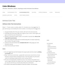
To pass each test you must identify the correct number, or correctly trace the wiggly lines. Sit approximately 75cm from your monitor, with each circle set at eye level.Preferably have mild natural light and no glare on your screen. Interior lights and glare can alter the color of the pictures.Attempt to identify the hidden number or line within 5 seconds then click on the image (left mouse button).Upon left clicking, the answer will be revealed along with an analysis explaining your condition if you got it wrong.Continue to the next Ishihara test, Complete them all to help gauge your color blindness severity.Share the test with your friends! Notes: NEW: A man by the name of Antony Tran has converted my test into an Android App, So for all of you with Android smartphones / Pads, check out Color Blend.
Theory Part 1: The Meaning of Color. Color in design is very subjective.
What evokes one reaction in one person may evoke a very different reaction in somone else. Sometimes this is due to personal preference, and other times due to cultural background. Color theory is a science in itself. Studying how colors affect different people, either individually or as a group, is something some people build their careers on. And there’s a lot to it. This is the first in a three-part series on color theory. Warm Colors Link Warm colors include red, orange, and yellow, and variations of those three colors. Red and yellow are both primary colors, with orange falling in the middle, which means warm colors are all truly warm and aren’t created by combining a warm color with a cool color.
Red (Primary Color) Link Red is a very hot color. Red can be associated with anger, but is also associated with importance (think of the red carpet at awards shows and celebrity events). Outside the western world, red has different associations. Examples. Colour Matching Game. Why Monet Never Used Black. Monet’s paintings evoke a sense of energy and life, they leap off the canvas with color and contrast, but Monet somehow managed to avoid using the color black for nearly his entire painting career.

By avoiding black in your own designs, you can replicate some of this dynamism. Monet and Other Impressionists Explored Their Medium Even when creating dramatic shadows, Monet avoided black, and instead manipulated the powerful relationships between colors Monet, and other impressionists, experimented obsessively with their medium: paint, some brushes, and a canvas. So just as pixels prohibit the use of Garamond on the web, the characteristics of the impressionists tools shaped their work. In the course of this experimentation, impressionists had to experiment with color to create the desired effects. The Impressionists Became Masters of Color Because he experimented with the juxtaposing colors, the pointillism of Georges Seurat is similar to a dithered GIF image Tints Pop, Shades Recede.
Kuler - Colour Pallettes. Color Scheme Designer. Colour Wheels.