
Multi-Device Layout Patterns. Through fluid grids and media query adjustments, responsive design enables Web page layouts to adapt to a variety of screen sizes.
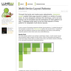
As more designers embrace this technique, we're not only seeing a lot of innovation but the emergence of clear patterns as well. I cataloged what seem to be the most popular of these patterns for adaptable multi-device layouts. To get a sense of emerging responsive design layout patterns, I combed through all the examples curated on the Media Queries gallery site several times. I looked for what high-level patterns showed up most frequently and tried to avoid defining separate patterns where there were only small differences. Mostly Fluid The most popular pattern was perhaps surprisingly simple: a multi-column layout that introduces larger margins on big screens, relies on fluid grids and images to scale from large screens down to small screen sizes, and stacks columns vertically in its narrowest incarnations (illustrated below). Column Drop Layout Shifter. Media Queries.
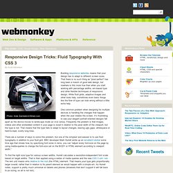
Responsive Design Tricks: Fluid Typography With CSS 3. Photo: Ariel Zambelich/Wired.com Building responsive websites means that your design has to adapt to different screen sizes.
That there is no such thing as “pixel perfect” has long been a maxim of good web design, but nowhere is this more true than when you start working with percentage widths, em-based type and other flexible techniques of responsive design. While fluid grids, adaptive images and other tools help, sometimes even basic things like the flow of type can look wrong without a little extra help. One common problem when designing for multiple devices is handling the changes that happen when the user rotates the screen. It’s frustrating to see your elegant portrait-oriented designs fall apart as the device moves to landscape mode (or vice versa). There are a number of ways to solve this problem, but one of the simplest and easiest is to use fluid typography in addition to your fluid grid.
Worried About HTML5 and CSS3 Being Unsupported? 1 February '12, 07:52pm Follow HTML5 and CSS3 have come a long way, but many important features are still risky to use — that is, they aren’t supported by all browsers.
So if you’re eager to take advantage of the shiny new toys available to you, you’ll need to know which elements and styles are fair game, and which will cause a catastrophic mess. Worry no further, thanks to HTML5 Please. This site, which is a community project from the people behind HTML5 Boilerplate, Modernizr & CSS3 Please, lets developers search and browse for elements / styles by how ready they are to use.
Co-creator Divya Manian‘s backstory on the project: Paul Irish and I thought it would be useful if there were a global set of recommendations that web developers could consult and tap on when they are deciding on how to use features. If you’ve been curious about why so many devs are raving about HTML5, here’s a way to dive in while playing it safe! HTML5 Please - Use the new and shiny responsibly. Boston Globe’s Responsive Redesign. Discuss. AS EVERY WEB DESIGNER not living under a rock hopefully already knows, The Boston Globe has had a responsive redesign at the hands of some of today’s best designers and developers: The spare Globe website has a responsive design that adapts to different window sizes, browsers and devices, and it has a built-in Instapaper-type feature that saves articles for reading off various devices on the subway.
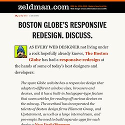
The overhaul has incorporated the talents of Boston design firms Filament Group, and Upstatement, as well as a large internal team, and pre-empts the need to build separate apps for each device. —New York Observer In a major step in the evolution of website design, the Boston Globe relaunched their site today using a Responsive Design approach. More work remains to be done. Congratulations to the Globe for its vision and these designers and developers for their brilliant work. Van Damme, that's good design In "Acclaim" Big Web Show: Monkey Do! In "A List Apart" Welcome to Ethan Marcotte’s website — Unstoppable Robot Ninja. Responsive Web Design: 50 Examples and Best Practices. Responsive web design term is related to the concept of developing a website design in a manner that helps the lay out to get changed according to the user’s computer screen resolution.
More precisely, the concept allows for an advanced 4 column layout 1292 pixels wide, on a 1025 pixel width screen, that auto-simplifies into 2 columns. Also, it suitably fixes on the smartphone and computer tablet screen. This particular designing technique we call “responsive design”. Now you can test your website using the Responsive Design Tool. Responsive web designing is an entirely different designing version than traditional web designing, and developers (especially fresher) must know about the pros and cons of responsive web designing. Pages that include data tables pose a special challenge to the responsive web designer. Images in responsive web designs are called context-aware.
Designmodo. Implementing Cross-Browser Video Playback in HTML5 » HTML & CSS, User Experience, Web Design » Design Festival.