
Maximo Patino sur Twitter : "Interested in teaching #DataJournalism in NYC? Come by our booth at #IRE15 for details about this great opportunity. Christopher Lim sur Twitter : "#dataJournalism is about using social science to tell news stories with precision & authority @martinstabe #DJW15. The story of getting Twitter data and its “missing middle” We’ve tried hard, but sadly we are not able to bring back our Twitter data tools.
Simply put, this is because Twitter have no route to market to sell low volume data for spreadsheet-style individual use. It’s happened to similar services in the past, and even to blog post instructions. There’s lots of confusion in the market about the exact rules, and why they happen. This blog post tries to explain them clearly! How can you get Twitter data? There are four broad ways. 1. There are two problems with this route – firstly to developers it sets the expectation that you can do whatever the API allows.
Secondly, it is unfair to non-programmers, who can’t get access to data which programmers easily can. 2. As soon as it gets serious, they should join the Twitter Certified Program to make sure Twitter approve of the app. These applications can’t allow general data analysis and coding by their users – they have to have specific canned dashboards and queries. 3. Introducing the Bitly Media Map! Last March, Bitly teamed up with Forbes to produce a data visualization which looks at how 15 media properties are being disproportionately consumed online on a state-by-state basis over the month of April.
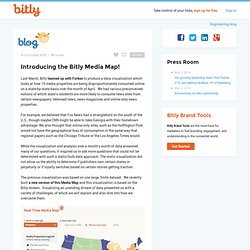
We had various preconceived notions of which state’s residents are more likely to consume news sites from certain newspapers, televised news, news magazines and online-only news properties. For example, we believed that Fox News had a stranglehold on the south of the U.S., though maybe CNN might be able to take Georgia with their hometown advantage. We also thought that online-only sites, such as the Huffington Post, would not have the geographical bias of consumption in the same way that regional papers such as the Chicago Tribune or the Los Angeles Times would. Social Media News NY. M.guardian.co.uk. How many people live in poverty in America?
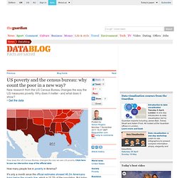
It's only a month since the official estimates showed 46.2m Americans living below the poverty line, which is 15.2% of the population. But today, new figures from the US Census Bureau show that another 3m people are living below the poverty line, one in six people. Online Journalism Blog. #media140 – Carlos Alonso’s favourite tools to finds stories behind the data. Here at Journalism.co.uk we understand data is one of the buzzwords in journalism at the moment, it is why we have built our news:rewired conference around the topic, and its popularity was certainly clear from the packed room at Media140 today, where journalist and online communications specialist Carlos Alonso spoke on the topic.
Alonso first discussed why the use of data itself is not new, illustrating this with the use of data in the 1800s to pinpoint deaths of cholera geographically, which then led to the finding that many occurred close to a specific well, or the mapping of revolutions in Scotland or England in 1786 to map where conflict was taking place. Telling Better Stories by Designing Custom Maps Using TileMill. Plotting information — say survey data in Pakistan’s Federally Administered Tribal Areas or election results in Afghanistan — on any kind of map adds critical geo-context to the data.
These maps quickly become move powerful when you start adding more custom overlays, showing data like where different ethnic groups live, high incidents of corruption, or more complex visuals like the number of deaths per drone strike in Pakistan and which U.S. president ordered it. What is really amazing is how accessible it is now for people to make custom maps to be able to tell more complex stories with data. Specifically, tools like Google Maps, OpenLayers, and Polymaps have made basic web mapping ubiquitous by making it simple to drop a map into a website, and their APIs open the door for everyone to customize maps by adding custom layers.
Needlebase. Journalism in the Age of Data. Search - #NICAR11. Get the Data: Data Q&A Forum. Masterclass 20: Getting started in data journalism. Coding for Journalists 101 : A four-part series. Photo by Nico Cavallotto on Flickr Update, January 2012: Everything…yes, everything, is superseded by my free online book, The Bastards Book of Ruby, which is a much more complete walkthrough of basic programming principles with far more practical and up-to-date examples and projects than what you’ll find here.
What could a journalist do with ScraperWiki? A quick guide. For non-programmers, a first look at ScraperWiki’s code could be a bit scary, but we want journalists and researchers to make use of the site, so we’ve set up a variety of initiatives to do that.
Firstly, we’re setting up a number of Hacks and Hacker Days around the UK, with Liverpool as our first stop outside of London. You can follow this blog or visit our eventbrite page to find out more details. Secondly, our programmers are teaching ScraperWiki workshops and classes around the UK. Anna Powell-Smith took ScraperWiki to the Midlands, and taught Paul Bradshaw’s MA students at Birmingham City University the basics. Paul has written up some notes at this link. An introduction to data scraping with Scraperwiki.