
Muzli - Design Inspiration. Effective Dart: Design. Here are some guidelines for writing consistent, usable APIs for libraries.
Names Naming is an important part of writing readable, maintainable code. The following best practices can help you achieve that goal. DO use terms consistently. Use the same name for the same thing, throughout your code. PageCount // A field. updatePageCount() // Consistent with pageCount. toSomething() // Consistent with Iterable's toList(). asSomething() // Consistent with List's asMap(). RenumberPages() // Confusingly different from pageCount. convertToSomething() // Inconsistent with toX() precedent. wrappedAsSomething() // Inconsistent with asX() precedent. The goal is to take advantage of what the user already knows. AVOID abbreviations. Unless the abbreviation is more common than the unabbreviated term, don’t abbreviate. PageCount buildRectangles IOStream HttpRequest numPages // "Num" is an abbreviation of "number (of)". buildRects InputOutputStream HypertextTransferProtocolRequest.
16 Things to Improve Your Website Accessibility (Checklist) Accessibility is the practice of ensuring websites are equally available to people with disabilities so they have equal access to the goods and services those sites provide.
It’s an integral part of professional web design and development. Why Should You Care About Accessibility? There are many reasons why developers, designers, and their employers/ clients should ensure that accessibility is an early and integral part of the process of web development. In many territories, such as the USA, EU, UK, Israel, and Japan, it’s a legal requirement not to discriminate against people due to their disability.
In the USA last year, 2,235 new ADA Website lawsuits were filed in federal court. The Common Standards and the Problems Luckily, the W3C (the body that produces many of the standards that the web relies on) has a standard on how to make websites accessible. In the Click-Away Pound survey, respondents with disabilities were asked what the main blocks to them completing purchases were. So: CSS Can Influence Screenreaders. Introduction Let's say we're building a shopping list app.
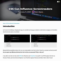
As we build out the app, we decide to style the list, stripping out the bullets that the browser gives us by default. Line 1 <ul> Line 2 <li>Apples</li> Line 3 <li>Bananas</li> Line 4 </ul> Line 1 <ul style="list-style: none;"> Being dutiful accessibility testers, let's run our screenreaders over the two lists. I was able to test the two lists with NVDA for Windows and VoiceOver for macOS. When I tested against the first, bulleted list, the screenreaders always told me how many items were in the list and preluded each list item with "bullet. " ... As we keep building our hypothetical shopping list app, we implement a feature to let users add new items, complete with a shiny new "Add" button. The definitive megalist of the best design books, podcasts, movies, and more.
Contrast Ratio: accessibilité visuelle par rapport aux couleurs web. Design. Prototypo - Official Beta. Structure - Layout. For guidance on arranging elements in z-space to achieve the correct behavior and shadows, see the Environment and Elevations and shadows sections.
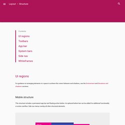
This structure includes a permanent app bar and floating action button. An optional bottom bar can be added for additional functionality or action overflow. Side nav menus overlay all other structural elements. This structure shows a permanent app bar with a floating action button. The app bar absorbs elements from the tablet and mobile bottom bars. The desktop structure contains a permanent app bar with a floating action button. Side navigation menus can take up the full height of the screen size (including under the app bar) and be accessed temporarily or pinned for permanent display. Define a primary horizontal or vertical divider. Gestalt principles in UI design. Here’re the Gestalt principles which can inform today’s UI design.
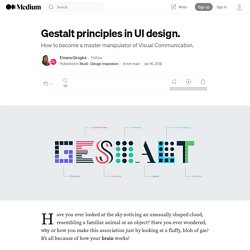
Elements arranged close to each other are perceived as more related than those placed further apart. This way different elements are viewed mainly as a group rather than as individual elements. How does the Proximity principle apply to UI design? We can use the Proximity principle in UI design for grouping similar information, organising content and decluttering layouts. Its correct use will have a positive impact on visual communication and user experience. As the principle states, items that are related should stay close to each other, while the unrelated items should stay further apart. We can apply the Proximity principle pretty much everywhere from navigation, cards, galleries and banners to lists, body text and pagination. Laisse-moi faire ma diva – 24 jours de web.
Ou pourquoi détruire un design en dev c’est plus grave que ça en a l’air.
Développeurs, intégrateurs, je vous dédie ce poème. Designers, graphistes, vous n’êtes pas seuls. 1. Les nuisibles Quand j’étais intégrateur HTML chez Publicis, il y avait une race de chefs de projet qu’on redoutait plus que tout : celle qui croyait mieux connaître notre métier que nous. C’était il y a dix ans. Eh bien dites-vous que pour un créatif, ces nuisibles, c’est à chaque projet.