
Philipwalton/flexbugs. Le petit flexbox illustré chez Vincent Valentin. Nantes, le 7 septembre 2015.
Flexbox est un nouveau module d’affichage CSS qui apporte quelques possibilités graphiques jusqu’alors impossibles et qui permet aussi de grandement simplifier les constructions habituelles. Son principal frein reste le support limité à IE 10+ (pas de souci pour la majorité des autres navigateurs), mais au regard des nouveautés offertes, il est d’ores et déjà intéressant d’en comprendre le fonctionnement et de résoudre certaines problématiques grâce à celui-ci. Déclencher un affichage flexbox passe par la propriété display. Flexbox diffère un peu des types d’affichages habituels car le changement va ici non seulement impacter l’élément sélectionné, mais également ses enfants directs. Ainsi on parlera de flex-container et de flex-items ; et il sera possible de passer des propriétés spécifiques à ces deux composants. La courbe d’apprentissage du module peut paraître abrupte au premier abord. Quoi qu’il en soit, au lieu de devoir écrire : La direction Par exemple :
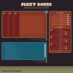
Flexy Boxes — CSS flexbox playground and code generation tool. Flexbox browser support Three versions of the flexbox spec – each with different syntax – have been implemented in browsers.
The two 2012 specs are roughly equivilant in terms of features, differing mainly in syntax. The earlier 2009 spec is less comprehensive though covers a lot of the same ground. Flexbox 2012 — W3C Candidate Recommendation, September 2012 Opera 12.1+, Firefox 22+. Chrome 21 -webkit- Flexbox early 2012 — W3C Working Draft, 22 March 2012 Internet Explorer 10 -ms- Flexbox 2009 — W3C Working Draft, 23 July 2009 Firefox 2+ -moz-, Chrome 4+ -webkit-, Safari 3.1+ -webkit-. iOS Safari 3.2+ -webkit- More browser support info available on caniuse.com.
Known issues Flexbox early 2012 Flexbox early 2012 (Internet Explorer 10) align-content (equiv. flex-line-pack) doesn't work if the cross axis dimension is set with min-width or min-height. Solved by Flexbox — Cleaner, hack-free CSS. All of the code samples on this site show how to solve a particular design problem with Flexbox.
They show just the code that's needed to make the demos work in a spec-compliant browser. Some browsers do not fully comply with the latest version of the spec, so sadly, a few workarounds were necessary. Workarounds for non-compliant browsers are not shown in the code samples, but if you're curious about those implementation details, you can check out the source files. Each demo links to its source, and all browser-specific workarounds are well-documented, so don't be afraid to take a look. The vendor prefixing and translating of current flex properties to their legacy equivalents is all handled by autoprefixer. The class naming convention used in the code samples and source files is taken from SUIT CSS, which is based on BEM methodologies. If you find a mistake or would like to suggest an additional example, feel free to open an issue or submit a pull request on Github.
[DevFest Nantes 2015] Flexrox. Normalizing Cross-browser Flexbox Bugs. Update: as a follow-up to this article, I’ve created the Github repo Flexbugs: a community curated list of cross-browser flexbox issues and their known workarounds.
The goal is if you’re building a website using flexbox, and something isn’t working as you’d expect, you can find the solution there. Way back in September of 2013, while testing my Solved by Flexbox project, I discovered a bug in Internet Explorer 10 and 11 that was preventing my sticky footer from actually sticking to the bottom of the page. I spent some time trying to work around the issue, but all my attempts failed. At first I was really annoyed. Before flexbox, it was impossible to build a sticky footer layout with just CSS unless you knew the exact dimensions of both the header and footer.[1] Flexbox changed this—finally we had respectable CSS solutions to today’s modern, responsive layouts.
A few weeks ago I received a pull request on Github that fixed the sticky footer issue with an IE-only @media rule.