
Data Visualization Blog. Content alone does not make a great video; you need a great video design that make a visual statement combining design and data visualization to deliver a story.

Designers often get a little excited and put too much fancy design to fill in the space. The best content marketing brands are the ones that know how use content to drive conversions and pushing the boundaries. Keep in mind, quality = attention span. Datavisualization.ch Selected Tools. Design Charts for Better Typography and Color. Mar 21 2011 We’re designers, so it makes sense that a lot of us are visual learners and do better looking at charts and graphs than reading an article or listening to a podcast.
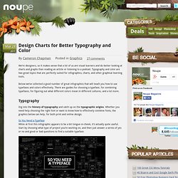
Typography and color are two great topics that are perfectly suited for infographics, charts, and other graphical learning tools. Below we’ve collected a good number of great infographics that will teach you how to use typefaces and colors effectively. There are guides for choosing a typeface, for combining typefaces, for figuring out what different colors mean in different cultures, and a lot more. Cool Infographics - Blog.