
Guidelines for Checkout Design. According to e-commerce researchers, an average 65.23% of potential customers abandon their shopping cart.
In this blog I have outlined some comprehensive steps that can help reduce cart abandonment. Add Description for Fields Labels Form field labels without an explanation could cause confusion regarding the information being asked of the customer. Most customers need extra help, so for example, instead of showing a “?” Or having a mouseover effect that shows details of what’s being asked, you can simply display the information below the form labels. Highlight Credit Card Fields with Security Icons Study shows that users are actually more concerned about security while entering the credit card information. Also, highlighting the payment input fields with different color or border and icons make them feel more secure and highlight the sensitive fields too. User Shipping Address as Billing Address by DefaultReduce the time it takes customer’s to fill in information.
No to NoUI – Timo Arnall. ‘The best design is invisible‘ is the interaction design phrase of the moment.
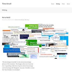
The images above are from my ever-expanding collection of quotes about how design and technology will ‘disappear‘, become ‘invisible‘ or how the ‘best interface is no interface‘. The Verge has recently given both Oliver Reichenstein and Golden Krishna a platform to talk about this. This has spawned manifestos, films, talks, books, #NoUI hashtags and some debates about what it might mean. Loop11.
Site Search. Online Usability 101 is here: watch our free 7-video series & become a user testing heavyweight. Online Usability 101 is here: watch our free 7-video series & become a user testing heavyweight News January 30th, 2013.
Books On Designing Products That Drive Action by ZURB. We received an amazing amount of tweets and questions following our talk on Design that Drives Action at MozCon yesterday.
Many folks asked for books and resources they can use to learn more about the principles behind designs that drive actions. So we decided to put together a quick post recommending some of the books that have helped us learn the craft. Visual Design Jakob Nielsen's "Homepage Usability: 50 Websites Deconstructed" focuses on home page design as the most important point of presence of any website. In the book, Nielsen systematically deconstructs 50 of the most popular homepages on the web. Web Design for SEO.
Pricing Pages in Web Design: Getting Users to Sign Up. What is are the first thing a visitor will look at before signing up for a paid service?
The pricing of course. Can they afford it? Are the features available worth the money spent? It's Not What You Say, It's How You Present It. 25-point Website Usability Checklist. I've been thinking a lot lately about my process.
Experience is a powerful thing, but it's rare that we really sit down and try to map out what we know. A while back, as part of my 5-point Website Clinic, I developed a 25-point website usability checklist - a way to create some method out of my madness and make sure that I don't forget anything critical when I'm working with a new client. Even though it's part of one of my paid offerings, I've decided to share this checklist. A few disclaimers: First, I don't claim this list is comprehensive or unique. Jakob Nielsen has a great 113-point checklist in his book, Homepage Usability, for example. Basic Overview The list is split into 4 roughly equal sections, (I) Accessibility, (II) Identity, (III) Navigation, and (IV) Content. Section I. This section contains not only traditional accessibility issues, but anything that might keep a visitor from being able to access the information on a website. 1.
Web Design. Interface Design is Copywriting. Kind of impossible to separate the skills of interface design and copywriting. There is a lot to like in the presentation The Language of Interfaces by Des Traynor, in which he makes several important points about Interface Design. The first is that words mean everything in the interface. Every single word you choose is important, from the call-to-action button to the headline to the words in an error message. Each word, if carefully chosen, adds to the experience of the user, making them more confident and sure that they’re on the right track. Why Your Links Should Never Say “Click Here” By anthony on 06/20/12 at 10:39 pm Have you ever wanted your users to click your links, but didn’t know how to get them to act?
When some designers run into this problem they’re tempted to use the words “click here” on their links. Before you give in to the temptation, you should know that using these words on a link can affect how users experience your interface. “Click” Puts Too Much Focus on Mouse Mechanics Using the word “click” on your links takes the user’s attention away from your interface and on to their mouse. “view” relates to the users task, while “click” puts the focus on mouse mechanics.