
Font. Best Free Fonts Archive. How to install fonts About Icon fonts About Webfonts Submit free fonts Love our site?
Tell a friend Name Mail to My email Message Check out It's the best fontsite ever! Business Plans Plan your next business venture better and start fully prepared. ActionFonts.com. Handpicked free fonts for graphic designers with commercial-use licenses. 1001 Fonts. 18,601 free fonts for Windows and Mac - FontSpace. 1001 Free Fonts - Download Free Fonts. Lost Type Co-op. Catman Font. I am the artist for a webcomic called Development, found at We are holding a contest from now until the end of February 2012.
The rules of the contest are as follows: Itsadzoke Font. Generation Font. Znikomit No25 Font. Montepetrum Font. Best Practices of Combining Typefaces. Advertisement Creating great typeface combinations is an art, not a science.
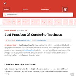
Indeed, the beauty of typography has no borders. While there are no absolute rules to follow, it is crucial that you understand and apply some best practices when combining fonts in a design. When used with diligence and attention, these principles will always yield suitable results. Today we will take a close look at some the best practices for combining typefaces — as well as some blunders to avoid. Combine a Sans Serif with a Serif By far the most popular principle for creating typeface combinations is to pair a sans serif header typeface with a serif body typeface. In the example below — a typical article layout — we have Trade Gothic Bold No.2 paired with Bell Gothic on the left side. Putting these two together creates an unwanted conflict in the design. Now let’s look at the example on the right.
Avoid Similar Classifications Now notice the example on the right side. So You Need A Typeface « Inspiration Lab. So You Need A Typeface I never usually feature my students but I’m going to make an exception, we had such a brilliant critique today that I just want to say “Thank god for passionate students like mine!”.

You guys rock!! (in spite of our verbal whupping; better to have tried and failed than not to have tried at all). So let’s end the week with a student project, an info graphic related to the job we do as graphic designers. Learn: Typeface Classifications. Perpetua (typeface) Perpetua is a typeface that was designed by English sculptor and typeface designer Eric Gill (1882–1940).
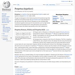
Though not designed in the historical period of transitional type (the hallmark of transitional type was John Baskerville's type designed in the last half of the 18th century), Perpetua can be classified with transitional typefaces because of characteristics such as high stroke contrast and bracketed serifs. Along with these characteristics, Perpetua bears the distinct personality of Eric Gill's letterforms. Comparison between printed (top) and digital (bottom) versions of Perpetua Gill began work on Perpetua in 1925 at the request of Stanley Morison, typographical advisor to Monotype.[1][2] Morison sought Gill's talent to design a new typeface for the foundry.
By 1929, Perpetua Roman was issued as Monotype Series 239.[3] Download Electra® font family. Mercury Text. Mercury: high performance meets high style.
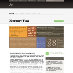
The product of nine years’ research and development, Mercury Text is a family of high-performance text faces designed to thrive under the most adverse conditions. Even while the headline font Mercury Display was still on the drawing board, we suspected that many of its ideas might someday lend themselves to a good text face.
Mercury’s compact proportions and clear gestures would naturally reproduce well in small sizes, and we imagined that its spiky geometry and taut curves could make text sparkle. We had the chance to explore this idea in 1999, when the New Times newspaper chain asked us to solve an interesting problem. Newspapers are one of typography’s most challenging environments, not only because their high-speed presses coincide with pulpy papers and thin inks, but because they contain so many different kinds of information, arranged in countless ways, that are often composed not by designers but by software.
Interstate (typeface) Interstate is a digital typeface designed by Tobias Frere-Jones in the period 1993–1999, and licensed by Font Bureau.
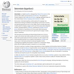
The typeface is closely related to the FHWA Series fonts, a signage alphabet drawn for the United States Federal Highway Administration in 1949. Akzidenz-Grotesk. History[edit] Variants of Akzidenz-Grotesk, showing the slight inconsistencies and idiosyncrasies between different weights and widths.
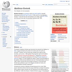
Contemporary versions of Akzidenz-Grotesk descend from a late-1950s project, directed by Günter Gerhard Lange at Berthold, to enlarge the typeface family, adding a larger character set, but retaining all of the idiosyncrasies of the 1898 face. Under the direction of Günter Gerhard Lange, he had designed 33 font styles to the Akzidenz-Grotesk family, including AG Extra (1958), AG Extra Bold (1966) and AG Super (1968), AG Super Italic (2001) and Extra Bold italic (2001).[5] In May 2006, Berthold announced the release of Akzidenz-Grotesk in OpenType format, under the name Akzidenz-Grotesk Pro.
The Pro family offers extended language support for Central European, Baltic and Turkish as well as Welsh, archaic Danish and Esperanto and is available in CFF PostScript OpenType. Akzidenz-Grotesk and Georgia are the official fonts of the American Red Cross. Figures: FF DIN. At a 1994 meeting of the ATypI (Association Typographique Internationale) in San Francisco, Pool encountered Erik Spiekermann, who encouraged him to design a revival of DIN 1451 for release by FontFont, the type foundry Spiekermann had just established.
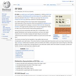
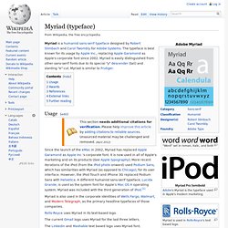
Today, FF DIN is one of the foundry’s best-selling typefaces.[2] Sharing structural similarities with DIN 1451, FF DIN differs in its weight distribution and naming conventions, and has a far wider character set. Gotham (typeface) Myriad (typeface) "Word" set in roman, italic, and bold.
"What Font Should I Use?": Five Principles for Choosing and Using Typefaces. Advertisement For many beginners, the task of picking fonts is a mystifying process. There seem to be endless choices — from normal, conventional-looking fonts to novelty candy cane fonts and bunny fonts — with no way of understanding the options, only never-ending lists of categories and recommendations. Choosing the Right Font: A Practical Guide to Typography on the Web. Typography is an huge field. People devote years of their lives to this ancient craft, and yet there's always something new to learn. In this article, I'll be reviewing the major points that you should consider when selecting a typeface for a website.
Republished Tutorial Every few weeks, we revisit some of our reader's favorite posts from throughout the history of the site. This tutorial was first published in October of 2010. Practical Typography When you design for the web, you have to accept that the content will change. How to select the right font every time. Selecting Fonts: A Quick Lesson - Austin Avrashow. Open Microsoft Word and you will see about 150 font choices (Office 2003 on XP) or even 250 (Office 2007 on Vista). Lost Type Co-op.