
CSS CSS Responsive Multi-Level Flat Menu Tutorial. HTMLBOY - Stop using the viewport meta tag (until you know how to use it) In the early years, when the smartphones came to Earth, they knew the Internet wasn’t prepared for them… so they expected every website to be around 1000px width (980px on the iPhone) and zoom out the website to fit into the screen.
And so the <meta name="viewport"> was created, basically to tell those smart dudes that your website was prepared for them. Nowadays, some popular front-end frameworks like HTML5 Boilerplate, Twitter Bootstrap and other pre-made templates include this meta tag by default –which is great for responsive web design, but very harmful for “traditional” web design. This is how it works. Briefly If you are not coding a responsive site, just don’t use any meta viewport. Any additional parameters in the content attribute usually screw up user’s experience.
EDIT: As Brad Frost correctly pointed out, you should also use the viewport meta if you are building a dedicated mobile site, so it’s not just for responsive sites. Responsive Web Layouts for Mobile Screens: Intro, Tips and Examples. Designers have it tougher now than before.
We not only have to design for stationary devices, but also mobile devices like the tablet and smartphones, and since we are talking about a lot of different screen sizes and resolutions here, it’s a huge task to shoulder. In light of this, responsive web design could be the best solution. It offers more than just a simple mobile template; instead, your entire site layout is designed to be flexible enough to fit into any possible screen resolution. Responsive design with a view full site link. A warranted preface on media queries and responsive design Does a responsive design with a view full site link really make sense?
As developers (and UI/UX designers) shouldn’t we be using the media queries to present information in a pleasant and effective manner for each and and every screen size? If you subscribe to the philosophy of ‘responsive design’, than yes. And I think those in support of the responsive approach, in general, assimilate. Take a look at Mashable, Disney and the Boston Globe. So what’s up? Get your CSS in order It’s common practice to put responsive CSS at the bottom of your style sheet.
Add link to “view full site” Nothing fancy here. I absolutely positioned it at the top of every page. Display none? Remove responsive design, change viewport and store prefs in HTML5 storage We have three ‘things’ to tackle here. So, get the responsive style sheet and the meta viewport tag. See it in action. Responsive Web Design just got Easier with the Responsive Grid System. Media Query-less Design, Content-based Breakpoints & Tweakpoints - dmolsen.com.
This post is a follow-up to Lessons Learned Building the New dmolsen.com: Static, A Performance Budget, Sass & SVG.
The previous post focused on my technical choices in the re-design of dmolsen.com. This post focuses on my design choices. I had two popular quotes floating around in my head as I moved my design for the new dmolsen.com from the sketchpad to the browser. The first quote was from Bryan Rieger (@bryanrieger): The second quote was from Stephen Hay (@stephenhay) (sorry, I could only find Brad's version of the quote): Android and Iphone - modern css media queries. CSS Responsive Breakpoints & Media Queries. 29-Aug-2012 Adaptations Tutorials Home | Adaptations Home | Adaptations Examples PVII Adaptations produces responsive Web pages that automatically adjust to the size of the browser window or the type of device being used.
It even adapts to the orientation—portrait or landscape—of your mobile device. The adaptable and responsive nature of Adaptations is driven by CSS3 Media Queries, which allow us to tailor the layout based upon parameters expressed in each query. Each Adaptations page you create is linked to a core CSS file and a response CSS file. When you visit a website with a mobile browser, your device will assume that you're viewing a traditional Web page and that you want to see pretty much the whole page—not just the top left edge. This tag tells your mobile device, no matter the brand, to display your Web page according to its physical viewport size, as if the page were actually designed to fit, which in the case of a PVII Adaptations, it is.
Media Queries for Standard Devices. If you think responsive's simple, I feel bad for you son.
We got 99 viewports, but the iPhone's just one. —Josh Brewer, March 10, 2010. How to build a responsive HTML5 website - a step by step tutorial. Rating: 8.6/10 (1247 votes cast) Required knowledge level: intermediate In this responsive web design tutorial we will create an awesome responsive HTML5 website starting from scratch.
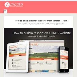
I tried to include as many different features as possible, so we will be dealing with a jQuery slider, CSS3 transitions and animations, CSS Media Queries and so on. This part of the tutorial will show you the HTML structure and the required scripts in a step by step tutorial.